Gauge Scale Properties
These properties affect gauge scales. A gauge scale fits into one of three categories, based on whether it has ticks, labels, or a track. Each category has its own properties.
For a guide to using gauges, see Designing Gauges.
Gauges and gauge scales can also be affected using Common Properties.
Shared Gauge Scale Properties
These properties affect the shape of any type of gauge scale.
Scale Type
Scale Type
Scale Type
Specifies whether the shape of the scale is defined by a circle (Circular) or a straight line (Linear). Default is Circular. The angle and radius properties apply to circular scales; the padding properties apply to linear scales.
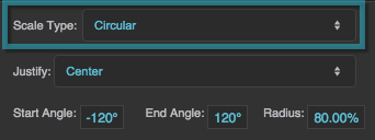
The Scale Type property
Start Angle
Start Angle
Start Angle
Defines the start angle of the circular scale, in degrees. A value of zero indicates the top of the circle. Valid values are between −360 and 360. Default is −120.
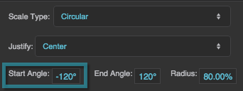
The Start Angle property
End Angle
End Angle
End Angle
Defines the end angle of the circular scale, in degrees. A value of zero indicates the top of the circle. Valid values are between −360 and 360. Default is 120.
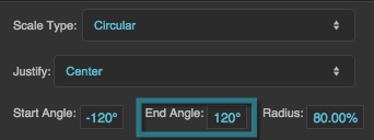
The End Angle property
Radius
Radius
Radius
Defines the radius of the circle that defines the scale, as a percentage of either half the width or half the height of the container, whichever is larger. Default is 90%.
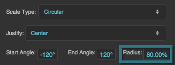
The Radius property
OriginX and OriginY
OriginX and OriginY
OriginX / OriginY
For scale labels only, define the center of the circular scale as a percentage of the container width and height. Default is 50% for both.
Left Padding
Left Padding
Left Padding
Defines the distance between the left side of a linear scale and the container boundary, in pixels. If a border stroke is defined, defines the distance between the scale and the border stroke. See Borders, Padding, and Content Size.
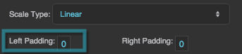
The Left Padding property
Right Padding
Right Padding
Right Padding
Defines the distance between the right side of a linear scale and the container boundary, in pixels. If a border stroke is defined, defines the distance between the scale and the border stroke. See Borders, Padding, and Content Size.
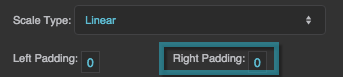
The Right Padding property
Scale Ticks Renderer Properties
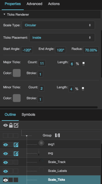
These properties affect a scale with ticks.
Ticks Placement
Ticks Placement
Ticks Placement
Specifies whether the ticks are positioned on the Inside, Center, or Outside of the circle or line that defines the scale. Default is Inside.
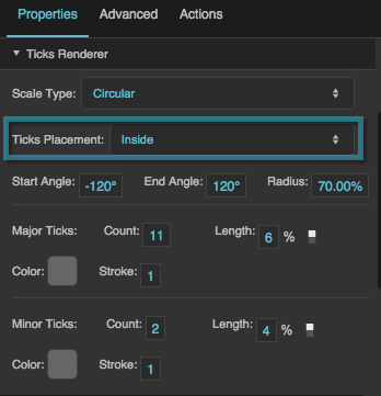
The Ticks Placement property
In the Property Inspector, the major and minor tick properties are each shown in a group with the labels Count, Length, Color, and Stroke.
Major Tick Count
Major Tick Count
Major Tick Count
Defines the total number of major ticks along this scale. Valid values are 0 to 30. Default is 11.
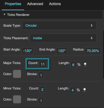
The Major Tick Count property
Major Tick Length
Major Tick Length
Major Ticks Length
Defines the length of each major tick, as a pixel value or a percentage. Default is 6%. For circular scales, a percentage is a portion of the circle’s radius. For linear scales, a percentage is a portion of half the container width.
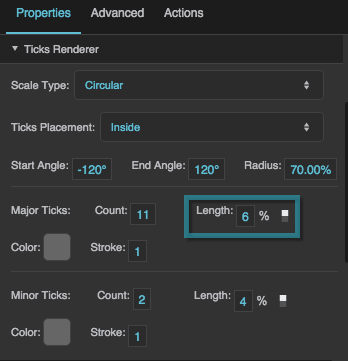
The Major Tick Length property
Major Tick Stroke Color
Major Tick Stroke Color
Major Tick Stroke Color
Defines the stroke color of the major ticks.
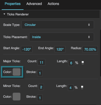
The Major Tick Color property
Major Tick Stroke Weight
Major Tick Stroke Weight
Major Tick Stroke Weight
Defines the stroke weight of each major tick.
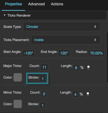
The Major Tick Weight property
Minor Tick Count
Minor Tick Count
Minor Tick Count
Defines the number of minor ticks between each consecutive pair of major ticks. Default is 2.
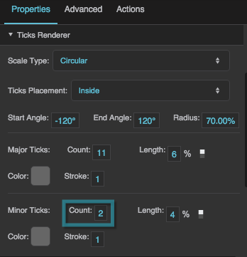
The Minor Tick Count property
Minor Tick Length
Minor Tick Length
Minor Tick Length
Defines the length of each minor tick, as a pixel value or a percentage. Default is 4%. For circular scales, a percentage is a portion of the circle’s radius. For linear scales, a percentage is a portion of half the container width.
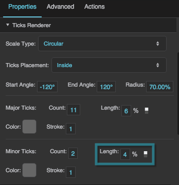
The Minor Tick Length property
Minor Tick Stroke Color
Minor Tick Stroke Color
Minor Tick Stroke Color
Defines the stroke color of the minor ticks.
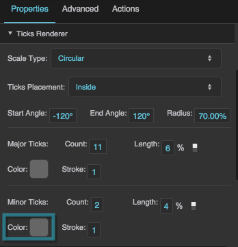
The Minor Tick Color property
Minor Tick Stroke Weight
Minor Tick Stroke Weight
Minor Tick Stroke Weight
Defines the stroke weight of each minor tick.
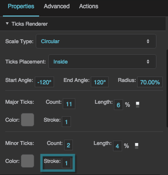
The Minor Tick Weight property
Scale Labels Renderer Properties
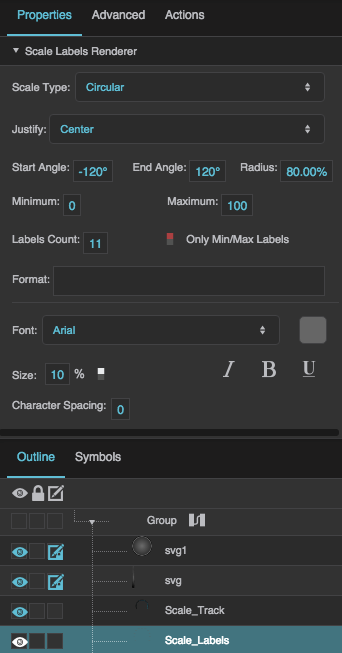
These properties affect a scale with number labels.
Justify
Justify
Justify
Specifies whether the labels appear on the Inside, Center, or Outside of the circle or line that defines the scale. Default is Center.
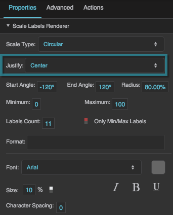
The Justify property
Minimum
Minimum
Minimum
Defines the lowest number on the scale. Default is 0.
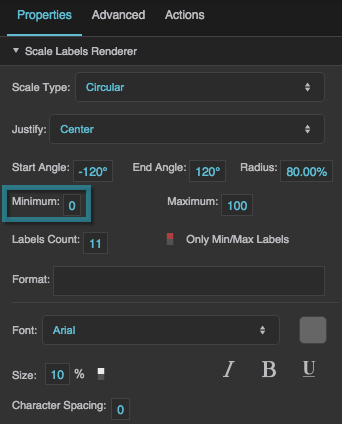
The Minimum property
Maximum
Maximum
Maximum
Defines the highest number on the scale. Default is 100.
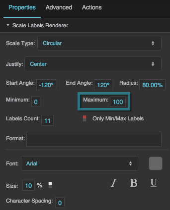
The Maximum property
Labels Count
Labels Count
Labels Count
Defines the total number of labels along this scale. Must be an integer greater than or equal to 2. Default is 11. The Only Min/Max Labels property overrides this property.
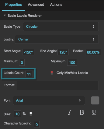
The Labels Count property
Only Min/Max Labels
Only Min/Max Labels
Only Min/Max Labels
Specifies whether the labels for the minimum and maximum of the scale are the only two labels that appear. This property overrides the Labels Count property.
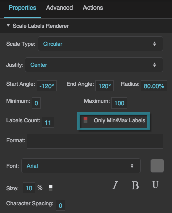
The Only Min/Max Labels property
Format
Format
Format
Defines the number format for scale labels, as a format string.
For example:
- ,##0.00: Labels have a thousands separator and two decimal digits.
- 000.00: Labels have three mandatory digits before the decimal, and two mandatory digits after the decimal.
For more information about supported formatting options, see Scripting and Syntax.
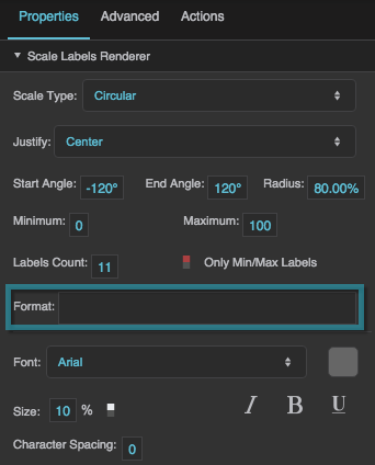
The Format property
Labels Font
Labels Font
Font
Defines the font used for the labels along this scale. To add a font to this project and use it for this property, see Text Component Properties.
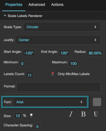
The Font property
Labels Size
Labels Size
Size
Defines the height of the scale numbers, as a pixel value or percentage. For circular scales, a percentage is a portion of the circle's radius. For linear scales, a percentage is a portion of half the container width. Default is 10%.
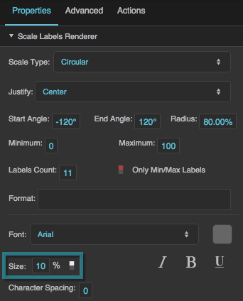
The Labels Size property
Labels Color
Labels Color
Labels Color
Defines the color of the labels. This is the color swatch next to Font.
Italic
Italic
Italic
Defines whether the labels along this scale are italic.
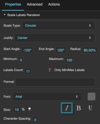
The Italic property
Bold
Bold
Bold
Defines whether the labels along this scale are bold.
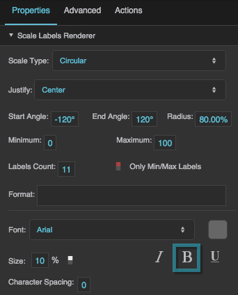
The Bold property
Underline
Underline
Underline
Defines whether the labels along this scale are underlined.
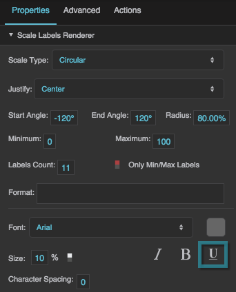
The Underline property
Character Spacing
Character Spacing
Tracking (Character Spacing)
Specifies the horizontal spacing between characters in the scale labels, as a pixel value. A null value means the font's default spacing is used.
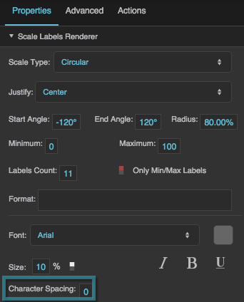
The Character Spacing property
Rotation
Rotation
Rotation
Rotates each label by the specified angle, in degrees. Valid values are between −180 and 180. Default is 0.
Align
Align
Align
Defines the text alignment of the labels: Left, Center, or Right. Default is Right.
Scale Track Renderer Properties
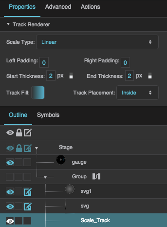
These properties affect a scale with a track.
Start Thickness
Start Thickness
Start Thickness
Defines the thickness of the scale track at its start, as a pixel or percentage value. For circular scales, a percentage is a portion of the circle’s radius. For linear scales, a percentage is a portion of the entire container width. Default is 1%.
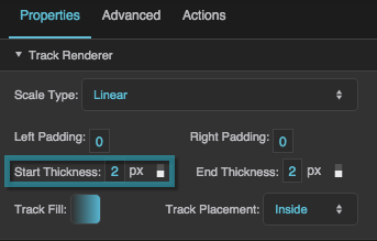
The Start Thickness property
End Thickness
End Thickness
End Thickness
Defines the thickness of the scale track at its end, as a pixel or percentage value. For circular scales, a percentage is a portion of the circle’s radius. For linear scales, a percentage is a portion of the entire container width. Default is 5%.
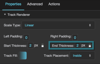
The End Thickness property
Track Fill
Track Fill
Track Fill
Defines the colors for the gradient fill for the scale track. To add colors, click below the track in the dialog. To delete colors, right-click on them in the dialog.
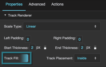
The Track Fill property
Track Placement
Track Placement
Track Placement
Specifies whether the track is positioned on the Inside, Outside, or Cross (center) of the circle or line that defines the scale. Default is Inside.
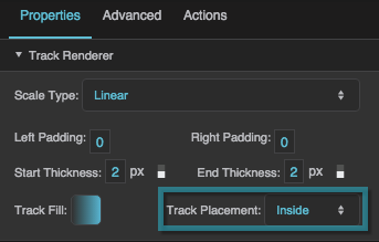
The Track Placement property