Table of Contents
Block Text
 Simple Widget Description.
Workflows
Standard Use of Widget Description.
Properties
| Preview | Property | Description |
|---|---|---|
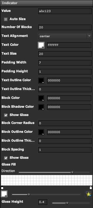 | Value | The Text to Display |
| Auto Size | Toggle whether Text should Auto-Size, or use Font Size | |
| Number of Blocks | Specify how many Blocks to Display | |
| Text Alignment | Specify Text Alignment | |
| Text Color | Specify the Color of the Text | |
| Text Size | Specify the Size of the Text | |
| Padding Width | Specify Width Padding in Pixels | |
| Padding Height | Specify Height Padding in Pixels | |
| Text Outline Color | Specify Color to Outline Text | |
| Text Outline Thickness | Specify Thickness of Text Outline in Pixels | |
| Block Color | Specify the Color of the Blocks | |
| Block Shadow Color | Specify the Color of the Blocks Shadow | |
| Show Gloss | Toggle whether Gloss is applied to Blocks | |
| Block Corner Radius | Specify Corner Radius of Blocks in Pixels | |
| Block Outline Thickness | Specify Block Outline Thickness in Pixels | |
| Block Spacing | Specify Spacing between each Block in Pixels | |
| Show Gloss | ||
| Direction | ||
| Gloss Height |
Demo
Sample Video of Widget in Use