Text Indicator
 The Indicator widget is one of the most used widgets in DGLux. It is able to display textual information in a variety of fonts, colors and sizes. It can be configured to automatically resize itself to fit any size or have a fixed font size.
Workflows
The most common workflow for the text indicator is to display real-time values on dashboards and graphics. Binding to the color property is a common way to indicate alarm status or another KPI. A variety of typographical effects may be achieved with the text indicator by combining Filters, Blend Modes, Font color, etc…
Properties
| Preview | Property | Description |
|---|---|---|
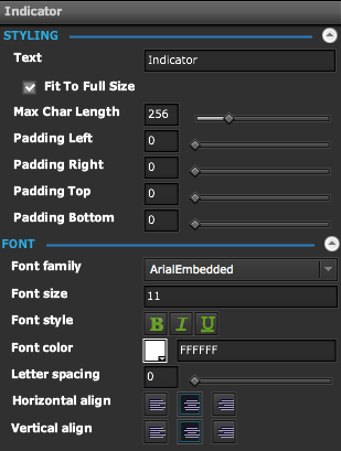 | Styling Section | |
| Text (Default) | The text to display | |
| Fit to Full size | If checked the text will resize to fill the bounds of the widget | |
| Auto-Size | If checked, the Width and Height of the Text Indicator will adjust to fix the text | |
| Max Char Length | Maximum number of characters to display | |
| Padding Left | Number of blank space in pixels from the left of the text | |
| Padding Right | Number of blank space in pixels from the right of the text | |
| Padding Top | Number of blank space in pixels from the top of the text | |
| Padding Bottom | Number of blank space in pixels from the bottom of the text | |
| Font Section | ||
| Font family | The font to use for the text | |
| Font size | The font size to use for the text. It is only applicable if the "Fit to full Size" is unchecked | |
| Font style | Bold, Italic, Underline | |
| Font color | Color to use for the text | |
| Letter Spacing | Spacing between individual characters of the text | |
| Horizontal align | Left, Center, Right | |
| Vertical Align | Top, Middle, Bottom | |
Demo