Check Box
 Simple Widget Description
Styles
Workflows
Standard Use of Widget Description
Properties
| Preview | Property | Description |
|---|---|---|
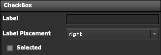 | Label | Specify Text to Display next to Check Box |
| Label Placement | Specify Text Position around the Check Box | |
| Selected | Bindable Boolean Point from Check Box | |
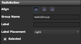 | Align | Specify Position of Radio Button |
| Group Name | Specify Grouping for Multiple Buttons | |
| Label | Text to Display | |
| Label Placement | Specify Text Position around Button | |
| Selected | Bindable Boolean Point |
Demo
Sample Video of Widget in Use