Date Picker
 Simple Widget Description
Styles
Workflows
Standard Use of Widget Description
Properties
| Preview | Property | Description |
|---|---|---|
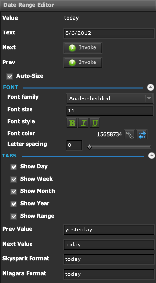 | Value | Displays Current Value of Date Selection |
| Text | Displays Formatted Value of Date Selection | |
| Next | Trigger to Change Date Selection to Next Value | |
| Previous | Trigger to Change Date Selection to Previous Value | |
| Auto Size | If checked, the Text will resize to fill the Bounds of the Widget | |
| Font | ||
| Font Family | The font to use for the text | |
| Font Size | The font size to use for the text | |
| Font Style | Bold, Italic, Underline | |
| Font Color | Color to use for the text | |
| Letter Spacing | Spacing between individual characters of the text | |
| Tabs | ||
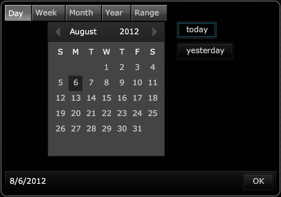
| Show Day | If Checked, 'Day' Tab will appear in Date Selection Window | |
| Show Week | If Checked, 'Week' Tab will appear in Date Selection Window | |
| Show Month | If Checked, 'Month' Tab will appear in Date Selection Window | |
| Show Year | If Checked, 'Year' Tab will appear in Date Selection Window | |
| Show Range | If Checked, 'Range' Tab will appear in Date Selection Window | |
| Previous Value | Displays Previous Date Value | |
| Next Value | Displays Next Date Value | |
| Skyspark Format | Displays Current Value in Skyspark Format | |
| Niagara Format | Displays Current Value in Niagara Format | |
 |
||
Demo
Sample Video of Widget in Use