Text Area
 Simple Widget Description.
Workflows
Standard Use of Widget Description.
Properties
| Preview | Property | Description |
|---|---|---|
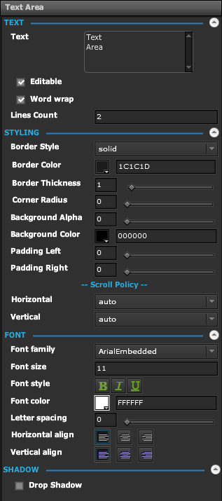 | Text | |
| Text | The Text to Display | |
| Editable | If Enabled, Allows Text Field to be used in View Mode | |
| Word Wrap | If Enabled, Allows Text to Wrap if Needed | |
| Lines Count | Output String containing the number of lines needed to fit Text | |
| Styling | ||
| Border Style | Specify the Style of Border Line | |
| Border Color | Specify the Color of the Border Line | |
| Border Thickness | Specify the Thickness, in pixels, of the Border Line | |
| Corner Radius | Specify the Radius of Border Corners in Pixels | |
| Background Alpha | Specify the Alpha of the Background Color | |
| Background Color | Specify the Color of the Background | |
| Padding Left | Specify the Padding to the Left of the Text in Pixels | |
| Padding Right | Specify the Padding to the Right of the Text in Pixels | |
| Horizontal | Specify how Horizontal Scroll Bars Behave | |
| Vertical | Specify how Vertical Scroll Bars Behave | |
| Font | ||
| Font Family | The Font to use for the Text | |
| Font Size | The Font Size to use for the Text | |
| Font Style | Bold, Italic, Underline | |
| Font Color | Color to use for the Text | |
| Letter Spacing | Spacing between Individual Characters of Text | |
| Horizontal Align | Left, Center, Right | |
| Vertical Align | Top, Middle, Bottom | |
Demo
Sample Video of Widget in Use