Text Input
 Simple Widget Description.
Workflows
Standard Use of Widget Description.
Properties
| Preview | Propert | Description |
|---|---|---|
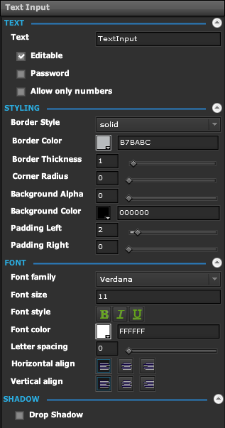 | Text | |
| Text | The Text to Display | |
| Editable | If enabled, allows user to input text in View Mode | |
| Password | If enabled, text will be replaced with * | |
| Allow Only Numbers | If enabled, will only allow numbers to be entered | |
| Styling | ||
| Border Style | List of Border Styles | |
| Border Color | Color to use for the border | |
| Border Thinkness | Thinkness of border in pixels | |
| Corner Radius | Radius of corners in pixels | |
| Background Alpha | Alpha to use for the background | |
| Background Color | Color to use for the background | |
| Padding Left | Number of blank space in pixels to the left of the text | |
| Padding Right | Number of blank space in pixels to the right of the text | |
| Font | ||
| Font Family | The font to use for the text | |
| Font Size | The font size to use for the text | |
| Font Style | Bold, Italic, Underline | |
| Font Color | Color to use for the text | |
| Letter Spacing | Spacing between individual characters of text | |
| Horizontal Align | Left, Center, Right | |
| Vertical Align | Top, Middle, Bottom | |
Demo
Sample Video of Widget in Use