Text
The text component is a simple text box. It supports basic HTML when the Is HTML or Is Advanced HTML property is enabled. The component's contents can also be styled with the Property Inspector. As with all properties in DGLux5, the text displayed in the component can be determined dynamically based on data, user interaction, or properties.
For a detailed reference of properties that affect text components, see Common Properties and Text Component Properties.

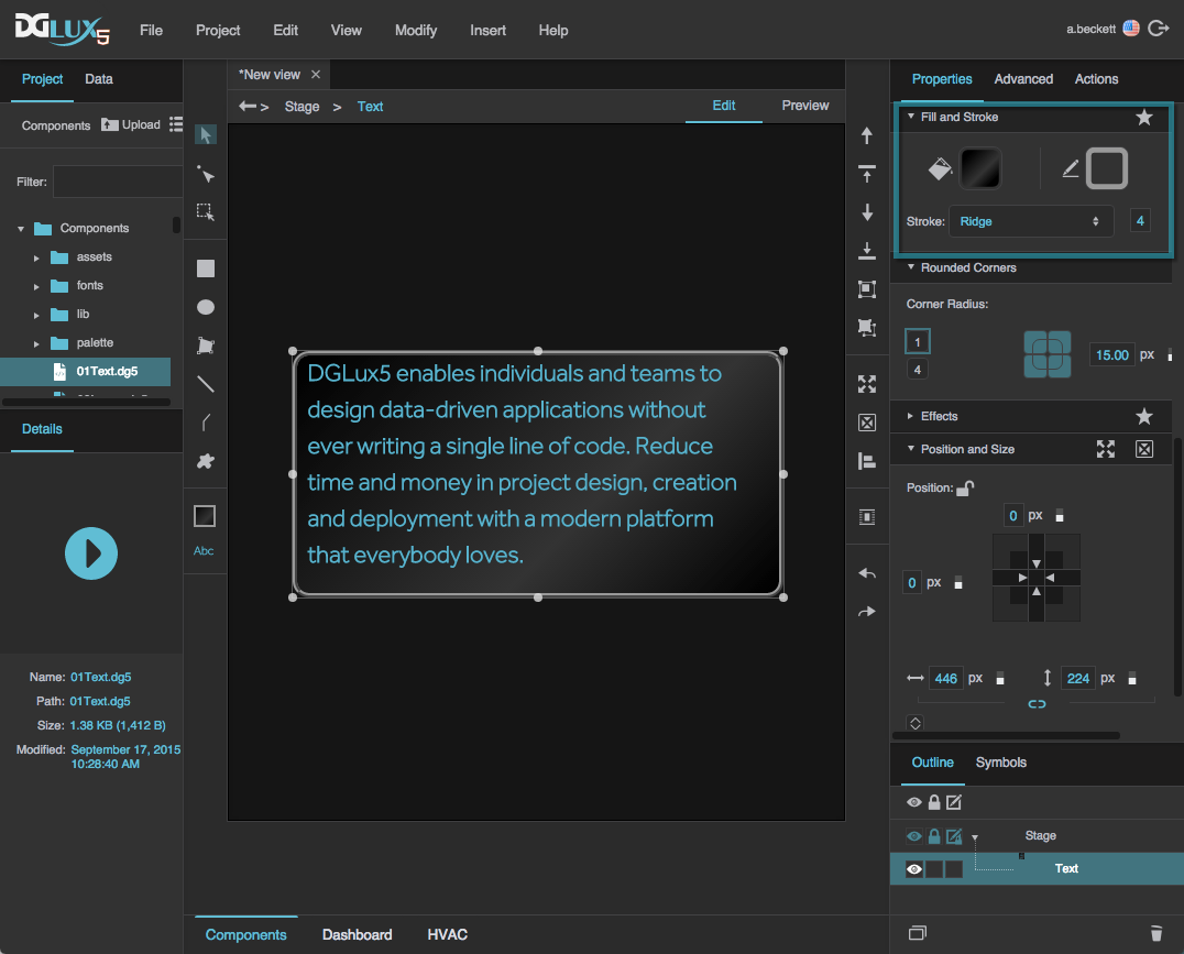
A text component in DGLux5
About Default Text and Font
When you create a new text component, the new component uses the default text and font. When you change any property in the Text and Font property group for any text component, all of that component's text and font property values become the new default. Alternatively, to change the default text and font, you can click the default text and font in the Tools panel and use the pop-up dialog.
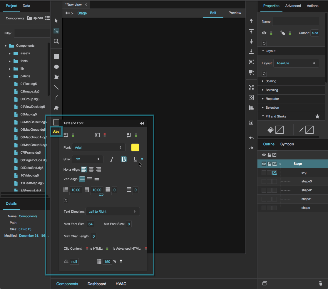
The default text and font
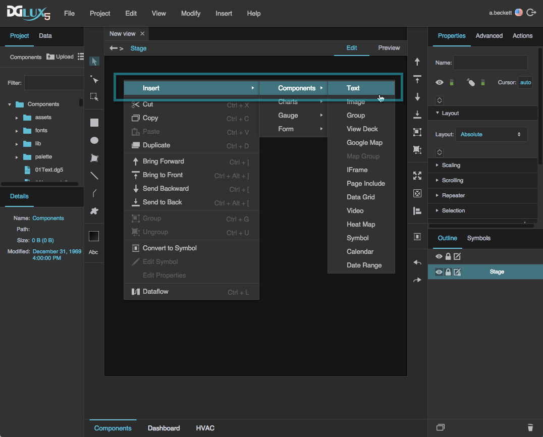
Create a Text Component
To create a text component:
Right-click in the Outline or Document window, and select Insert > Components > Text.
- In the Outline or Document window, select the text component.
In the Property Inspector, under Text and Font, for Text, enter the text that you want to display in the component.
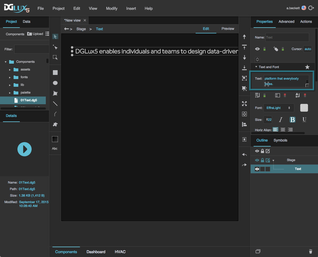
Alternatively, you can bind a property, or a data value from the Metrics panel, to this property. See Bindings.
- Style the appearance of the text component:
Format the text using the Text and Font properties.
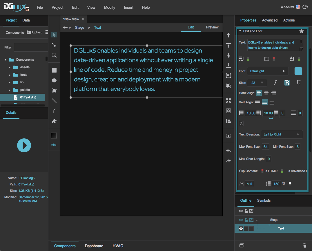
Format the background fill and the outline stroke using the Fill and Stroke properties.
Text Component FAQ
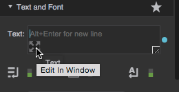
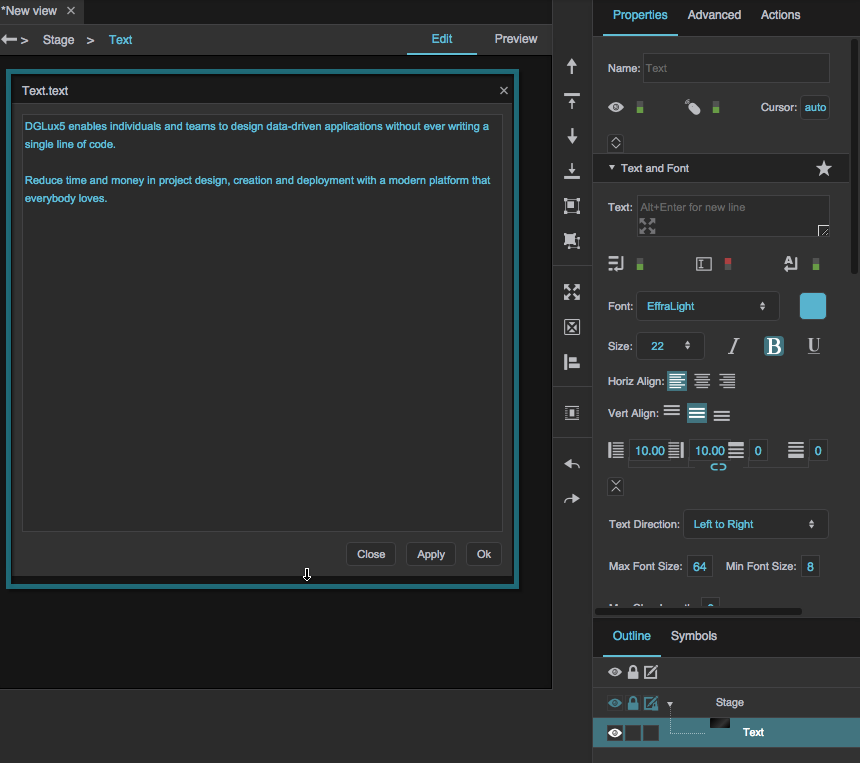
How do I enlarge the text field to make entering text easier?
How do I enlarge the text field to make entering text easier?
How do I enlarge the text field to make entering text easier?
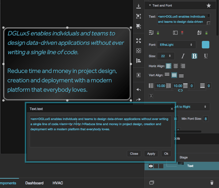
- In the Property Inspector, hover over the Text property field until an
 Edit in Window icon appears.
 Click the icon to open a pop-up window for editing text.
How do I add a hard line break?
How do I add a hard line break?
How do I add a hard line break?
- To insert a line break, press Alt + Enter in the Property Inspector, or press Enter in the popup window. Hard line breaks appear only when Is HTML and Is Advanced HTML are FALSE.
How do I add a new font to my project?
How do I add a new font to my project?
How do I add a new font to my project?
You can add a new font to your project. WOFF is the recommended file format.
To add a new font to your project:
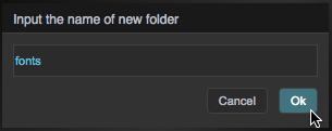
If you have not already done so, right-click the root folder for your project, and add a new folder named
fonts.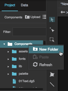
Navigate to the font file on your computer and drag it to the
fontsfolder.
Save your work and refresh the browser.
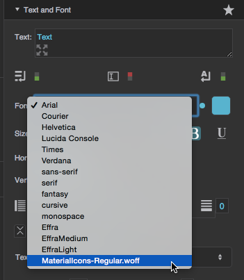
Now you can select the font from the drop-down menu for the Font property.
See this video for a demonstration.
How do I use a custom icon font?
How do I use a custom icon font?
How do I use a custom icon font?
To create a custom icon font, you can use an online service like the IcoMoon App. Documentation for the IcoMoon App is here.
Create a fonts Folder and upload the font
Before you can add a custom icon font to your project, you must have a fonts folder. If you have not already created a fonts folder, right-click the root folder of your project, add a new folder, and name it fonts.
There are two ways to add a custom icon font to the project. One way is to simply drag the file to your fonts folder. This is another way:
Click the
fontsfolder and select Upload.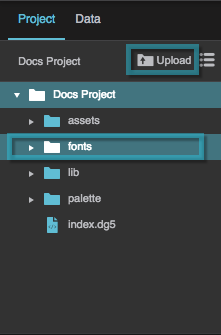
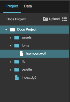
Browse to the font file on your computer, and add it.
WOFF is the recommended file format. Add only the font file. You do not need to add any accompanying files you might have received when the font was generated.
First Method for Using Icon Fonts: Paste Glyphs
One way to use the icon font is to paste glyphs, if they are available to you:
Set the Font property of the text component to the icon font.
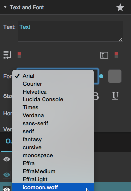
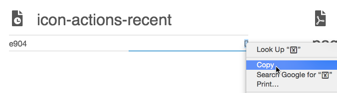
Copy the glyph that represents the icon you want to use.
Paste the glyph in the Text property of a text component.

Second Method for Using Icon Fonts: HTML
Another way to use an icon font is to use HTML. HTML only works if the Editable property is set to FALSE.
- Set the Font property of the text component to the icon font.
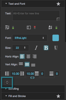
At the bottom of the Text and Font properties section, click
 Expand.
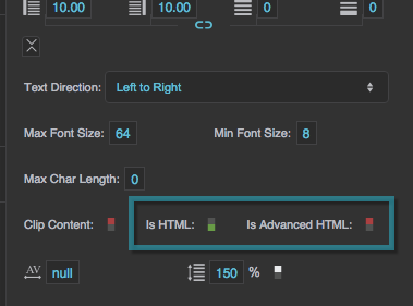
Set the Is HTML or Is Advanced HTML property of the text component to TRUE.
In the Text property of the text component, enter HTML code for the entity. Use the following format:

for an entity whose CSS looks like this:
.<icon name>:before {
    content: "\e932";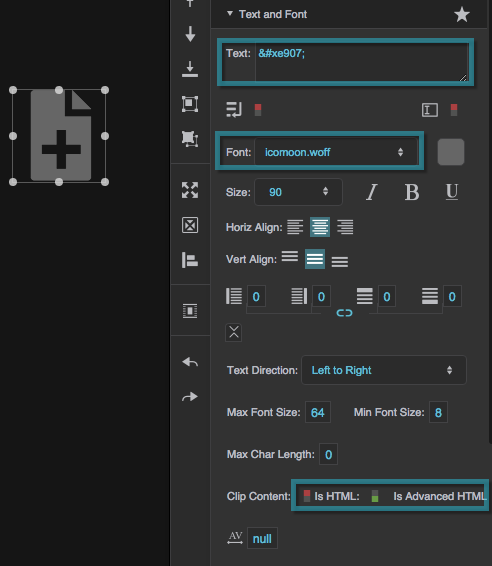
Important
When you use an online icon font generator, the code for each entity might change when you re-upload the icons or re-generate the font. To avoid the need to update glyphs or HTML code in the Property Inspector, make sure your font has all the icons you want before you start using it.
How do I use HTML?
How do I use HTML?
How do I use HTML?
- In the Outline or Document Window, select the text component.
In the Property Inspector, under Text and Font, click
Expand.
Set Is HTML or Is Advanced HTML to TRUE.
If your HTML includes hyperlinks, use the Is Advanced HTML property.
Enter your HTML content in the text component's Text property field.
HTML only works if the Editable property is set to FALSE, Horizontal Alignment is set to Left, and Vertical Alignment is set to Top. In HTML content, hard line breaks that you added by pressing Alt + Enter are not respected.
How do I put text on more than one line, or restrict text to one line?
How do I put text on more than one line, or restrict text to one line?
How do I put text on more than one line, or restrict text to one line?
To enable multi-line text:
- In the Outline or Document window, select the text component.
In the Property Inspector, under Text and Font, set Multi-Line to TRUE.
To disable multi-line text, set Multi-Line to FALSE.
How do I enable the user to edit text?
How do I enable the user to edit text?
How do I enable the user to edit text?
- In the Outline or Document window, select the text component.
In the Property Inspector, under Text and Font, set Editable to TRUE.
Alternatively, you might want to use the text input or text area component to accept user input.
How do I enable soft line breaks or wrapping?
How do I enable soft line breaks or wrapping?
How do I enable soft line breaks or wrapping?
- In the Outline or Document window, select the text component.
In the Property Inspector, under Text and Font, set Word Wrap and Multi-Line to TRUE.
This causes text to wrap when a line is longer than the width of the text component. Otherwise, if Multi-Line is enabled and Word Wrap is not, only hard line breaks are included.
How do I cause the size of the text component to follow the size of its content?
How do I cause the size of the text component to follow the size of its content?
How do I cause the size of the text component to follow the size of its content?
These steps cause the text component size to follow the content size only when the text component's position is not defined relative to the center of its parent.
- In the Outline or Document window, select the text component.
- In the Property Inspector, under Position and Size, set Width to Auto:
Hover over the
 Width property until a blue dot appears.
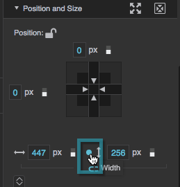
Click the blue dot, and select Reset.
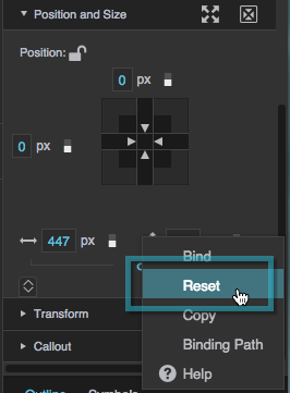
- Repeat step 2 for Height.
How do I cause the font size to follow the size of the text component?
How do I cause the font size to follow the size of the text component?
How do I cause the font size to follow the size of the text component?
This is not typically recommended, as it can cause the text to be unreadable at some sizes. See this post in the DGLogik Community Forum.
To create this effect:
- In the Outline or Document window, select the text component.
- In the Property Inspector, under Text and Font, set Font Size to Auto.
How do I cause the content of the text box to be determined by data?
How do I cause the content of the text box to be determined by data?
How do I cause the content of the text box to be determined by data?
You can bind a value from the Metrics panel or dataflow to the Text property of the component.
You can also format numbers, round numbers, and perform other calculations, using the dataflow or the binding dialog. For more information, see Dataflow and Bindings.
Text Component Properties
These properties affect the text component.
For a guide to using the text component, see Text.
Text components are also affected by Common Properties.

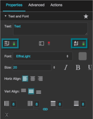
The Text and Font properties in the Property Inspector
Text
Text
Text
Sets or reflects the string that appears in this text component.

The Text property
Multiline
Multiline
Multiline
Specifies whether this text component has multiline capability. Press Alt + Enter to insert a line break.
TRUE
Line breaks are recognized.
FALSE
Line breaks are ignored. All text is displayed on a single line.
The Multiline property
Editable
Editable
Editable
Specifies whether the user can edit the text in this component at runtime by clicking on it.
The Editable property
Word Wrap
Word Wrap
Word Wrap
Specifies whether overflow text wraps. Multiline text must be enabled for this property to take effect.

The Word Wrap property
Font
Font
Font
Specifies the font for this element. You can add a new font, and then specify it using the drop-down menu for this property.
To add a new font to your project and use it for this property:
- If you have not already done so, right-click the root folder for your project, and add a new folder named
fonts. - Navigate to the font file on your computer and drag it to the
fontsfolder. - Save your work and refresh the browser.
- Specify the font using the drop-down menu for this property.

The Font property
Font Color
Font Color
Font Color
Defines the font color for this element.

The Font Color property
Font Size
Font Size
Font Size
Defines the font size for this element. If the font size is set to Auto, the text scales to occupy the size of the component.
Note
When Font Size is Auto, the font size automatically updates when the text component size changes, but only if the text component width and height are pixel values. To force the font size to update, you can invoke the measureText property in the Advanced Properties panel.
If the text component size is Auto or a percentage of the text component's parent size, you might want to bind the the parent's onResize Advanced property to the text component's measureText Advanced property to ensure that the font size updates when the parent size changes.

The Font Size property
Italic
Italic
Italic
Specifies whether text in this element is italicized.

The Italic property
Bold
Bold
Bold
Specifies whether text in this element is bold.

The Bold property
Underline
Underline
Underline
Specifies whether text in this element is underlined.

The Underline property
Horizontal Alignment
Horizontal Alignment
Horizontal Alignment
Specifies whether the content in this component is left-justified, centered, or right-justified.

The Horizontal Alignment property
Vertical Alignment
Vertical Alignment
Vertical Alignment
Specifies whether the content in this component is positioned at the top, middle, or bottom of the container.

The Vertical Alignment property
Left Padding
Left Padding
Left Padding
Defines a number of pixels of space between the left container boundary and the leftmost edge of the content. Negative numbers are not allowed.
Paddings are part of an object's width and height. See Borders, Padding, and Content Size.

The Left Padding property
Right Padding
Right Padding
Right Padding
Defines a number of pixels of space between the right container boundary and the rightmost edge of the content. Negative numbers are not allowed.
Paddings are part of an object's width and height. See Borders, Padding, and Content Size.

The Right Padding property
Top Padding
Top Padding
Top Padding
Defines a number of pixels of space between the top container boundary and the topmost edge of the content. Negative numbers are not allowed.
Paddings are part of an object's width and height. See Borders, Padding, and Content Size.

The Top Padding property
Bottom Padding
Bottom Padding
Bottom Padding
Defines a number of pixels of space between the bottom container boundary and the bottommost edge of the content. Negative numbers are not allowed.
Paddings are part of an object's width and height. See Borders, Padding, and Content Size.

The Bottom Padding property
Link Paddings
Link Paddings
Link Paddings
Links all four padding editors so that their values are equal.

The Link Paddings property
Text Direction
Text Direction
Text Direction
Specifies the direction for text and input in this component, to support the use of right-to-left languages.
Left to right
The text or user input direction is left to right.
Right to left
The text or user input direction is right to left.
Auto
The direction of user input is automatically detected as the user enters text.

The Text Direction property
Max Font Size
Max Font Size
Max Font Size
Defines the maximum font size for this text component. This property is only applicable when text size is set to Auto.

The Max Font Size property
Min Font Size
Min Font Size
Min Font Size
Defines the minimum font size for this text component. This property is only applicable when text size is set to Auto.

The Min Font Size property
Max Char Length
Max Char Length
Max Char Length
Specifies the maximum number of characters allowed in this text component.

The Max Char Length property
Clip Content
Clip Content
Clip Content
Defines the handling of text that overflows this text component.
TRUE
All overflowed text is clipped and is not visible.
FALSE
All overflowed text is visible and responds to mouse events.

The Clip Content property
Is HTML
Is HTML
Is HTML
Specifies whether the string in this text component is rendered as HTML. For security, does not not parse advanced HTML tags such as hyperlinks. Only works if Editable is set to FALSE, Horizontal Alignment is set to Left, and Vertical Alignment is set to Top. Hard line breaks added by pressing Alt + Enter are not rendered.

The Is HTML property
Is Advanced HTML
Is Advanced HTML
Is Advanced HTML
Renders the text as HTML, including links, forms, images and marquees. Links must be preceded with "http:" or "https:". Only works if Editable is set to FALSE, Horizontal Alignment is set to Left, and Vertical Alignment is set to Top. Hard line breaks added by pressing Alt + Enter are not rendered.

The Is Advanced HTML property
Character Spacing
Character Spacing
Character Spacing
Specifies the horizontal spacing between characters. If null, the default spacing for the selected font is used.

The Character Spacing property
Line Spacing
Line Spacing
Line Spacing
Specifies the vertical spacing between lines. If 0, the default spacing for the selected font is used.

The Line Spacing property