Position and Size Properties
These properties affect the position and size of the element.

The Position and Size properties in the Property Inspector
Only some of the fields for editing the position properties are visible at a given time. You can change which fields are visible by clicking in the 9-square position gadget and the four bars that surround it.
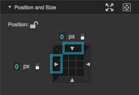
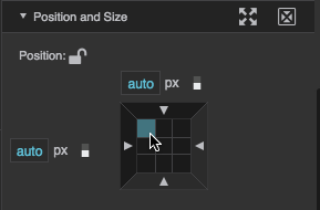
The Left and Top property fields are showing. To display both of these fields, either click the relevant bars outside the 9-square gadget, or click the relevant corner of the 9-square gadget.

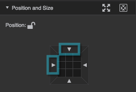
The Vertical Center property field is showing. To display this field, click either the top middle square or the bottom middle square of the gadget.
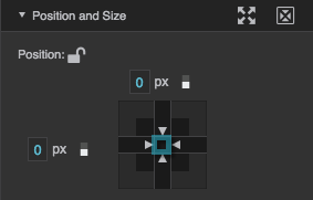
The Vertical Center and Horizontal Center property fields are showing. To display both of these fields, click the center square of the gadget.
None of the position and size fields are showing. To hide all of the fields, click the bars outside the 9-square gadget until the fields disappear.
Position properties work differently for elements inside a map group. In a map group, these properties place elements geographically relative to the map.
Left
Left
Left
In absolute layout, sets the left edge of this element to a distance to the left or right of the left edge of its parent container.
In vertical or horizontal layout, sets the left edge of this element to a distance to the left or right of its normal position.
Distances are either pixel values, or percentages of the parent height. A value of Auto positions the left edge of this component in its normal position. To set a value of Auto, hover over the property until a blue dot appears. Then, click the blue dot and select Reset.

The Left property
Right
Right
Right
In absolute layout, sets the right edge of this element to a distance to the left or right of the right edge of its parent container.
In vertical or horizontal layout, sets the right edge of this element to a distance to the left or right of its normal position.
Distances are either pixel values, or percentages of the parent height. A value of Auto positions the right edge of this component in its normal position. To set a value of Auto, hover over the property until a blue dot appears. Then, click the blue dot and select Reset.

The Right property
Top
Top
Top
In absolute layout, sets the top edge of this element to a distance above or below the top edge of its parent container.
In vertical or horizontal layout, sets the top edge of this element to a distance above or below its normal position.
Distances are either pixel values, or percentages of the parent height. A value of Auto positions the top edge of this component in its normal position. To set a value of Auto, hover over the property until a blue dot appears. Then, click the blue dot and select Reset.

The Top property
Bottom
Bottom
Bottom
In absolute layout, sets the bottom edge of this element to a distance above or below the bottom edge of its parent container.
In vertical or horizontal layout, sets the bottom edge of this element to a distance above or below its normal position.
Distances are either pixel values, or percentages of the parent height. A value of Auto positions the bottom edge of this component in its normal position. To set a value of Auto, hover over the property until a blue dot appears. Then, click the blue dot and select Reset.

The Bottom property
Horizontal Center
Horizontal Center
Horizontal Center
In absolute or vertical layout, sets the horizontal center of this element to a distance to the left or right of the horizontal center of its parent container. The value can be pixels, or a percent of the parent width.
A negative value moves this element to the left, and a positive value moves it to the right. A value of Auto positions the horizontal center of this element in its normal position in the layout. To set a value of Auto, hover over the property until a blue dot appears. Then, click the blue dot and select Reset.

The Horizontal Center property
Vertical Center
Vertical Center
Vertical Center
In absolute or horizontal layout, sets the vertical center of this element to a distance above or below the vertical center of its parent container. The value can be pixels, or a percent of the parent height.
A negative value moves this element up, and a positive value moves it down. A value of Auto positions the vertical center of this element in its normal position in the layout. To set a value of Auto, hover over the property until a blue dot appears. Then, click the blue dot and select Reset.

The Vertical Center property
Width
Width
Width
Specifies the width of this element, as a pixel value, a percentage of the parent width, or Auto.
Borders and paddings are part of an object's width and height. See Borders, Padding, and Content Size.
To set Auto width, hover over the property until a blue dot appears. Then, click the blue dot and select Reset. Auto width is recommended whenever possible. It creates the most responsive layouts. You can use Auto width in the following ways:
- Stretch: For all components, when the parent layout is Vertical, and horizontal alignment is Stretch, use Auto width to make this element’s width inherit the parent width. Does not work properly for calendars, or with wrapping.
- Flex-Grow: For all components, when the parent layout is Horizontal, use Auto width together with Flex-Grow to cause this element and its siblings to share the entire parent width. Alternatively, you can use Flex-Grow with a pixel or percent size, but Auto is usually a better choice.
- Text Components: Use Auto width to make this component's width follow the content width. If Auto height is also used, the component follows the content size. Exception: if the text component's Vertical Center property is not Auto, then a text component width of Auto causes the width of the component to follow the width of the parent.
- Symbols: Use Auto width to cause this container to follow the content width. Only works if the boolean autoSize property is set to TRUE, and the internal symbol width and height are in pixels.
- Groups: Use Auto width to make this group’s width follow the content width. Only works when this group’s layout is vertical or horizontal.
- Page Includes: Use Auto width to cause this container to follow the content width. Only works if the boolean autoSize property is set to TRUE, and the internal content width is set to pixels or percent.
- Videos: Use Auto width and a pixel or percent height to make this component’s width follow the content aspect ratio without growing wider than the content. Depending on the height, part of the container might be empty. If Auto height is also used, the component follows the content size.

The Width property
Height
Height
Height
Specifies the height of this element, as a pixel value, a percentage of the parent width, or Auto.
Borders and paddings are part of an object's width and height. See Borders, Padding, and Content Size.
To set Auto height, hover over the property until a blue dot appears. Then, click the blue dot and select Reset. Auto height is recommended whenever possible. It creates the most responsive layouts. You can use Auto height in the following ways:
- Stretch: For all components, when the parent layout is Horizontal, and vertical alignment is Stretch, use Auto height to make this element’s height inherit the parent height. Does not work properly for calendars, or with wrapping.
- Flex-Grow: For all components, when the parent layout is Vertical, use Auto height together with Flex-Grow to cause this element and its siblings to share the entire parent height. Alternatively, you can use Flex-Grow with a pixel or percent size, but Auto is usually a better choice.
- Text Components: Use Auto height to make this component's height follow the content height. If Auto width is also used, the component follows the content size. Exception: if the text component's Horizontal Center property is not Auto, then a text component height of Auto causes the height of the component to follow the height of the parent.
- Symbols: Use Auto height to cause this container to follow the content height. Only works if the boolean autoSize property is set to TRUE, and the internal symbol width and height are is in pixels.
- Groups: Use Auto height to make this group’s width follow the content width. Only works when this group’s layout is vertical or horizontal.
- Page Includes: Use Auto height to cause this container to follow the content height. Only works if the boolean autoSize property is set to TRUE, and the internal content height is set to pixels or percent.
- Videos: Use Auto height and a pixel or percent width to make this component’s height follow the content aspect ratio without growing taller than the content. Depending on the width, part of the container might be empty. If Auto width is also used, the component follows the content size.

The Height property
Keep Aspect Ratio
Keep Aspect Ratio
Keep Aspect Ratio
Maintains the aspect ratio of this element when its width or height properties are adjusted. If this element's width or height is set to Auto, it has no explicit aspect ratio, and this property does nothing.

The Keep Aspect Ratio property
Flex-Grow
Flex-Grow
Flex-Grow
Specifies how much this element will grow relative to the rest of the flexible items inside the same container. A value greater than zero indicates that this component will grow to absorb extra space. The amount that it grows depends on its flex-grow factor and the sum of all the flex-grow factors assigned to items in the container.
For more information on flexible items go to: http://bocoup.com/weblog/dive-into-flexbox/

The Flex-Grow property
Flex-Shrink
Flex-Shrink
Flex-Shrink
Specifies how much this element will shrink relative to the rest of the flexible items inside the same container. A value greater than zero indicates that this component will shrink to counteract insufficient space. The amount that it shrinks depends on its flex-shrink factor and the sum of all the flex-shrink factors assigned to items in the container.
For more information on flexible items go to: http://bocoup.com/weblog/dive-into-flexbox/

The Flex-Shrink property
Follow Path
Follow Path
Follow Path
Defines the path that this element follows. If the path is a shape, line, or SVG path, this element follows the path inside the container. For most components, this element follows the boundary of the container.
To make this element follow a path:
- Drag the button onto the path you want this element to follow.
- Move this element along the path by changing the Follow Path Position property. The center point of this element becomes aligned with the specified path position.

The Follow Path property
Follow Path Rotation
Follow Path Rotation
Follow Path Rotation
Specifies whether this element rotates as it follows its path.
TRUE
This element rotates relative to its path. If Base Rotation is 0, then the bottom edge of the element stays parallel to the path. A non-zero Base Rotation value adds to or subtracts from this angle.
FALSE
This element's rotation is independent from its position on the path.

The Follow Path Rotation property
Follow Path Position
Follow Path Position
Follow Path Position
Defines how far along the path this element is located. Typically, a value of 0% indicates the top-left corner of the path. Valid values are between 0% and 100%.

The Follow Path Position property
Follow Path Base Rotation
Follow Path Base Rotation
Follow Path Base Rotation
Defines a rotation for the element, as an angle. If the Follow Path Rotation property is set to TRUE, then this base value becomes a constant that is added to the path-based rotation.

The Follow Path Base Rotation property