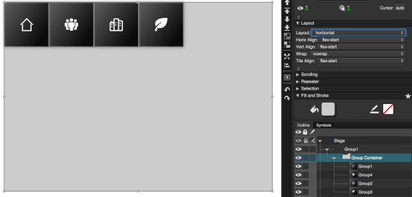
Horizontal Layout
When the Layout property of a group or the Stage is set to Horizontal, items in that group or Stage are automatically arranged from left to right.
When Layout is Horizontal, use the Horizontal Alignment, Vertical Alignment, and Wrap properties to customize placement of your components within the group or the Stage.
For quick steps to create a simple page that uses Horizontal and Vertical layout, see Create a Simple Page.
For more information about Layout, see an online reference about flexbox, such as this one.
For a detailed reference of Layout properties in DGLux5, see Layout Properties.
Horizontal Alignment Examples
This group's Layout property is set to Horizontal. When the Horizontal Alignment and Vertical Alignment properties change, the placement of the components changes accordingly.

Horizontal Alignment is set to Flex-End. Items are aligned at the right of the parent.

Horizontal Alignment is set to Center. Items are aligned at the horizontal center.

Horizontal Alignment is set to Space-Between. Items are aligned to the left and right of the parent, with equal space between all items.

Horizontal Alignment is set to Space-Around. Items are positioned with equal space between them, and half that amount of space between the parent boundaries and the rightmost and leftmost elements.
Vertical Alignment Examples
As with the previous examples, this group's Layout property is set to Horizontal. When the Horizontal Alignment and Vertical Alignment properties change, the placement of the components changes accordingly.

Vertical Alignment is set to Flex-End. Items are aligned at the bottom of the container.

Vertical Alignment is set to Center. Items are aligned at the vertical center.
