Designing Input Components

Form input components let users enter input.

DGLux5 form input components are HTML5 components. To read more about the behavior of each component type, you can consult an HTML5 reference like this one.

DGLux5 includes the following form input components:

For a detailed reference of properties that affect input components, see Common Properties and Input Component Properties.

Text Input component
Text input components in DGLux5


Add a Form Input Component

To add a form input component:

  • Select Insert > Form and the component type.

A Note about Styling Form Input Components

To a certain degree, you can style form input components using properties. However, some visual aspects of some input components depend on the user's browser and operating system. For example, the appearance of the drop-down list in the list input component, and that of the slider and track in the range input component, depend partly on the user's browser and OS. It is possible to create custom widgets that are less dependent on these factors.


Use Form Input to Change Data Metrics

To use form input to change data metrics, you can use a Data action.

These steps create a text input component that commits its contents to the data when the user presses Enter.

  1. Insert the input component by selecting Insert > Form > Text Input.
  2. With the input component selected, in the Actions panel, click 
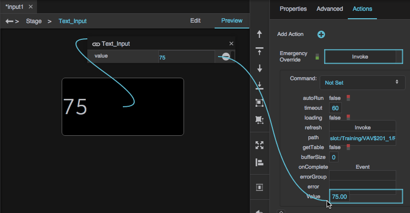
Add Action, and specify Data Action.
  3. In the Data panel and Metrics panel, navigate to the data metric that you want to change.
  4. Right-click the data metric to display a list of command types.
  5. From the list, drag the relevant command type name to "drag data action here" in the Actions panel.
  6. Bind the text input component's value to the Data action's Value property:
    1. In the Outline, select the text input component.
    2. In the Property Inspector, hover over the Value property until a blue dot appears.
    3. Click the blue dot and select Bind.

      A small binding pop-up opens.

    4. Open the Actions panel.
    5. Hover over the value in the pop-up until a blue dot appears, and drag the blue dot to the Value property.

  7. Add a key press as the trigger for the action:
    1. In the Outline, next to the text input component, click Dataflow.
    2. Expand Logic, and add a Keyboard Event block to the dataflow window.
    3. With the text input component selected, click the Advanced properties tab, and find the onKeyDown property.
    4. Bind the onKeyDown property to the input property of the Keyboard Event block.

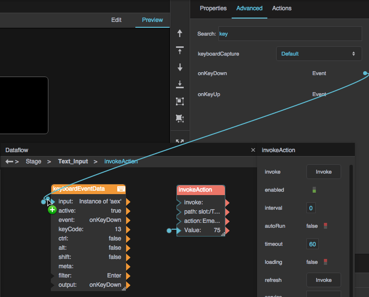
    5. For the filter property of the block, type Enter.
    6. Link the output property of the Keyboard Event block to the input property of the Invoke Action block.

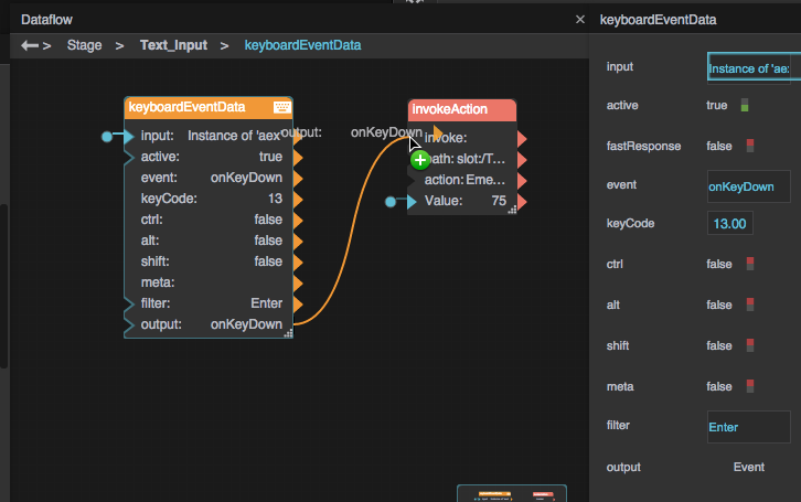
      At runtime, when the user presses enter, the data action is executed using the contents of the component as the value.


Save Input as Value

To save a user's input as the component's value, you can use a Local Storage dataflow block.

  1. Insert the input component by selecting Insert > Form > Text Input.
  2. In the Outline, right-click the text input component, and select Dataflow.
  3. Expand Browser API, and add a Local Storage block to the dataflow window.
  4. For the key property of the Local Storage block, enter an identifying name, such as inputValue.
  5. Bind the Value property of the text input component and the value property of the Local Storage block to each other.

    At runtime, whenever the user enters input, it is saved as the value of the input component.


Input Component Properties

These properties affect input components.

For a guide to using input components, see Designing Input Components.

Input components are also affected by Common Properties.

2019/07/17 19:17

Shared Input Properties

These properties affect any of the following components:

  • Text Input
  • Text Area
  • Password Input
  • Date Input
  • Color Input
  • Number Input
  • Range Input

Value

Value

Value
Sets or returns the current contents of this input component.

The Value property
The Value property

Is Valid

Is Valid

Is Valid
Returns whether this componentโ€™s current contents are valid. Validity is determined by the component type, and by properties like Minimum, Maximum, and Input Type.

Validity is checked whenever data is committed. Therefore, if Live Update is enabled, validity is checked constantly. If Live Update is disabled, validity is checked when the focus leaves the component.

The Is Valid property

Live Update

Live Update

Live Update
Specifies when the userโ€™s changes to this component are committed. This property affects changes made in Preview Mode, the Viewer, and the deployed application. It does not affect changes that you make within the Property Inspector.

TRUE
Changes are committed constantly, as the user makes them.

FALSE
Changes are committed only when focus leaves the component.

The Live Update property

Left Padding

Left Padding

Left Padding
Defines a number of pixels of space between the left container boundary and the leftmost edge of the content. Negative numbers are not allowed.

Paddings are part of an object's width and height. See Borders, Padding, and Content Size.

The Left Padding property

Right Padding

Right Padding

Right Padding
Defines a number of pixels of space between the right container boundary and the rightmost edge of the content. Negative numbers are not allowed.

Paddings are part of an object's width and height. See Borders, Padding, and Content Size.

The Right Padding property

Top Padding

Top Padding

Top Padding
Defines a number of pixels of space between the top container boundary and the topmost edge of the content. Negative numbers are not allowed.

Paddings are part of an object's width and height. See Borders, Padding, and Content Size.

The Top Padding property

Bottom Padding

Bottom Padding

Bottom Padding
Defines a number of pixels of space between the bottom container boundary and the bottommost edge of the content. Negative numbers are not allowed.

Paddings are part of an object's width and height. See Borders, Padding, and Content Size.

The Bottom Padding property

Link Paddings

Link Paddings

Link Paddings
Links all four padding editors so that their values are equal.

The Link Paddings property

Text Direction

Text Direction

Text Direction
Specifies the direction for text and input in this component, to support the use of right-to-left languages.

Left to right
The text or user input direction is left to right.

Right to left
The text or user input direction is right to left.

Auto
The direction of user input is automatically detected as the user enters text.

The Text Direction property

These properties affect any of the following components:

  • Text Input
  • Text Area
  • Password Input
  • Date Input
  • Number Input

Font

Font

Font
Specifies the font for this element.

To add a new font to your project and use it for this property, see How do I add a new font to my project?

The Font property
The Font property

Font Color

Font Color

Font Color
Defines the font color for this component.

The Font Color property

Font Size

Font Size

Font Size
Defines the font size for this component. If the font size is set to Auto, the text scales to occupy the size of the component.

The Font Size property

Italic

Italic

Italic
Specifies whether text in this element is italicized.

The Italic property
The Italic property

Bold

Bold

Bold
Specifies whether text in this element is bold.

The Bold property
The Bold property

Underline

Underline

Underline
Specifies whether text in this element is underlined.

The Underline property

Horizontal Alignment

Horizontal Alignment

Horizontal Alignment
Specifies whether the content in this component is left-justified, centered, or right-justified.

The Horizontal Alignment property

The Placeholder property affects any of the following components:

  • Text Input
  • Text Area
  • Password Input
  • Number Input
  • List Input

Placeholder

Placeholder

Placeholder
Defines the placeholder text that appears in this input component when there is no Value.

The Placeholder property


2019/07/17 19:17

Text Input and Text Area Properties

These properties affect a text input component or a text area component. These components are also affected by shared input properties.

Input Type

Input Type

Input Type
For a text input component, specifies the valid input type, or the expected input type.

Text
A single line of text. Line breaks are automatically removed.

Email
A single, properly formatted e-mail address, or the empty string.

URL
A single, valid, absolute URL, or the empty string.

Tel
A single line of text. Line breaks are automatically removed. On mobile devices, the on-screen keyboard is optimized for number entry.

The Input Type property


2019/07/17 19:17

Date Input Properties

These properties affect a date input component. This component is also affected by shared input properties.

Input Type

Input Type

Input Type
Specifies the valid input type, or the expected input type.

Date
A year, month, and day.

Week
A year and a week number. A week that spans two years is both week 53 of the earlier year and week 1 of the later year.

Month
A month and year.

The Input Type property


2019/07/17 19:17

Color Input Properties

These properties affect a color input component. This component is also affected by shared input properties.

Open

Open

Open
Opens the browser color picker. The color picker is also automatically opened when the user clicks the component.

The Open property
The Open property

Datalist

Datalist

Datalist
Specifies the predefined colors in this color input component. Predefined colors are not supported in all browsers. Regardless of whether the predefined list is supported, the user can still enter a custom value.

Click on color in the Property Inspector to edit it.

Colors are displayed in order in this color input component, with the top color appearing first.

The Datalist property


2019/07/17 19:17

Number Input Properties

These properties affect a number input component. This component is also affected by shared input properties.

Min

Min

Min
Defines the predefined colors in this color input component. Predefined colors are not supported in all browsers. Regardless of whether the predefined list is supported, the user can still enter a custom value.

Click on color in the Property Inspector to edit it.

Colors are displayed in order in this color input component, with the top color appearing first.

If this is a range input component, and the minimum is null, the bottom of the range is zero.

The Min property
The Min property

Max

Max

Max
Defines a maximum valid number for this input component.

If this is a range input component, and the maximum is null, the top of the range is 100.

The Max property
The Max property

Step

Step

Step
Defines the interval between valid numbers for this input component. Valid numbers are the minimum and multiples of the Step value larger than the minimum. If no minimum is defined, valid numbers are zero and multiples of the Step value larger or smaller than zero. A Step value of zero means that any interval is allowed.

The Step property
The Step property


shared input properties]]. <hidden Min> **Min**\\ Defines a minimum valid number for this input component. If this is a range input component, and the minimum is null, the bottom of the range is zero. {{:dglux5_wiki:widgets_and_property_inspector:property_inspector:properties_input_range_min.png?direct|The Min property
The Min property </hidden>

Max

Max

Max
Defines a maximum valid number for this input component.

If this is a range input component, and the maximum is null, the top of the range is 100.

The Max property
The Max property

Step

Step

Step
Defines the interval between valid numbers for this input component. Valid numbers are the minimum and multiples of the Step value larger than the minimum. If no minimum is defined, valid numbers are zero and multiples of the Step value larger or smaller than zero. A Step value of zero means that any interval is allowed.

The Step property
The Step property

Ticks

Ticks

Ticks
Defines values where ticks appear on the range selector, as a list of comma-separated values.

The Ticks property
The Ticks property


2019/07/17 19:17

Input Component Properties

These properties affect input components.

For a guide to using input components, see Designing Input Components.

Input components are also affected by Common Properties.


Shared Input Properties

These properties affect any of the following components:

  • Text Input
  • Text Area
  • Password Input
  • Date Input
  • Color Input
  • Number Input
  • Range Input

Value

Value

Value
Sets or returns the current contents of this input component.

The Value property
The Value property

Is Valid

Is Valid

Is Valid
Returns whether this componentโ€™s current contents are valid. Validity is determined by the component type, and by properties like Minimum, Maximum, and Input Type.

Validity is checked whenever data is committed. Therefore, if Live Update is enabled, validity is checked constantly. If Live Update is disabled, validity is checked when the focus leaves the component.

The Is Valid property

Live Update

Live Update

Live Update
Specifies when the userโ€™s changes to this component are committed. This property affects changes made in Preview Mode, the Viewer, and the deployed application. It does not affect changes that you make within the Property Inspector.

TRUE
Changes are committed constantly, as the user makes them.

FALSE
Changes are committed only when focus leaves the component.

The Live Update property

Left Padding

Left Padding

Left Padding
Defines a number of pixels of space between the left container boundary and the leftmost edge of the content. Negative numbers are not allowed.

Paddings are part of an object's width and height. See Borders, Padding, and Content Size.

The Left Padding property

Right Padding

Right Padding

Right Padding
Defines a number of pixels of space between the right container boundary and the rightmost edge of the content. Negative numbers are not allowed.

Paddings are part of an object's width and height. See Borders, Padding, and Content Size.

The Right Padding property

Top Padding

Top Padding

Top Padding
Defines a number of pixels of space between the top container boundary and the topmost edge of the content. Negative numbers are not allowed.

Paddings are part of an object's width and height. See Borders, Padding, and Content Size.

The Top Padding property

Bottom Padding

Bottom Padding

Bottom Padding
Defines a number of pixels of space between the bottom container boundary and the bottommost edge of the content. Negative numbers are not allowed.

Paddings are part of an object's width and height. See Borders, Padding, and Content Size.

The Bottom Padding property

Link Paddings

Link Paddings

Link Paddings
Links all four padding editors so that their values are equal.

The Link Paddings property

Text Direction

Text Direction

Text Direction
Specifies the direction for text and input in this component, to support the use of right-to-left languages.

Left to right
The text or user input direction is left to right.

Right to left
The text or user input direction is right to left.

Auto
The direction of user input is automatically detected as the user enters text.

The Text Direction property

These properties affect any of the following components:

  • Text Input
  • Text Area
  • Password Input
  • Date Input
  • Number Input

Font

Font

Font
Specifies the font for this element.

To add a new font to your project and use it for this property, see How do I add a new font to my project?

The Font property
The Font property

Font Color

Font Color

Font Color
Defines the font color for this component.

The Font Color property

Font Size

Font Size

Font Size
Defines the font size for this component. If the font size is set to Auto, the text scales to occupy the size of the component.

The Font Size property

Italic

Italic

Italic
Specifies whether text in this element is italicized.

The Italic property
The Italic property

Bold

Bold

Bold
Specifies whether text in this element is bold.

The Bold property
The Bold property

Underline

Underline

Underline
Specifies whether text in this element is underlined.

The Underline property

Horizontal Alignment

Horizontal Alignment

Horizontal Alignment
Specifies whether the content in this component is left-justified, centered, or right-justified.

The Horizontal Alignment property

The Placeholder property affects any of the following components:

  • Text Input
  • Text Area
  • Password Input
  • Number Input
  • List Input

Placeholder

Placeholder

Placeholder
Defines the placeholder text that appears in this input component when there is no Value.

The Placeholder property


Text Input and Text Area Properties

These properties affect a text input component or a text area component. These components are also affected by shared input properties.

Input Type

Input Type

Input Type
For a text input component, specifies the valid input type, or the expected input type.

Text
A single line of text. Line breaks are automatically removed.

Email
A single, properly formatted e-mail address, or the empty string.

URL
A single, valid, absolute URL, or the empty string.

Tel
A single line of text. Line breaks are automatically removed. On mobile devices, the on-screen keyboard is optimized for number entry.

The Input Type property


Date Input Properties

These properties affect a date input component. This component is also affected by shared input properties.

Input Type

Input Type

Input Type
Specifies the valid input type, or the expected input type.

Date
A year, month, and day.

Week
A year and a week number. A week that spans two years is both week 53 of the earlier year and week 1 of the later year.

Month
A month and year.

The Input Type property


Color Input Properties

These properties affect a color input component. This component is also affected by shared input properties.

Open

Open

Open
Opens the browser color picker. The color picker is also automatically opened when the user clicks the component.

The Open property
The Open property

Datalist

Datalist

Datalist
Specifies the predefined colors in this color input component. Predefined colors are not supported in all browsers. Regardless of whether the predefined list is supported, the user can still enter a custom value.

Click on color in the Property Inspector to edit it.

Colors are displayed in order in this color input component, with the top color appearing first.

The Datalist property


Number Input Properties

These properties affect a number input component. This component is also affected by shared input properties.

Min

Min

Min
Defines the predefined colors in this color input component. Predefined colors are not supported in all browsers. Regardless of whether the predefined list is supported, the user can still enter a custom value.

Click on color in the Property Inspector to edit it.

Colors are displayed in order in this color input component, with the top color appearing first.

If this is a range input component, and the minimum is null, the bottom of the range is zero.

The Min property
The Min property

Max

Max

Max
Defines a maximum valid number for this input component.

If this is a range input component, and the maximum is null, the top of the range is 100.

The Max property
The Max property

Step

Step

Step
Defines the interval between valid numbers for this input component. Valid numbers are the minimum and multiples of the Step value larger than the minimum. If no minimum is defined, valid numbers are zero and multiples of the Step value larger or smaller than zero. A Step value of zero means that any interval is allowed.

The Step property
The Step property


shared input properties]]. <hidden Min> **Min**\\ Defines a minimum valid number for this input component. If this is a range input component, and the minimum is null, the bottom of the range is zero. {{:dglux5_wiki:widgets_and_property_inspector:property_inspector:properties_input_range_min.png?direct|The Min property
The Min property </hidden>

Max

Max

Max
Defines a maximum valid number for this input component.

If this is a range input component, and the maximum is null, the top of the range is 100.

The Max property
The Max property

Step

Step

Step
Defines the interval between valid numbers for this input component. Valid numbers are the minimum and multiples of the Step value larger than the minimum. If no minimum is defined, valid numbers are zero and multiples of the Step value larger or smaller than zero. A Step value of zero means that any interval is allowed.

The Step property
The Step property

Ticks

Ticks

Ticks
Defines values where ticks appear on the range selector, as a list of comma-separated values.

The Ticks property
The Ticks property


File Input Properties

These properties affect the file input component.

Filename

Filename

Filename
Sets or returns the name of the file to open.

The Filename property

File Content

File Content

File Content
Displays the content of the selected file as a string or binary.

The File Content property

Files

Files

Files
Returns a read-only table describing the files selected by the user.

The Files property
The Files property

Mode

Mode

Mode
Sets whether the file content is displayed as a string or as binary.

The Mode property
The Mode property

Selection Type

Selection Type

Selection Type
Determines whether the user can select multiple files.

Single File
The user can select only one file.

Multiple Files
The user can select one or more files.

The Selection Type property

Accept

Accept

Accept
Specifies the file formats that are accepted by this file chooser.

Enter one or more of the following values separated by commas:

  • .png, .jpg, .gif, etc.: Files of the format specified.
  • audio/*: All sound files.
  • video/*: All video files.
  • image/*: All image files.
  • media_type/*: Replace media_type with any valid media type, to accept all formats within that type. Look at IANA Media Types for a complete list of standard media types.

The Accept property
The Accept property

Open

Open

Open
A trigger that opens the browser file chooser. For information about using triggers, see Binding from an Event Property to a Trigger Property.

The Open property
The Open property


List Input Properties

These properties affect a list input component.

Value

Value

Value
Sets or returns the currently selected list option.

The Value property
The Value property

Selected Index

Selected Index

Selected Index
Sets or returns the index of the currently selected list option. A value of 0 indicates the top option in the list.

The Selected Index property

Options

Options

Options
Defines the list of options for this list element, as comma-separated values.

The Options property

Selected Element Font

Selected Element Font

Selected Element Font
Defines the font for the selected option.

To add a new font to your project and use it for this property, see How do I add a new font to my project?

The Selected Element Font property

Selected Element Font Color

Selected Element Font Color

Selected Element Font Color
Defines the font color for the selected option.

The Selected Element Font Color property

Selected Element Font Size

Selected Element Font Size

Selected Element Font Size
Defines the font size for the selected option.

The Selected Element Font Size property

Selected Element Font Italic

Selected Element Font Italic

Selected Element Font Italic
Defines whether the selected option is italic.

The Selected Element Font Italic property

Selected Element Font Bold

Selected Element Font Bold

Selected Element Font Bold
Defines whether the selected option is bold.

The Selected Element Font Bold property

Selected Element Font Underline

Selected Element Font Underline

Selected Element Font Underline
Defines whether the selected option is underlined.

The Selected Element Font Underline property

Options Font

Options Font

Options Font
Defines the font for the options list. Not supported in all browsers. To add a font to this project and use it for this property, see How do I add a new font to my project?

The Options Font property

Options Font Color

Options Font Color

Options Font Color
Defines the font color for the options list. Not supported in all browsers.

The Options Font Color property

Options Font Size

Options Font Size

Options Font Size
Defines the font size for the options list. Not supported in all browsers.

The Options Font Size property

Options Font Italic

Options Font Italic

Options Font Italic
Defines whether the options list is italic. Not supported in all browsers.

The Options Font Italic property

Options Font Bold

Options Font Bold

Options Font Bold
Defines whether the options list is bold. Not supported in all browsers.

The Options Font Bold property

Options Font Underline

Options Font Underline

Options Font Underline
Defines whether the options list is underlined. Not supported in all browsers.

The Options Font Underline property

Options Background

Options Background

Options Background
Defines the background color for the options list. Not supported in all browsers.

The Options Background property

Show Arrow

Show Arrow

Show Arrow
Determines whether an arrow graphic appears in the component, indicating a drop-down list.

The Show Arrow property

Arrow Image

Arrow Image

Arrow Image
Specifies a custom arrow graphic that appears if Show Arrow is enabled. If you don't specify an image, a default graphic is used.

The Arrow Image property

2019/07/17 19:17

File Input Properties

These properties affect the file input component.

Filename

Filename

Filename
Sets or returns the name of the file to open.

The Filename property

File Content

File Content

File Content
Displays the content of the selected file as a string or binary.

The File Content property

Files

Files

Files
Returns a read-only table describing the files selected by the user.

The Files property
The Files property

Mode

Mode

Mode
Sets whether the file content is displayed as a string or as binary.

The Mode property
The Mode property

Selection Type

Selection Type

Selection Type
Determines whether the user can select multiple files.

Single File
The user can select only one file.

Multiple Files
The user can select one or more files.

The Selection Type property

Accept

Accept

Accept
Specifies the file formats that are accepted by this file chooser.

Enter one or more of the following values separated by commas:

  • .png, .jpg, .gif, etc.: Files of the format specified.
  • audio/*: All sound files.
  • video/*: All video files.
  • image/*: All image files.
  • media_type/*: Replace media_type with any valid media type, to accept all formats within that type. Look at IANA Media Types for a complete list of standard media types.

The Accept property
The Accept property

Open

Open

Open
A trigger that opens the browser file chooser. For information about using triggers, see Binding from an Event Property to a Trigger Property.

The Open property
The Open property


2019/07/17 19:17

List Input Properties

These properties affect a list input component.

Value

Value

Value
Sets or returns the currently selected list option.

The Value property
The Value property

Selected Index

Selected Index

Selected Index
Sets or returns the index of the currently selected list option. A value of 0 indicates the top option in the list.

The Selected Index property

Options

Options

Options
Defines the list of options for this list element, as comma-separated values.

The Options property

Selected Element Font

Selected Element Font

Selected Element Font
Defines the font for the selected option.

To add a new font to your project and use it for this property, see How do I add a new font to my project?

The Selected Element Font property

Selected Element Font Color

Selected Element Font Color

Selected Element Font Color
Defines the font color for the selected option.

The Selected Element Font Color property

Selected Element Font Size

Selected Element Font Size

Selected Element Font Size
Defines the font size for the selected option.

The Selected Element Font Size property

Selected Element Font Italic

Selected Element Font Italic

Selected Element Font Italic
Defines whether the selected option is italic.

The Selected Element Font Italic property

Selected Element Font Bold

Selected Element Font Bold

Selected Element Font Bold
Defines whether the selected option is bold.

The Selected Element Font Bold property

Selected Element Font Underline

Selected Element Font Underline

Selected Element Font Underline
Defines whether the selected option is underlined.

The Selected Element Font Underline property

Options Font

Options Font

Options Font
Defines the font for the options list. Not supported in all browsers. To add a font to this project and use it for this property, see How do I add a new font to my project?

The Options Font property

Options Font Color

Options Font Color

Options Font Color
Defines the font color for the options list. Not supported in all browsers.

The Options Font Color property

Options Font Size

Options Font Size

Options Font Size
Defines the font size for the options list. Not supported in all browsers.

The Options Font Size property

Options Font Italic

Options Font Italic

Options Font Italic
Defines whether the options list is italic. Not supported in all browsers.

The Options Font Italic property

Options Font Bold

Options Font Bold

Options Font Bold
Defines whether the options list is bold. Not supported in all browsers.

The Options Font Bold property

Options Font Underline

Options Font Underline

Options Font Underline
Defines whether the options list is underlined. Not supported in all browsers.

The Options Font Underline property

Options Background

Options Background

Options Background
Defines the background color for the options list. Not supported in all browsers.

The Options Background property

Show Arrow

Show Arrow

Show Arrow
Determines whether an arrow graphic appears in the component, indicating a drop-down list.

The Show Arrow property

Arrow Image

Arrow Image

Arrow Image
Specifies a custom arrow graphic that appears if Show Arrow is enabled. If you don't specify an image, a default graphic is used.

The Arrow Image property

2019/07/17 19:17

More Resources

This thread in the DGLogik Community Forum addresses user input: