Table of Contents
Scale Track
The scale track component is a custom gradient aligned to a line or arc. You can use it when building a gauge widget.
To use this component, first you insert it by selecting Insert > Gauge > Scale Track. Then, you configure style and behavior using properties. You can customize the start angle and end angle, the start thickness and end thickness, the gradient, and other properties.
Gradient Customization
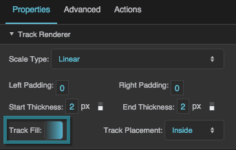
To edit the gradient for a scale track, click  Track Fill. A dialog opens that includes a track for defining the gradient.
Any time you customize a gradient in DGLux5:
- To change a color value, click the small square below the track in the dialog, and then use the color picker.
- To add a color to the gradient, click below the track in the dialog.
- To delete a color from the gradient, right-click the small square.
- Drag colors to move them.
For more information about creating gauges, see Designing Gauges.
For a detailed reference of properties that affect gauge scales, see Common Properties and Gauge Scale Properties.
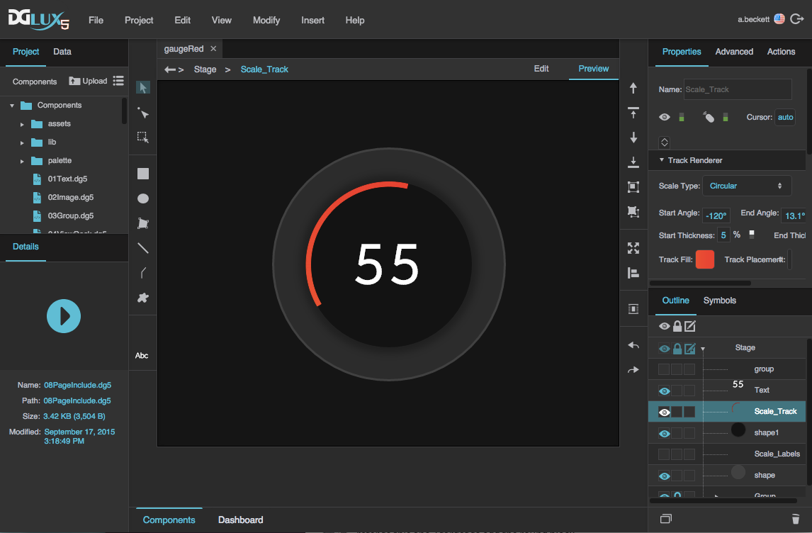
A gauge with a scale track in DGLux5
Gauge Scale Properties
These properties affect gauge scales. A gauge scale fits into one of three categories, based on whether it has ticks, labels, or a track. Each category has its own properties.
For a guide to using gauges, see Designing Gauges.
Gauges and gauge scales can also be affected using Common Properties.
Shared Gauge Scale Properties
These properties affect the shape of any type of gauge scale.
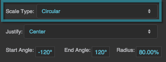
Scale Type
Scale Type
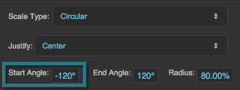
Start Angle
Start Angle
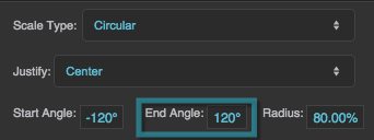
End Angle
End Angle
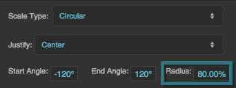
Radius
Radius
Left Padding
Left Padding
Left Padding
Defines the distance between the left side of a linear scale and the container boundary, in pixels. If a border stroke is defined, defines the distance between the scale and the border stroke. See Borders, Padding, and Content Size.
Right Padding
Right Padding
Right Padding
Defines the distance between the right side of a linear scale and the container boundary, in pixels. If a border stroke is defined, defines the distance between the scale and the border stroke. See Borders, Padding, and Content Size.
Scale Ticks Renderer Properties
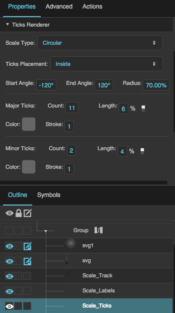
These properties affect a scale with ticks.
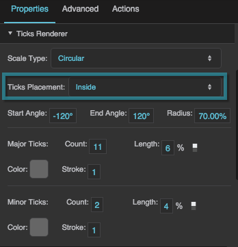
Ticks Placement
Ticks Placement
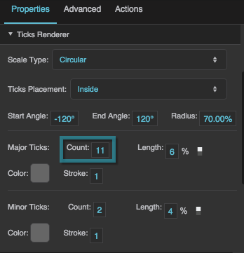
Major Tick Count
Major Tick Count
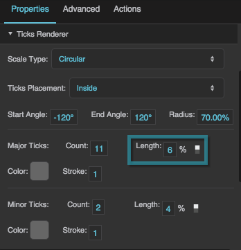
Major Tick Length
Major Tick Length
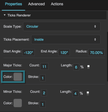
Major Tick Stroke Color
Major Tick Stroke Color
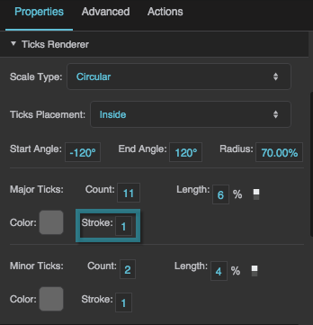
Major Tick Stroke Weight
Major Tick Stroke Weight
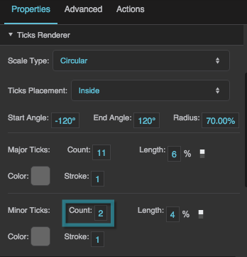
Minor Tick Count
Minor Tick Count
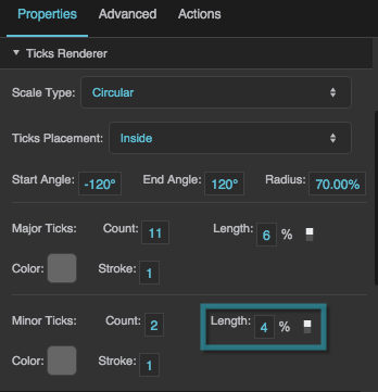
Minor Tick Length
Minor Tick Length
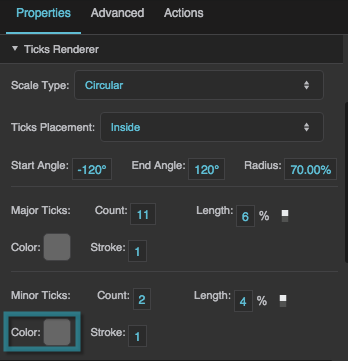
Minor Tick Stroke Color
Minor Tick Stroke Color
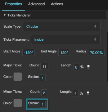
Minor Tick Stroke Weight
Minor Tick Stroke Weight
Scale Labels Renderer Properties
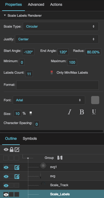
These properties affect a scale with number labels.
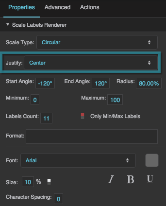
Justify
Justify
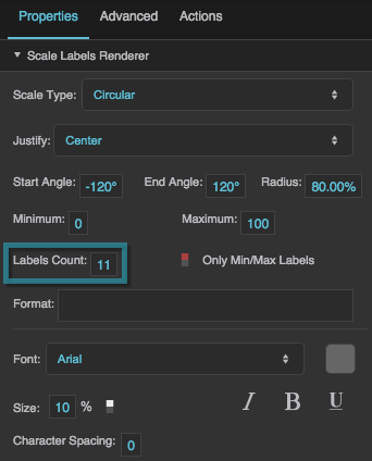
Labels Count
Labels Count
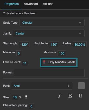
Only Min/Max Labels
Only Min/Max Labels
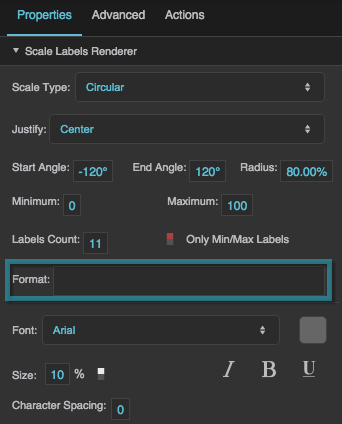
Format
Format
Format
Defines the number format for scale labels, as a format string.
For example:
- ,##0.00: Labels have a thousands separator and two decimal digits.
- 000.00: Labels have three mandatory digits before the decimal, and two mandatory digits after the decimal.
For more information about supported formatting options, see Scripting and Syntax.
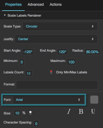
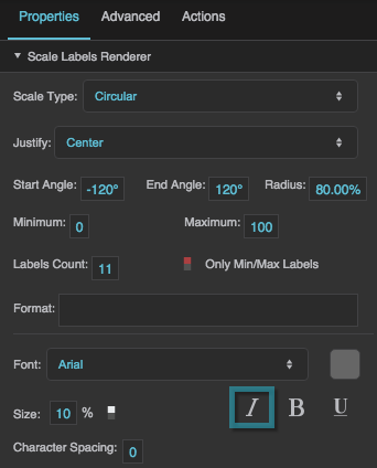
Labels Font
Labels Font
Labels Font
Defines the font used for the labels along this scale. To add a font to this project and use it for this property, see Text Component Properties.
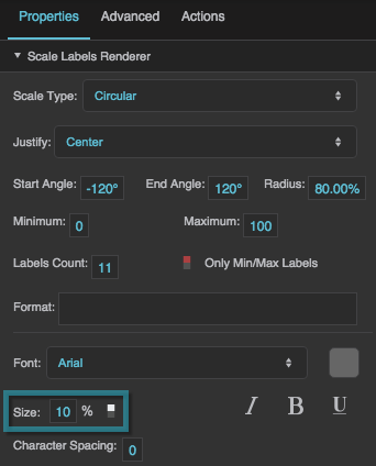
Labels Size
Labels Size
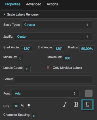
Underline
Underline
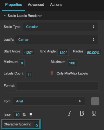
Character Spacing
Character Spacing
Scale Track Renderer Properties
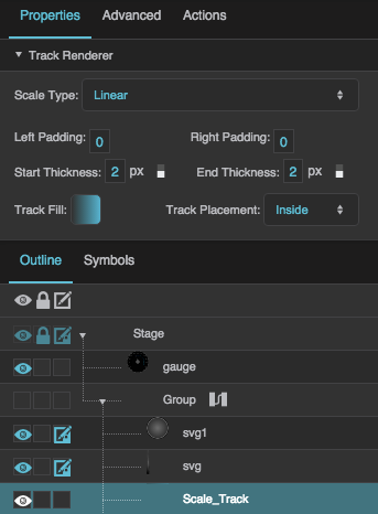
These properties affect a scale with a track.
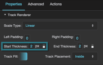
Start Thickness
Start Thickness
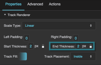
End Thickness
End Thickness
Track Fill
Track Fill
