Text Component Properties
These properties affect the text component.
For a guide to using the text component, see Text.
Text components are also affected by Common Properties.
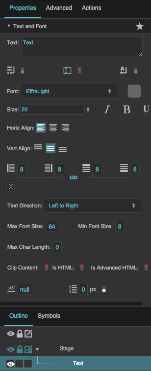
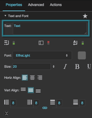
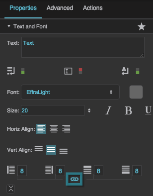
The Text and Font properties in the Property Inspector
Multiline
Multiline
Editable
Editable
Word Wrap
Word Wrap
Font
Font
Font
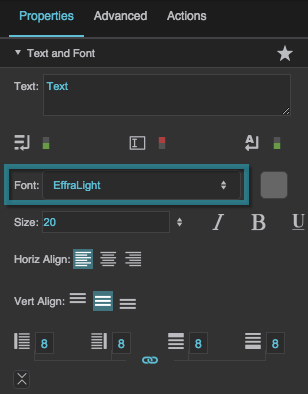
Specifies the font for this element. You can add a new font, and then specify it using the drop-down menu for this property.
To add a new font to your project and use it for this property:
- If you have not already done so, right-click the root folder for your project, and add a new folder named
fonts. - Navigate to the font file on your computer and drag it to the
fontsfolder. - Save your work and refresh the browser.
- Specify the font using the drop-down menu for this property.
Font Size
Font Size
Font Size
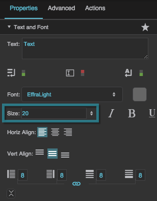
Defines the font size for this element. If the font size is set to Auto, the text scales to occupy the size of the component.
Note
When Font Size is Auto, the font size automatically updates when the text component size changes, but only if the text component width and height are pixel values. To force the font size to update, you can invoke the measureText property in the Advanced Properties panel.
If the text component size is Auto or a percentage of the text component's parent size, you might want to bind the the parent's onResize Advanced property to the text component's measureText Advanced property to ensure that the font size updates when the parent size changes.
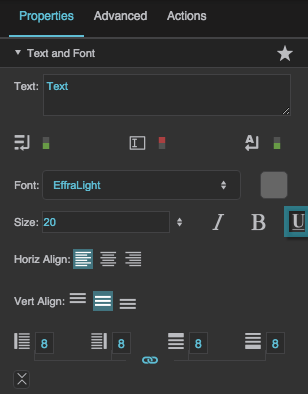
Underline
Underline
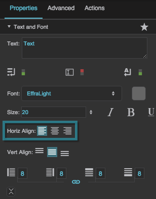
Horizontal Alignment
Horizontal Alignment
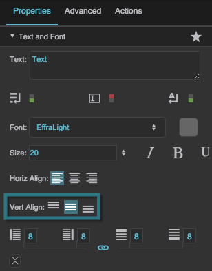
Vertical Alignment
Vertical Alignment
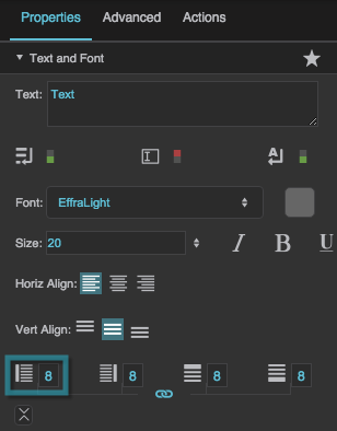
Left Padding
Left Padding
Left Padding
Defines a number of pixels of space between the left container boundary and the leftmost edge of the content. Negative numbers are not allowed.
Paddings are part of an object's width and height. See Borders, Padding, and Content Size.
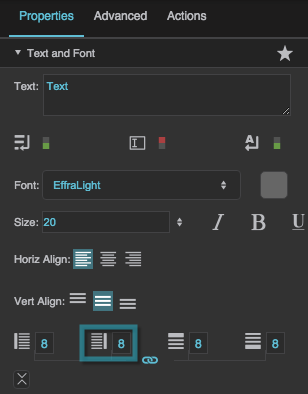
Right Padding
Right Padding
Right Padding
Defines a number of pixels of space between the right container boundary and the rightmost edge of the content. Negative numbers are not allowed.
Paddings are part of an object's width and height. See Borders, Padding, and Content Size.
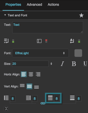
Top Padding
Top Padding
Top Padding
Defines a number of pixels of space between the top container boundary and the topmost edge of the content. Negative numbers are not allowed.
Paddings are part of an object's width and height. See Borders, Padding, and Content Size.
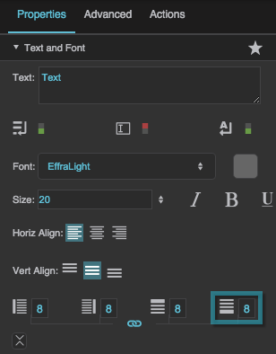
Bottom Padding
Bottom Padding
Bottom Padding
Defines a number of pixels of space between the bottom container boundary and the bottommost edge of the content. Negative numbers are not allowed.
Paddings are part of an object's width and height. See Borders, Padding, and Content Size.
Link Paddings
Link Paddings
Text Direction
Text Direction
Text Direction
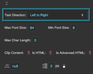
Specifies the direction for text and input in this component, to support the use of right-to-left languages.
Left to right
The text or user input direction is left to right.
Right to left
The text or user input direction is right to left.
Auto
The direction of user input is automatically detected as the user enters text.
Max Font Size
Max Font Size
Min Font Size
Min Font Size
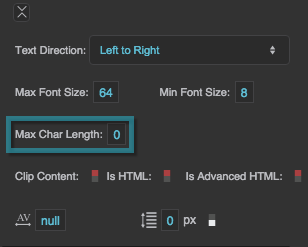
Max Char Length
Max Char Length
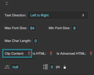
Clip Content
Clip Content
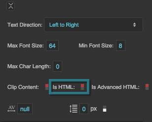
Is HTML
Is HTML
Is HTML
Specifies whether the string in this text component is rendered as HTML. For security, does not not parse advanced HTML tags such as hyperlinks. Only works if Editable is set to FALSE, Horizontal Alignment is set to Left, and Vertical Alignment is set to Top. Hard line breaks added by pressing Alt + Enter are not rendered.
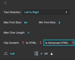
Is Advanced HTML
Is Advanced HTML
Is Advanced HTML
Renders the text as HTML, including links, forms, images and marquees. Links must be preceded with "http:" or "https:". Only works if Editable is set to FALSE, Horizontal Alignment is set to Left, and Vertical Alignment is set to Top. Hard line breaks added by pressing Alt + Enter are not rendered.
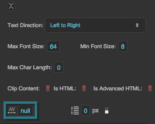
Character Spacing
Character Spacing
