Date Range Picker
The date range picker component allows the user to click and select any date range.
For a detailed reference of properties that affect date range pickers, see Common Properties and Date Range Picker Properties.
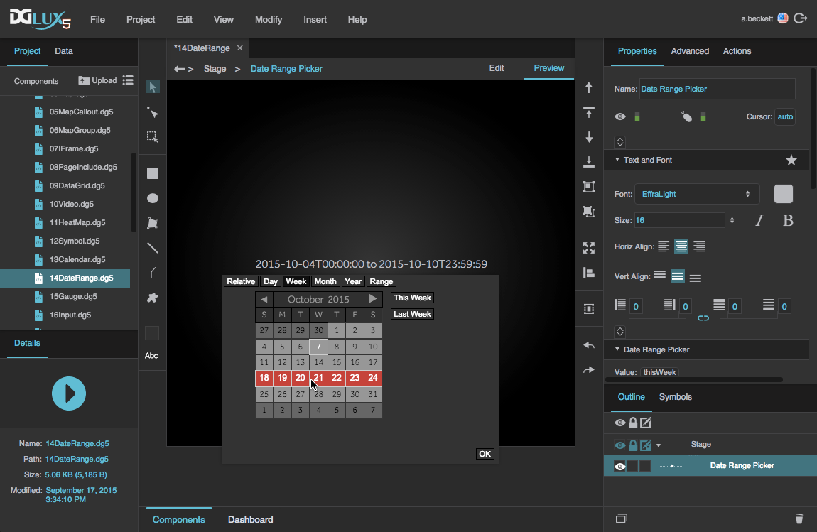
A date range picker component in DGLux5
Video Tutorial: Bind Date Range Picker to Chart
Date Range Picker Properties
These properties affect the date range picker component. For a guide to using the date range picker component, see Date Range Picker.
Date range pickers are also affected by Common Properties.

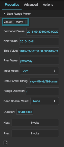
The Date Range Picker properties in the Property Inspector
Value
Value
Value
Returns the currently selected date range in the date range picker using one of the formats listed below.
- Range: "yyyy-MM-ddThh:mm:ss/yyyy-MM-ddThh:mm:ss"
- Day: "yyyy-MM-dd", "today", or "yesterday"
- Week: "yyyy-MM-ddThh:mm:ss/yyyy-MM-ddThh:mm:ss"
- Month: "yyyy-MM", "thisMonth", or "lastMonth"
- Year: "yyyy", "thisYear", or "lastYear"
- Relative: "[current/previous]N[seconds/minutes/hours/days/weeks/months/years]", where N is a number and one element is chosen from each set of square brackets
Formatted Value
Formatted Value
Formatted Value
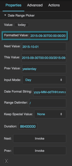
Returns a formatted version of the Value property. The format is determined using the Date Format String, Range Delimiter, and Keep Special Value properties.
Changing this property changes the text displayed in this date range component, but it does not change the Value selected.
Next Value
Next Value
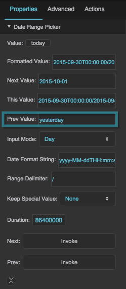
Previous Value
Previous Value
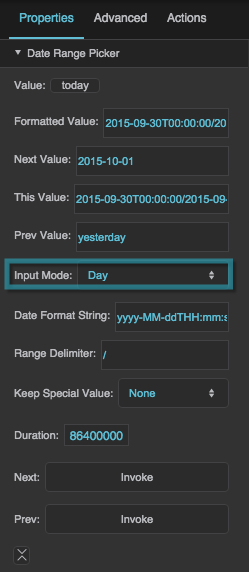
Input Mode
Input Mode
Input Mode
Sets or returns the currently selected input mode. The user can select from enabled input modes in a pop-up dialog. To enable and disable input modes in the Property Inspector, toggle the input mode properties, such as Show Range and Show Day.
Range
The user can specify a start date and end date using two calendars. If Show Full Time is enabled, the user can also specify a start time and end time using 24-hour time.
Day
The user can specify one day using a calendar, or specify today or yesterday using buttons.
Week
The user can specify one week using a calendar, or specify this week and last week using buttons. Clicking any date selects a week that includes that date. A week starts on a Sunday and ends on a Saturday.
Month
The user can specify a month and year using drop-down menus, or specify this month or last month using buttons.
Year
The user can specify one of the past ten years, using a drop-down menu, or specify this year and last year using buttons.
Relative
The user can specify a range relative to the current date and time. The user is prompted to enter a number of seconds, minutes, hours, days, weeks, months, or years, and to specify either "current" or "previous." A "current" range begins at the start of the unit; for example, if the current time is 3:26, the "current hour" is the hour from 3:00 to 4:00, and the "current two hours" is the period from 2:00 to 4:00. A "previous" range immediately precedes the current one. For example, if the time is 3:26, the "previous hour" is the hour from 2:00 to 3:00.
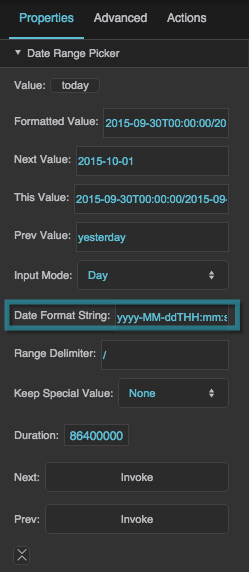
Date Format String
Date Format String
Date Format String
Defines the date format used by the component, as a date format string—for example, “yyyy-MM-ddTHH:mm:ss”. See date formatting help here.
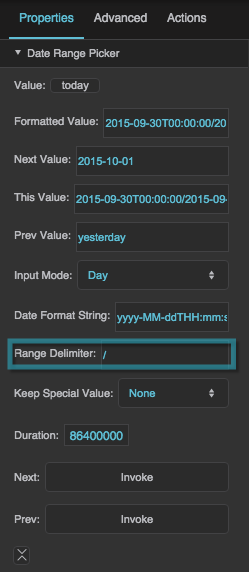
Range Delimiter
Range Delimiter
Keep Special Value
Keep Special Value
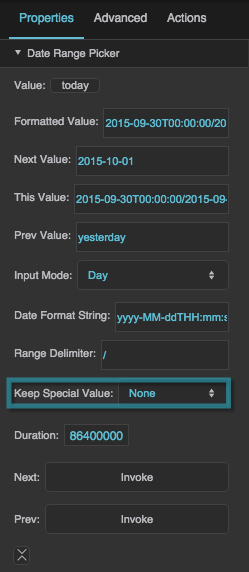
Keep Special Value
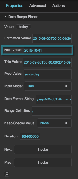
Specifies how formatting is determined for the Formatted Value, Next Value, and Previous Value properties.
Keep Special Value Formatting
The Keep Special Value property specifies how formatting is determined for the Formatted Value, Next Value, and Previous Value properties. There are four choices for this property: None, Raw, Formatted, and Format Clean.
None
- If Date Format String is null, the behavior of None is the same as the behavior of Raw.
- If Date Format String is not null, Formatted Value, Next Value, and Previous Value are formatted as two instances of the Date Format String, separated by the Range Delimiter.
Raw
- If the "Today," "Yesterday," "This Week," "Last Week," "This Month," "Last Month," "This Year," or "Last Year" button is clicked, the Formatted Value is one of the following special strings: "today", "yesterday", "thisWeek", "lastWeek", "thisMonth", "lastMonth", "thisYear", "lastYear".
- Otherwise, the behavior of Raw is the same as the behavior of Formatted.
Formatted
- Range input: If Date Format String is null, the Formatted Value uses "yyyy-MM-ddThh:mm:ss/yyyy-MM-ddThh:mm:ss". Otherwise, the Formatted Value uses two instances of the Date Format String separated by the Range Delimiter. The Next Value and Previous Value use "yyyy-MM-ddThh:mm:ss/yyyy-MM-ddThh:mm:ss".
- Day input: If Date Format String is null, the Formatted Value uses "yyyy-MM-dd". If Date Format String is not null, and the Today or Yesterday button is clicked, the Formatted Value uses the entire Date Format String for midnight on the specified date. Otherwise, the Formatted Value uses the two instances of the Date Format String separated by the Range Delimiter. The Next Value and Previous Value use either "today", "yesterday", or "yyyy-MM-dd".
- Week input: If Date Format String is null, the Formatted Value uses "thisWeek", "lastWeek", or "yyyy-MM-ddThh:mm:ss/yyyy-MM-ddThh:mm:ss". If Date Format String is not null, the Formatted Value uses two instances of the Date Format String separated by the Range Delimiter. The Next Value and Previous Value use either "thisWeek", "lastWeek", or "yyyy-MM-ddThh:mm:ss/yyyy-MM-ddThh:mm:ss".
- Month input: If Date Format String is null, the Formatted value uses "yyyy-MM". If Date Format String is not null, and the This Month or Last Month button is clicked, the Formatted Value uses the entire Date Format String for midnight on the first day of the specified month. Otherwise, the Formatted Value uses two instances of the Date Format String separated by the Range Delimiter. The Next Value and Previous Value use either "yyyy-MM", "thisMonth", or "lastMonth".
- Year input: If Date Format String is null, the Formatted Value uses "yyyy". If Date Format String is not null, and the This Year or Last Year button is clicked, the Formatted Value uses the entire Date Format String for midnight on the first day of the specified year. Otherwise, the Formatted Value uses two instances of the Date Format String separated by the Range Delimiter. The Next Value and Previous Value use either "yyyy", "thisYear", or "nextYear".
- Relative input: If Date Format String is null, the Formatted value uses the format "[current/previous]N[seconds/minutes/hours/days/weeks/months/years]", where N is a number and one element is chosen from each set of square brackets. Otherwise, the Formatted Value uses two instances of the Date Format String separated by the Range Delimiter. The Next Value and Previous value use either "[current/previous]N[seconds/minutes/hours/days/weeks/months/years]" or "yyyy-MM-ddThh:mm:ss/yyyy-MM-ddThh:mm:ss".
Format Clean
- Range input: The behavior of range input for Formatted Clean is the same as the behavior for Formatted.
- Day input: If Date Format String is not null, and the Today or Yesterday button is clicked, the Formatted Value uses the Date Format String, with any time information removed. Otherwise, the behavior of day input for Formatted Clean is the same as the behavior for Formatted.
- Week input: The behavior of week input for Formatted Clean is the same as the behavior for Formatted.
- Month input: If Date Format String is not null, and the This Month or Last Month button is clicked, the Formatted Value uses the Date Format String, with any time and day information removed. Otherwise, the behavior of month input for Formatted Clean is the same as the behavior for Formatted.
- Year input: If Date Format String is not null, and the This Year or Last Year button is clicked, the Formatted Value uses only the year portion of the Date Format String. Otherwise, the behavior of year input for Formatted Clean is the same as the behavior for Formatted.
- Relative input: The behavior of relative input for Formatted Clean is the same as the behavior for Formatted.
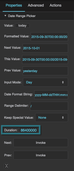
Duration
Duration
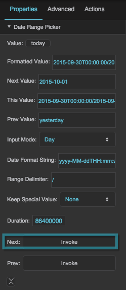
Next
Next
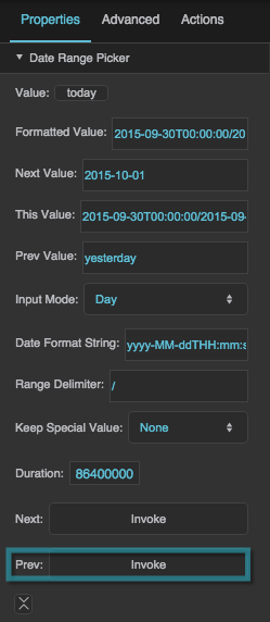
Previous
Previous
Show Day
Show Day
Show Week
Show Week
Show Relative
Show Relative
Show Month
Show Month
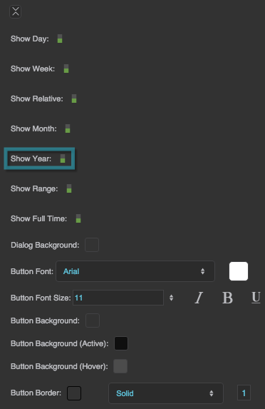
Show Year
Show Year
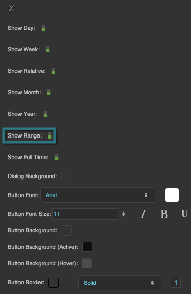
Show Range
Show Range
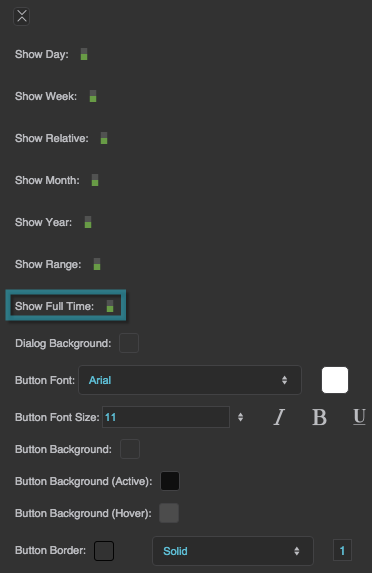
Show Full Time
Show Full Time
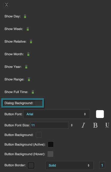
Dialog Background
Dialog Background
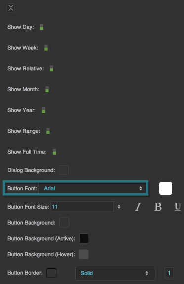
Button Font
Button Font
Button Font
Defines the font for buttons within this date range picker. To add a font to this project and use it for this property, see Text Component Properties.
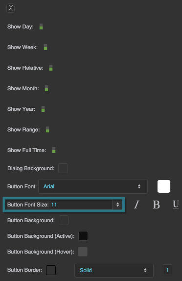
Button Font Size
Button Font Size
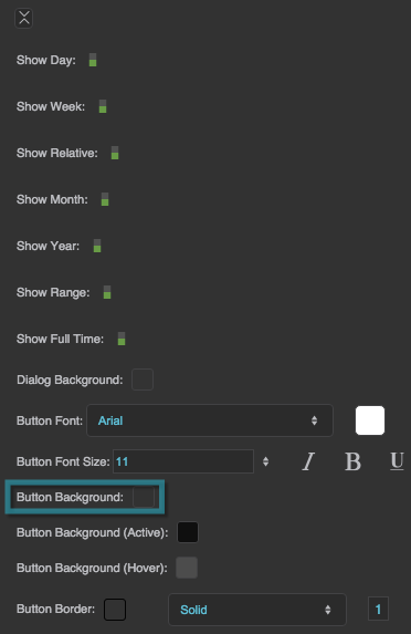
Button Background
Button Background
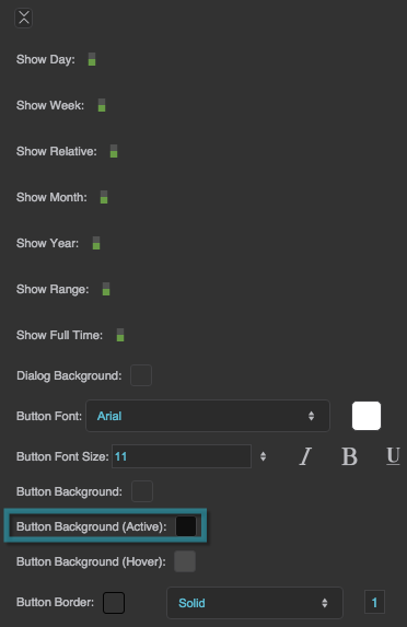
Button Background (Active)
Button Background (Active)
Button Background (Hover)
Button Background (Hover)
