Calendar

The calendar component is an interactive calendar that lets the user select a day, week, or month.

For a detailed reference of properties that affect calendar components, see Common Properties and Calendar Properties.


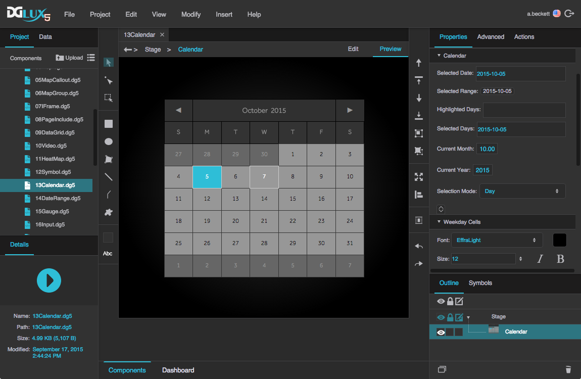
A calendar component in DGLux5


Calendar Properties

These properties affect the calendar component.

For a guide to using the calendar component, see Calendar.

Calendar components are also affected by Common Properties.


Calendar Properties

These properties affect the entire calendar.

Selected Date

Selected Date

Selected Date
Sets or returns the currently selected date for this calendar. Uses the format "yyyy-MM-dd". For more information about date formats, see Scripting and Syntax.

If the user selects a range of dates, this property reflects only the date that the user clicked to select the range.

The Selected Date property

Selected Range

Selected Range

Selected Range
Sets or returns the currently selected date range for this calendar. Uses the format "yyyy-MM-ddThh:mm:ss/yyyy-MM-ddThh:mm:ss". For more information about date formats, see Scripting and Syntax.

To let the user change this property, set the Selection Mode property to Day, Week, or Month.

To change this property using the Property Inspector, click the Selected Range button to open a DGLux5 date range picker. Using this dialog, you can choose a date range in several ways:

  • Range: Specify a start date and end date. Optionally, you can also specify a start time and end time using 24-hour time.
  • Day: Specify one day.
  • Week: Specify one week. Clicking any date selects a week that includes that date. The selected week starts on a Sunday and ends on a Saturday.
  • Month: Specify a month and year.
  • Year: Specify a year.
  • Relative: Specify a range relative to the current date and time. Enter a number of seconds, minutes, hours, days, weeks, months, or years, and specify either "current" or "previous." A "current" range begins at the start of the unit; for example, if the current time is 3:26, the "current hour" is the hour from 3:00 to 4:00, and the "current two hours" is the period from 2:00 to 4:00. A "previous" range immediately precedes the current one. For example, if the time is 3:26 PM, the "previous hour" is the hour from 2:00 to 3:00.

The Selected Range property

Highlighted Days

Highlighted Days

Highlighted Days
Sets the highlighted days, as a list of comma-separated values with the format "yyyy-MM-dd". For more information about date formats, see Scripting and Syntax

The Highlighted Days property

Selected Days

Selected Days

Selected Days
Sets or returns the currently selected days as a comma-separated list.

The Selected Days property

Current Month

Current Month

Current Month
Sets or returns the month of the current calendar page.

The Current Month property

Current Year

Current Year

Current Year
Sets or returns the year of the current calendar page.

The Current Year property

Selection Mode

Selection Mode

Selection Mode
Determines the selection mode for the component.

Day
The user can select one day.

Week
The user can select one week. Selecting any date selects a week that includes that date. The week selected starts on a Sunday and ends on a Saturday, regardless of the currently selected First Day of Week.

Month
The user can select one month. Selecting any date selects its entire calendar month.

The Selection Mode property

Disable Selection of Future Dates

Disable Selection of Future Dates

Disable Selection of Future Dates
Determines whether it is possible for the user to select future dates.

TRUE
If Selection Mode is set to Day, the user cannot select future dates. If Selection Mode is set to Week or Month, the user cannot select weeks or months after the week or month containing today.

FALSE The user can select future dates.

The Disable Selection of Future Dates property

Month Names

Month Names

Month Names
Defines the month names that appear on the calendar, as a comma-separated list of 12 values. The first value is displayed for January, and the last is displayed for December. Must be 12 values in order for defined names to take effect.

The Month Names property

DOW Names

DOW Names

DOW Names
Defines the day of the week names that appear on the calendar, as a comma-separated list of 7 values. The first value is mapped to Monday and the last value to Sunday, regardless of the currently selected First Day of Week. Must be 7 values in order for defined names to take effect.

The DOW Names property

First Day of Week

First Day of Week

First Day of Week
Defines the day of the week that appears in the leftmost column of the calendar.

The First Day of Week property

Left Padding

Left Padding

Left Padding
Defines a number of pixels of space between the left edge of the date cells, and the border of the calendar component.

Paddings are part of an object's width and height. See Borders, Padding, and Content Size.

The Left Padding property

Right Padding

Right Padding

Right Padding
Defines a number of pixels of space between the right edge of the date cells, and the border of the calendar component.

Paddings are part of an object's width and height. See Borders, Padding, and Content Size.

The Right Padding property

Top Padding

Top Padding

Top Padding
Defines a number of pixels of space between the top edge of the date cells, and the header of the calendar.

Paddings are part of an object's width and height. See Borders, Padding, and Content Size.

The Top Padding property

Bottom Padding

Bottom Padding

Bottom Padding
Defines a number of pixels of space between the bottom edge of the date cells, and the border of the calendar component.

Paddings are part of an object's width and height. See Borders, Padding, and Content Size.

The Bottom Padding property

Horizontal Spacing

Horizontal Spacing

Horizontal Spacing
Defines the amount of empty space, in pixels, between columns in the calendar.

The Horizontal Spacing property

Vertical Spacing

Vertical Spacing

Vertical Spacing
Defines the amount of empty space, in pixels, between rows in the calendar.

The Vertical Spacing property


Calendar Cell Properties

These properties affect groups of cells.

These groups of cells can be affected by Cell properties:

  • Weekday cells — The calendar cells for Monday through Friday
  • Selected cells — The cells the user clicks
  • Highlighted cells — The cells the user mouses over, or the highlighted cells specified using the Property Inspector
  • Days of Week — The column headers that hold the days of the week
  • Weekend cells — The calendar cells for Saturday and Sunday
  • Out of Month cells — The calendar cells that are showing for the previous and next months
  • Today cell — The calendar cell for today

Font

Font

Font
Specifies the font for numbers in these cells. To add a font to this project and use it for this property, see textbox.

The Font property
The Font property

Font Color

Font Color

Font Color
Defines the font color for numbers in these cells.

The Font Color property

Font Size

Font Size

Font Size
Defines the font size for numbers in these cells.

The Font Size property

Italic

Italic

Italic
Specifies whether text in these cells is italicized.

The Italic property
The Italic property

Bold

Bold

Bold
Specifies whether text in these cells is bold.

The Bold property
The Bold property

Corner Radius

Corner Radius

Corner Radius
Defines the corner radius for these cells, as arcs of circles or ellipses. The circles or ellipses are defined using a pixel value or percentage. A pixel value is the radius of a circle. A percentage value defines an ellipse with horizontal and vertical radii that are that percentage of the cell's width and height, respectively. A value of 0 means that corners are not rounded.

The Corner Radius property

Fill

Fill

Fill
Defines the fill for these cells.

The Fill property
The Fill property

Stroke

Stroke

Stroke
Defines the stroke color for outlining these cells.

The Stroke property
The Stroke property


Calendar Header Properties

These properties affect the calendar's header. The header typically contains the month name and arrow buttons for the next and previous months.

Height

Height

Height
Defines the height of the calendar header, as a pixel value or Auto. A value of Auto means that the height of the header is equal to other calendar cells, and therefore depends on the calendar height.

The Height property
The Height property

Font

Font

Font
Specifies the font for the month and year in the calendar header. To add a font to this project and use it for this property, see textbox.

The Font property
The Font property

Size

Size

Size
Defines the font size used for the month and year in the calendar header.

The Size property
The Size property

Italic

Italic

Italic
Specifies whether header text is italicized.

The Italic property
The Italic property

Bold

Bold

Bold
Specifies whether header text is bold.

The Bold property
The Bold property

Arrow Font

Arrow Font

Arrow Font
Specifies the font used for the previous and next arrow glyphs in the calendar header.


The Arrow Font property

Previous

Previous

Previous
Defines the text or the glyph used for the previous month arrow. You can find more information on glyphs here.

The Previous property

Next

Next

Next
Defines the text or the glyph used for the next month arrow. You can find more information on glyphs here.

The Next property
The Next property

2019/07/17 19:17