Layout Basics
Designing a great application or dashboard requires ensuring an optimal experience across all devices. DGLux5 allows you to control item placement in response to browser window size, to ensure that your application responds appropriately on desktops, laptops, tablets, and smartphones. For more about the principles of DGLux5 layout, see an online reference to flexbox, such as this one.
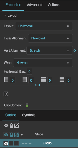
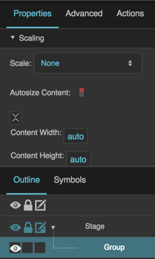
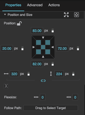
To create a layout that responds to window size, set the Layout property of groups and the Stage to Absolute, Vertical or Horizontal, and then modify the group's Layout or Scaling properties, and its children's Position and Size properties. For a detailed reference of these properties, see Layout Properties, Scaling Properties, and Position and Size Properties.
Create a Layout
To create a layout that responds to window size, first you combine items into groups or sets of groups. For information on creating a group, see Group. When you have created a group, its children appear nested below it in the Outline.
Customize a Layout
To customize your group, you select the group or Stage and edit its Layout properties. First, you set the Layout property of the group to Absolute, Horizontal, or Vertical. Absolute Layout gives you flexibility to manually position components within the group. With Absolute Layout, you can use the Scaling properties to ensure responsiveness. Horizontal Layout automatically arranges children from left to right. Vertical Layout automatically arranges children from top to bottom. With Horizontal or Vertical Layout, you can use the Layout Properties as described in Vertical Layout and Horizontal Layout, as well as the Flex-Grow and Flex-Shrink properties, to create a responsive layout.


