Tree Properties

These properties affect the tree component. For a guide to using the tree component, see Tree.

Trees are also affected by Common Properties.


Tree Properties

These properties affect the entire tree.

Table (Required)

Table (Required)

Table (Required)
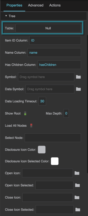
Defines the table that the tree uses as a data source. This table contains the top level of nodes and references to the next level of nodes, if they exist. This table must include a column that contains item IDs.

The Table property
The Table property

Item ID Column (Required)

Item ID Column (Required)

Item ID Column (Required)
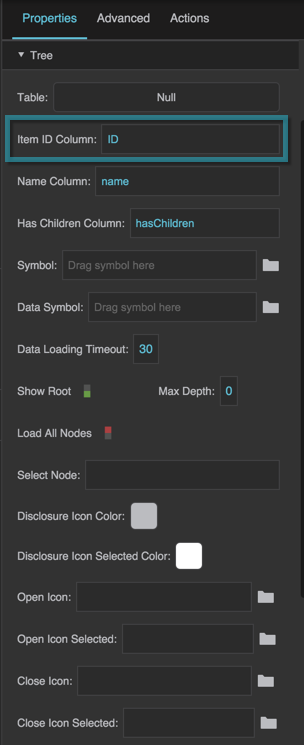
Contains the name of a column in this tree's source table. This column contains IDs for tree nodes. IDs must be unique within a given table.

The Item ID Column property

Name Column (Recommended)

Name Column (Recommended)

Name Column (Recommended)
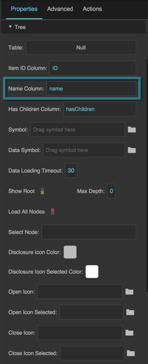
Contains the name of a column in this tree's source table. This column contains names for tree nodes. If default tree styling is used, the items in this column are used as display text. If a symbol is used for the tree, and the symbol has a default property defined, the items in this column are used for that default property.

The Name Column property

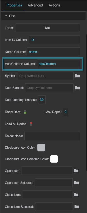
Has Children Column (Recommended)

Has Children Column (Recommended)

Has Children Column (Recommended)
Contains the name of a column in this tree's source table. This column indicates whether items in the tree have children and whether the disclosure icon is displayed. All values are considered TRUE except:

  • false
  • False
  • a null value
  • any string that is parsed as 0

If no column is set, the disclosure icon is always displayed, and an attempt can always be made to load children.

The Has Children Column property

Symbol

Symbol

Symbol
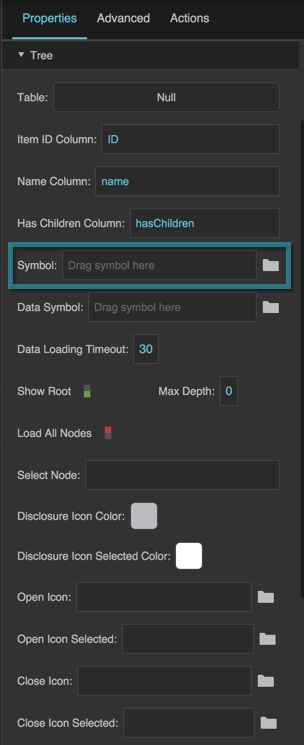
Optionally, this property can be used to specify a symbol to represent the tree nodes, instead of the default tree styling.

The Symbol property
The Symbol property

Data Symbol (Required)

Data Symbol (Required)

Data Symbol (Required)
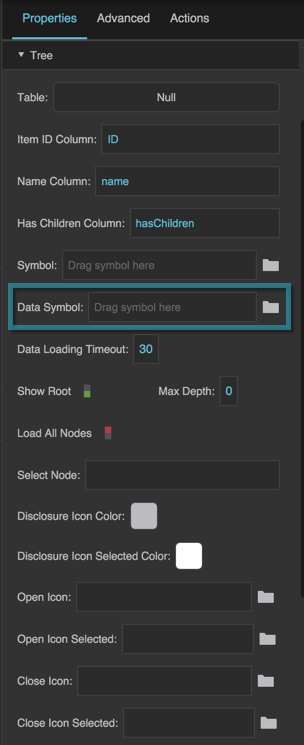
Specifies the name of the dataflow symbol to be used by this tree. As described here, the dataflow symbol must include input and output tabledata parameters. This symbol takes a one-row table and returns the child table that it refers to, if any.

The Data Symbol property

Data Loading Timeout

Data Loading Timeout

Data Loading Timeout
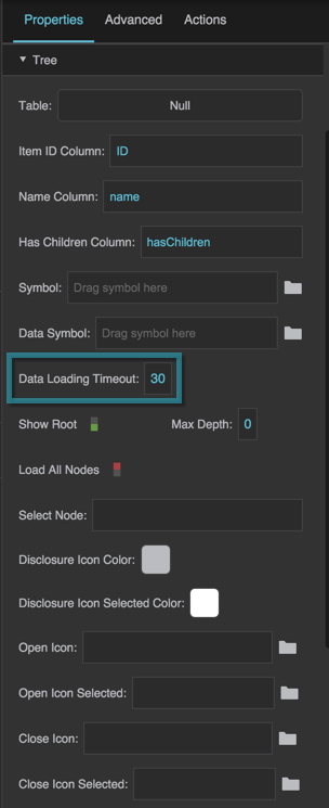
Specifies how long, in seconds, DGLux5 will attempt to load a child table before stopping the attempt.

The Data Loading Timeout property

Show Root

Show Root

Show Root
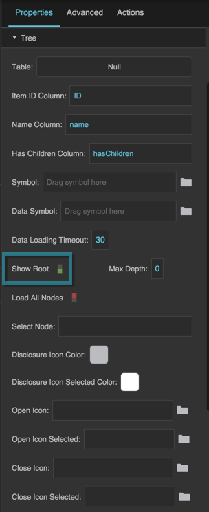
Specifies whether the data in the top-level table is displayed in the tree component. This property is TRUE by default.

TRUE
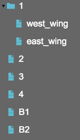
The tree component displays as its top level the nodes named in the table that is used as the Table property.

FALSE
The tree component displays as its top level the children of the first row of the table that is used as the Table property. The other rows from the top-level table are not displayed.

The Show Root property

The Show Root property

A tree with the Show Root property set to TRUE (left) and FALSE (right)

The Show Root property

Max Depth

Max Depth

Max Depth
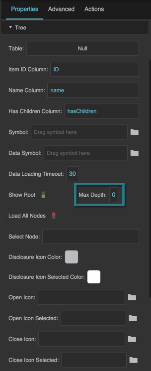
An integer that specifies the maximum level of tree descendants that are allowed. A value of 0 allows an unlimited number of levels. A value of 1 allows only one level of nodes and does not allow any descendants to be loaded.

The Max Depth property

Load All Nodes

Load All Nodes

Load All Nodes
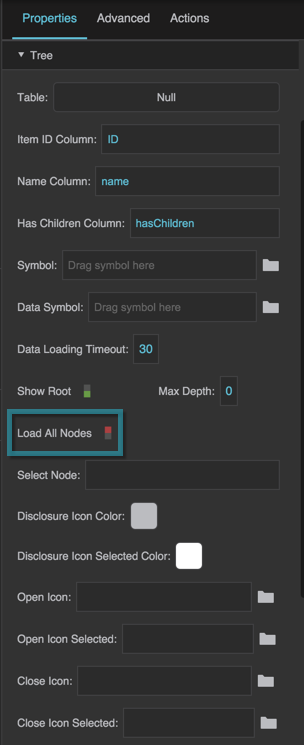
A boolean value that indicates whether to pre-load children for the tree. This value is FALSE by default.

TRUE
All children are loaded when the page is first loaded, when the data table is first set, or when this property becomes TRUE.

FALSE
Children of a node are loaded only when requested, for example when a user clicks the disclosure icon.

The Load All Nodes property

Expand All Nodes

Expand All Nodes

Expand All Nodes
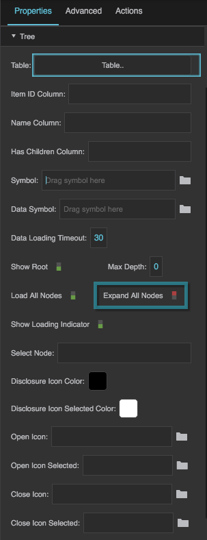
This property is visible only when Load All Nodes is TRUE. It determines whether to expand all nodes after they are loaded.

The Expand All Nodes property

Show Loading Indicator

Show Loading Indicator

Show Loading Indicator
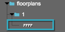
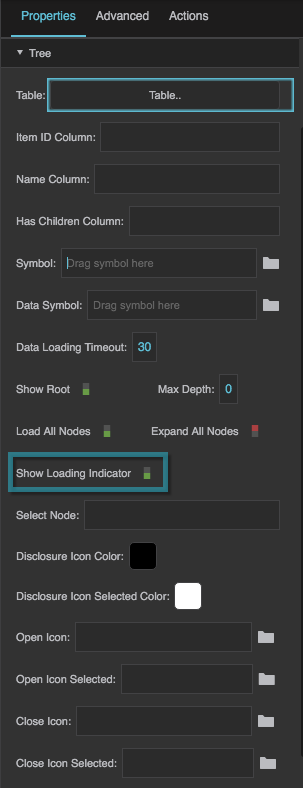
Determines whether to disaply a visual signal when an attempt is being made to load tree nodes.

An example of the loading indicator

The Show Loading Indicator property

Select Node

Select Node

Select Node
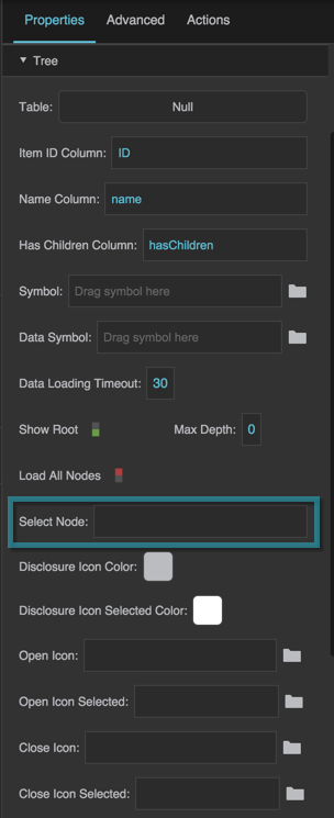
A node ID that specifies a loaded node to select, expand, and make visible. Only works if the tree's Selection Behavior is set to a value other than None.

If the specified node is not loaded, this property does nothing. You can use this property together with the Load All Nodes property and the onAllNodesLoaded event property in the Advanced properties, to ensure that all nodes are loaded before this property's value is set.

If a node with the specified ID exists in more than one table, then the first node with this ID that is encountered is used.

For selection of more than one node, use the Selected Items property in the Selection properties. However, Selected Items controls selection only, not which nodes are expanded.

The Select Node property

Disclosure Icon Color

Disclosure Icon Color

Disclosure Icon Color
A color to be used for the default "expand" and "collapse," or "open" and "close," icons for a node that has children and is not currently selected.

The Disclosure Icon property
A tree with a black Disclosure Icon Color and a white Disclosure Icon Selected Color

The Disclosure Icon Color property

Disclosure Icon Selected Color

Disclosure Icon Selected Color

Disclosure Icon Selected
A color to be used for the default "expand" and "collapse," or "open" and "close," icons for a node that has children and is currently selected. Only works if selection is enabled for this tree.

The Disclosure Icon property
A tree with a black Disclosure Icon Color and a white Disclosure Icon Selected Color

The Disclosure Icon Selected Color property

Open Icon

Open Icon

Open Icon
An image to be used as the "expand," or "open," icon for a node that has children, is currently closed, and is not currently selected.

The Open Icon property
A tree with a triangle SVG used as the Open Icon property

The Open Icon property

Open Icon Selected

Open Icon Selected

Open Icon Selected
An image to be used as the "expand," or "open," icon for a node that has children, is currently closed, and is currently selected. Only works if selection is enabled for this tree.

The Open Icon Selected property
A tree with a gray triangle SVG used as the Open Icon Selected property

The Open Icon Selected property

Close Icon

Close Icon

Close Icon
An image to be used as the "collapse," or "close," icon for a node that has children, is currently open, and is not currently selected.

The Close Icon property
A tree with a black triangle SVG used as the Close Icon property

The Close Icon property

Close Icon Selected

Close Icon Selected

Close Icon Selected
An image to be used as the "collapse," or "close," icon for a node that has children, is currently open, and is currently selected. Only works if selection is enabled for this tree.

The Close Icon Selected property
A tree with a gray triangle SVG used as the Close Icon Selected property

The Close Icon Selected property


Tree Items Properties

These properties affect the visual formatting of the tree.

Tree Items Text and Font Properties

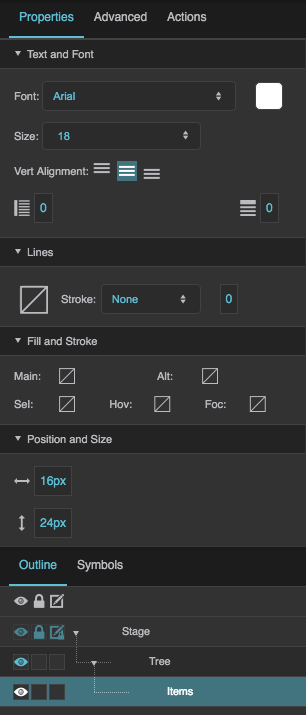
The Text and Font properties for tree items are similar to those for Text components.

Tree Items Lines Properties

The Lines properties for tree items affect the lines that connect tree items.
The Tree Items Lines properties
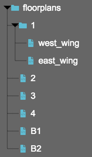
A tree with the Lines properties set as a black dotted line.

Lines Stroke Color

Lines Stroke Color

Lines Stroke Color
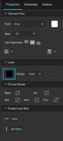
Defines the color used for lines in the tree.

The Lines Stroke Color property

Lines Stroke Style

Lines Stroke Style

Lines Stroke Style
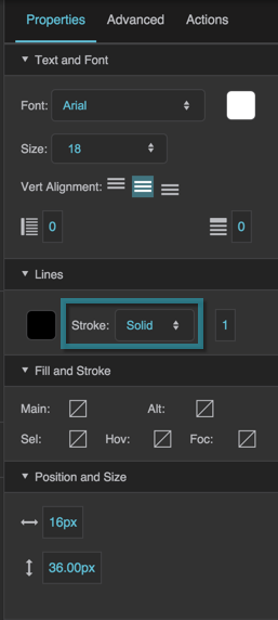
Defines whether lines in the tree are solid or dotted lines.

The Lines Stroke Style property

Lines Stroke Weight

Lines Stroke Weight

Lines Stroke Weight
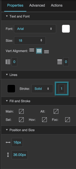
Defines the stroke weight used for lines in the tree.

The Lines Stroke Weight property

Tree Items Fill Properties

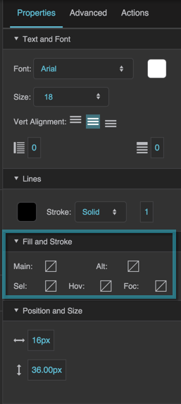
Tree items fill properties affect the types of rows listed in this table.

Property Description
Main Rows The first group of alternating rows.
Alternate Rows The second group of alternating rows.
Hovered Row The row that the user mouses over.
Focused Row The row that is in focus.
Selected Rows The selected rows. Only works if selection is enabled for this tree.

The Tree Items Fill properties

Tree Items Position and Size Properties

Indent

Indent

Indent
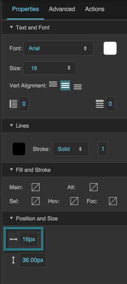
Defines the number of pixels by which each level in the tree is indented. If an image is specified for the Open Item Icon and Close Item Icon properties, then Indent also controls the width of this image.

The Indent property
The Indent property

Item Height

Item Height

Item Height
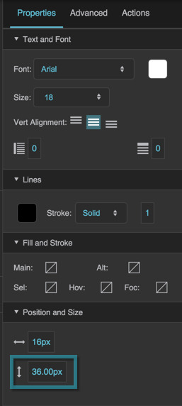
Defines the height of each item in the tree, in pixels.

The Item Height property