Series Properties
These properties affect a line, area, bar, column, or bubble series. Which properties are available depends on whether you have selected a line, area, bar, or column series, or whether you inserted a pre-made bubble chart widget. For pie chart properties, see Pie Chart Properties.
For a guide to using charts, see Designing Charts.
Series can also be affected by Fill and Stroke properties and Selection properties.

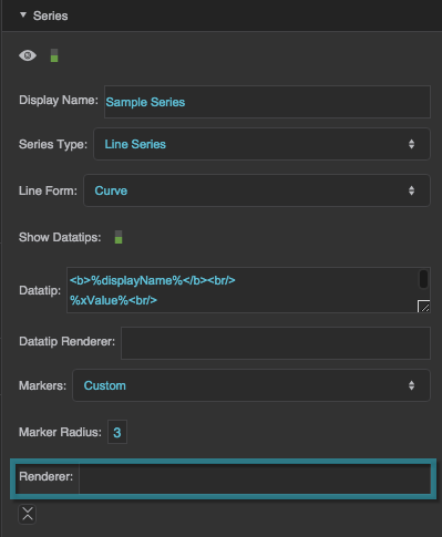
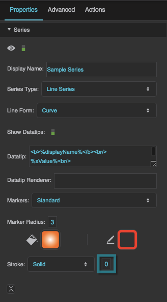
Series properties in the Property Inspector
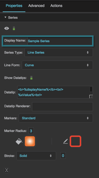
Display Name
Display Name
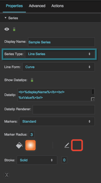
Series Type
Series Type
Series Type
Defines how the series data is visually represented.
Line series
Markers represent the data points. Lines connect the markers.
Area series
Markers represent the data points. Lines connect the markers, and the area delimited by the lines is filled in.
Bar series
Horizontal bars represent the data points.
Column series
Vertical columns represent the data points.
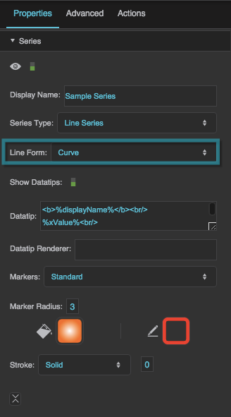
Line Form
Line Form
Line Form
Defines the shape of the lines in a line or area series.
Segment
Markers are connected using line segments.
Step
Markers are connected using orthogonal line segments. Horizontal and vertical segments alternate, beginning with a horizontal segment.
ReverseStep
Data points are connected using orthogonal line segments. Vertical and horizontal segments alternate, beginning with a vertical segment.
Vertical
Only the vertical segments from a Step line form are displayed.
Horizontal
Only the horizontal segments from a Step line form are displayed.
Curve
Markers are connected using a curve.
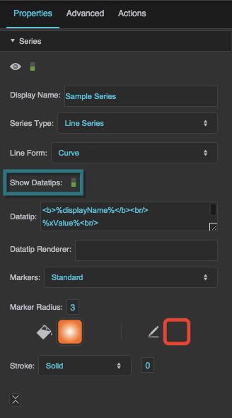
Show Datatips
Show Datatips
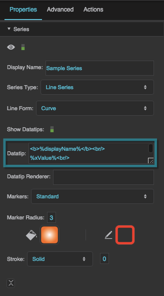
Datatip
Datatip
Datatip
Configures the text displayed in a datatip for a series. Use the tags listed below to format the datatip and include data.
HTML tags
Include these tags to format the datatip:
<br/>— line break<b>insert text here</b>— bold<i>insert text here</i>— italic
Including data
Include these tags to show values from the data:
%displayName%— the Display Name property for this series%xValue%— the X value of the point%yValue%— the Y value of the point%value%— the value of the pie wedge%yValueTotal%— The sum of the Y values for this point and other points in this table row. Only includes points from this series and others that appear above it inside this series stacker.%A%— Replace A with the name of a column to show the value of that column.
Formatting numbers
To control how a number is formatted, include a format string inside brackets, before the final percent sign. For example:
%yValue[,##0.00]%— the Y value with a thousands separator and two decimal digits%value[000.00]%— the pie wedge value with three mandatory digits before the decimal, and two mandatory digits after the decimal.
For number formatting help, see Scripting and Syntax.
Formatting dates
To control how a date is formatted, include a format string inside brackets, before the final percent sign. For example:
%xValue[yy/MM/dd]%— the X value as a date with a two-digit year, two-digit month, and two-digit day%xValue[y MMMM dd]%— the X value as a date with the full year, the name of the month, and a two-digit day%xValue[yy/MM/dd HH:mm:ss]%— the X value as a date and time%xValue[yMd]%— the X value as a localized short date pattern. The pattern will be different based on the locale.%xValue[yMMMd| |Hms]%— the X value as a localized date and time. The pattern will be different based on the locale. In this example, vertical bar symbols (|) are used to join three patterns: one for the localized date, one that contains a space, and one for the localized time.
For date formatting help, see Scripting and Syntax.
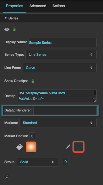
Datatip Renderer
Datatip Renderer
Datatip Renderer
Specifies the symbol to use as the datatip for the series. This property overrides any text entered in the Datatip property. To use a symbol from this project, enter the name of the symbol. To use a symbol from another project in your library, enter the path to that symbol.
When you populate this field with a symbol, the datatip renderer appears in the Outline as a child of this series, and you can bind table columns to symbol properties in the Property Inspector.
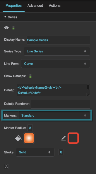
Markers
Markers
Markers
Defines the type of markers used by this series. Markers are used to visually represent each data point in the series, in addition to the line or shape that represents the entire series.
None
No markers are used by this series.
Standard
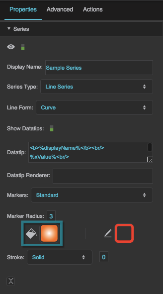
This series uses DGLux5’s standard marker design, a circle with a customizable fill, stroke, and size.
Custom
This series uses the specified symbol as a marker.
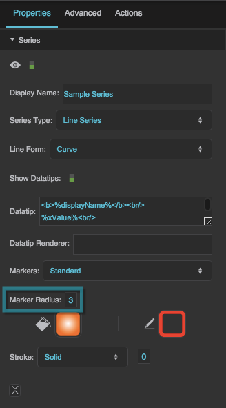
Marker Radius
Marker Radius
Marker Renderer
Marker Renderer
Marker Renderer
Specifies the symbol to use for custom markers. To use a symbol from this project, enter the name of the symbol. To use a symbol from another project in your library, enter the path to that symbol.
When you populate this field with a symbol, the marker's item renderer appears in the Outline as a child of this series, and you can bind table columns to symbol properties in the Property Inspector.
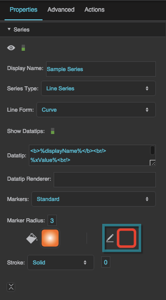
Marker Stroke Color
Marker Stroke Color
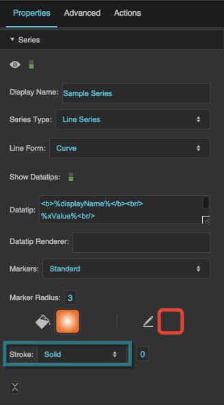
Marker Stroke Style
Marker Stroke Style
Marker Stroke Weight
Marker Stroke Weight
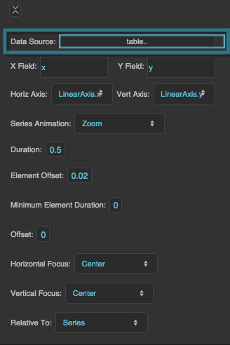
Data Source
Data Source
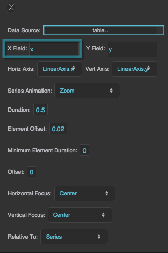
X Field
X Field
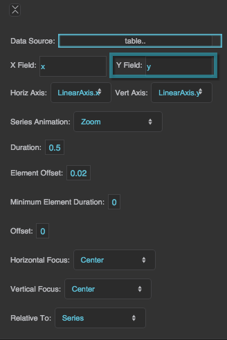
Y Field
Y Field
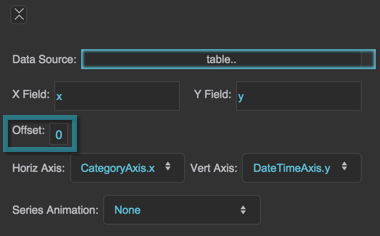
Column Series Offset
Column Series Offset
Column Series Offset
Moves columns to the left or right by a portion of the maximum column width. The maximum column width is equal to 1/n of the plot area width, with n being the total number of columns for the chart.
A Column Series Offset of −0.1 moves the columns to the left by 10% of this maximum width. A Column Series Offset of 0.1 moves the columns to the right by 10% of this maximum width.
This property is related to the Column Width Ratio property for the chart. The Column Width Ratio determines the width of each column in the chart as a percentage of the maximum column width.
Example
The Column Width Ratio is 60%, and there are two series. To offset the columns in series 1 by 10% of their width, use the value (0.6 / 2) * 0.1 = 0.03 for Column Series Offset.
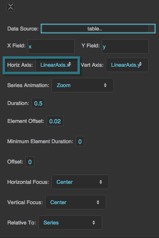
Horizontal Axis
Horizontal Axis
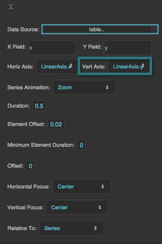
Vertical Axis
Vertical Axis
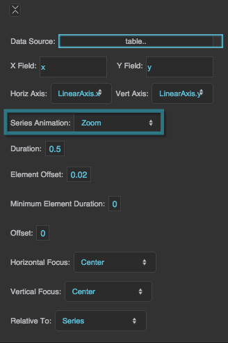
Series Animation
Series Animation
Series Animation
Defines animation behavior for this series.
None
An updated chart replaces the old chart without any animation.
Interpolate
The series goes through a smooth transition, with the old chart as the first frame and the new chart as the final frame.
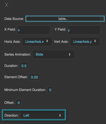
Slide
The series "slides" in and out of the chart boundaries from a direction that you specify.
Zoom
The series "implodes" and "explodes" from a focal point that you specify.
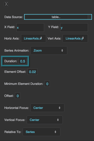
Duration
Duration
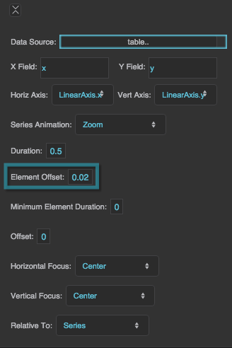
Element Offset
Element Offset
Element Offset
Specifies the amount of time, in seconds, that the animation of each element in the series is delayed. A value of zero means that all elements in the series begin animating at the same time and finish at the same time. A value of 1 means that the second element starts and finishes animating one second after the first element, and so on.
The Element Offset and Minimum Element Duration properties can cause the animation duration to be longer than that specified by the Duration property.
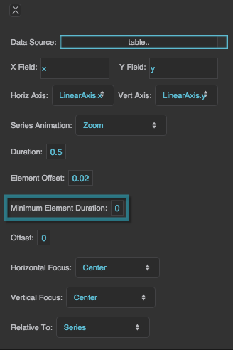
Minimum Element Duration
Minimum Element Duration
Minimum Element Duration
Specifies the minimum amount of time, in seconds, that an individual element takes to complete the animation.
The Element Offset and Minimum Element Duration properties can cause the animation duration to be longer than that specified by the Duration property.
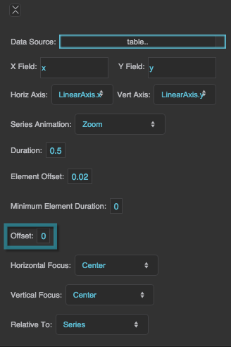
Offset
Offset
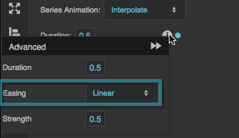
Easing
Easing
Easing
Specifies the rate of change over time for this animation.
Linear
The animation's rate of change is constant.
Ease In
The animation starts slowly and accelerates linearly as it executes.
Ease Out
The animation starts with a fast change rate and decelerates linearly as it executes.
Ease In Out
The animation starts slowly, accelerates linearly, and then decelerates linearly as it executes.
Cubic In
The animation starts slowly and accelerates cubically as it executes.
Cubic Out
The animation starts with a fast change rate and decelerates cubically as it executes.
Cubic In Out
The animation starts slowly, accelerates cubically, and then decelerates cubically as it executes.
Elastic In
The animation's rate of change starts on a small-amplitude sine wave. The sine wave grows as the animation executes.
Elastic Out
The animation's rate of change starts on a large-amplitude sine wave. The sine wave decays as the animation executes.
Elastic In Out
The animation's rate of change starts on a small-amplitude sine wave. The sine wave grows and then decays as the animation executes.
Bounce
The animation starts with a fast change rate, and decelerates to zero with an effect similar to a ball falling and bouncing on a floor.
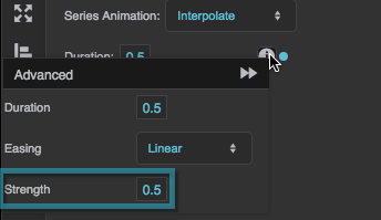
Strength
Strength
Strength
Affects the differential or the change rate of the easing function. A value of 0.5 is the default. Values below 0.5 decrease the differential or the change rate, making the easing appear less pronounced. Values above 0.5 increase the differential or the change rate, making the easing appear more pronounced.
Direction
Direction
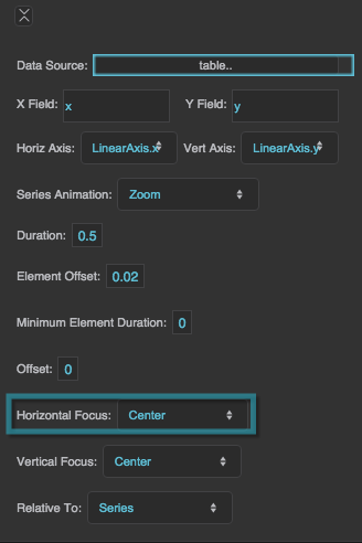
Horizontal Focus
Horizontal Focus
Horizontal Focus
Together with Vertical Focus and Relative To, determines the focal point of the zoom animation.
Left
The zoom animation begins at the left of the bounding box defined in Relative To.
Right
The zoom animation begins at the right of the bounding box defined in Relative To.
Center
The zoom animation begins at the horizontal center of the bounding box defined in Relative To.
Null
If Horizontal Focus is null, and Vertical Focus is not null, then the focus is a horizontal line rather than a point. If both values are null, then the focal point is the center of the bounding box.
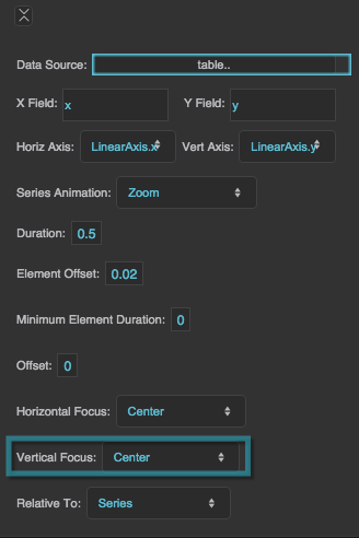
Vertical Focus
Vertical Focus
Vertical Focus
Together with Horizontal Focus and Relative To, determines the focal point of the zoom animation.
Top
The zoom animation begins at the top of the bounding box defined in Relative To.
Bottom
The zoom animation begins at the bottom of the bounding box defined in Relative To.
Center
The zoom animation begins at the vertical center of the bounding box defined in Relative To.
Null
If Vertical Focus is null, and Horizontal Focus is not null, then the focus is a vertical line rather than a point. If both values are null, then the focal point is the center of the bounding box.
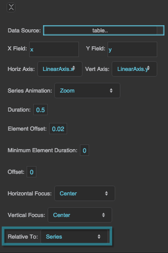
Relative To
Relative To
Relative To
Controls the bounding box used to determine the focal point of the zoom animation. Used together with Horizontal Focus and Vertical Focus.
Series
The bounding box tightly surrounds the horizontal and vertical minimums and maximums of the series data.
Chart
The bounding box tightly surrounds the plot area of the chart.
