Table of Contents
Designing Charts
This page includes quick steps for loading tables and creating simple charts, as well as answers to frequently asked questions about charts.
For a detailed reference of properties that affect charts, see Common Properties and Chart Properties.

Some of the default chart widgets in DGLux5
Load Data
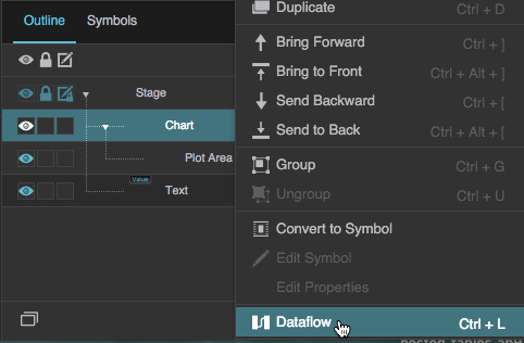
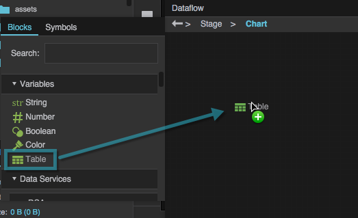
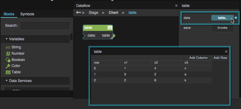
Typically, before you can design a chart or data grid, you must load a table in the dataflow.
To load a table, follow the steps in Working with Tables.
Tutorial: Create a Simple Chart
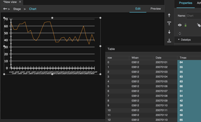
This tutorial shows quick steps for adding series and axes to a very basic chart, using data in your dataflow.
If you have not already done so, select the stage in the Outline or Document window, and select Insert > Charts > Chart.
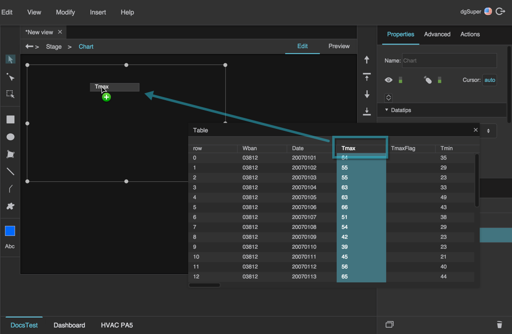
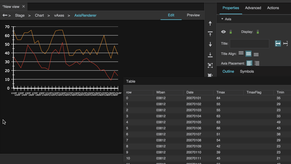
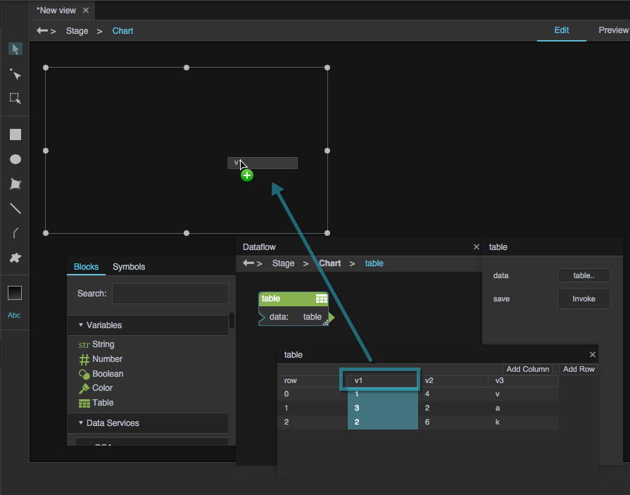
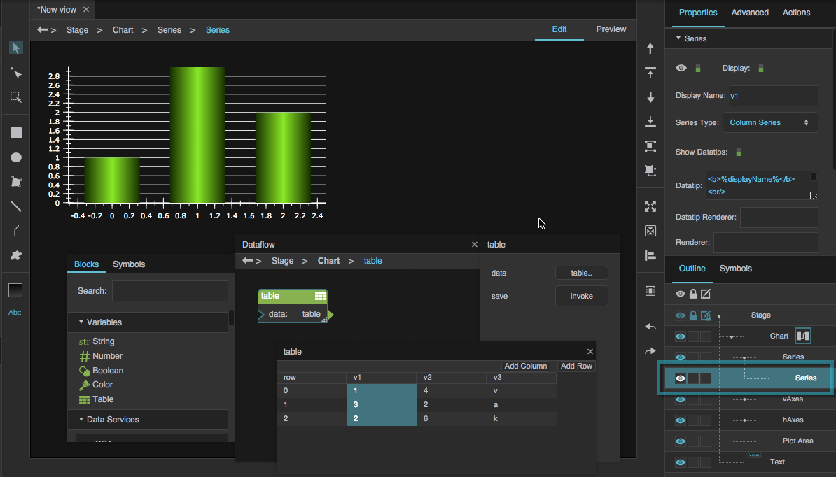
In your table, find the column that corresponds to the X value or Y value you want to use for a series, and drag the column header to your empty chart widget.
This only works in Edit mode.
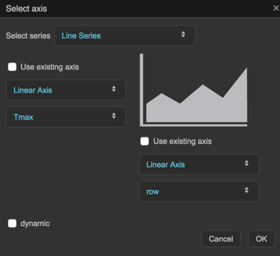
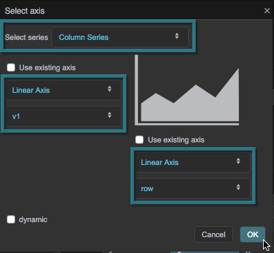
When you release the mouse button, a Select Axis pop-up panel opens.
Configure the Select Axis panel for the series:
- Select a series type, such as Line or Column.
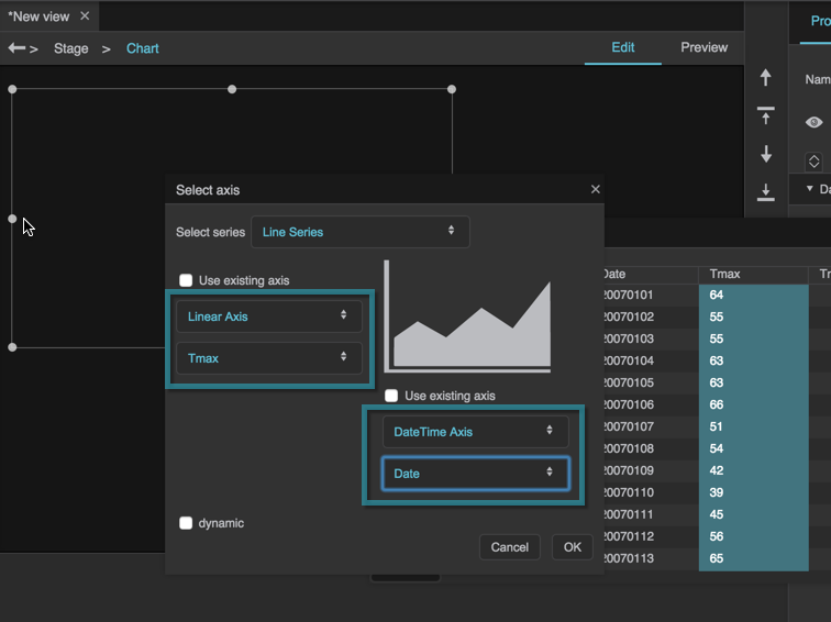
- For each axis, use the drop-down menu to select a table column name. For example, you might want to use date data on the x-axis and temperature data on the y-axis.
- For each axis, use the drop-down menu to select an axis type.
- Use a datetime axis for linearly progressing date and time.
- Use a linear axis for other linearly increasing values.
- Use a category axis when the data is not a number or date.
- For each axis, leave Use Existing Axis unchecked.
To add more series from the same table, repeat steps 2 and 3, except check Use Existing Axis for both axes.
Make sure to choose the same axis types as the first series, and use values with the same units.
Make sure that you don't drop table columns onto existing series. Drop table columns on some other part of the chart.
Set the properties that you want for each series.
Set the properties that you want for each axis.
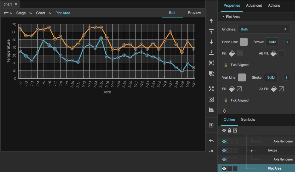
Set the properties that you want for the plot area.
Using Multiple Tables with Charts
With a linear, logarithmic, or datetime axis, each series can come from a different table.
With a category axis, all series must come from the same table.
Series Stacker
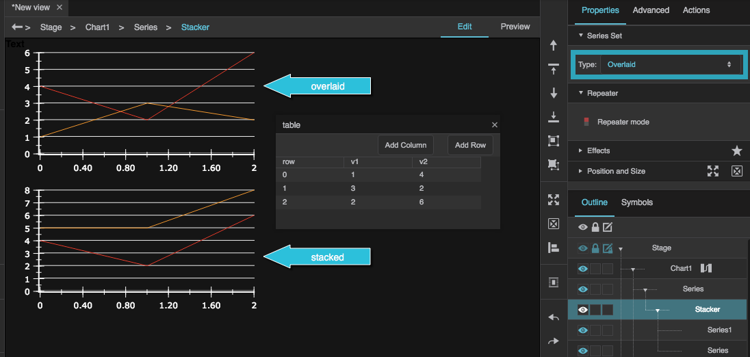
A series stacker groups multiple series that use the same axes. Within the group, series can be overlaid or stacked using the series stacker's Type property. Stacked series contribute to a total value, as shown in the following image.
To create a series stacker, select multiple series in the Outline, and then right-click the series and choose Group.
Chart Recorder Mode
The recorderMode property optimizes performance for line and area charts that are updated by adding a row to the end of the data and deleting a row from the beginning. In such a case, the recorderMode property causes the chart to update without reloading the unchanged values. One example of a situation where this happens is when the chart data is determined by a Realtime Recorder block with a full buffer.

An example of a chart that can use Recorder Mode
To use Chart Recorder Mode:
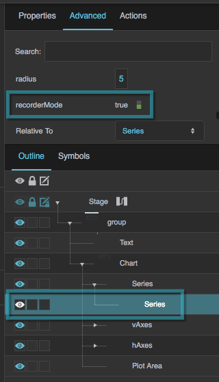
(Required) In the Outline, select the series, and in the Advanced Properties panel, set recorderMode to TRUE.
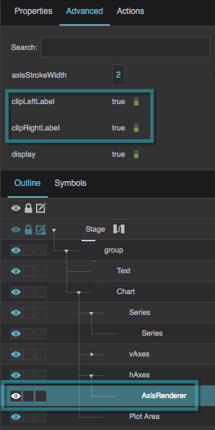
(Recommended) With the same axis renderer selected, in the Property Inspector, set Labels to Auto, and set Left/Right Label Threshold to 0.
Charts FAQ
This section provides answers to some common questions about creating charts in DGLux5.
Many chart modifications can be achieved either by manipulating the chart's table or by editing properties of the chart, series, axes, or plot area.
How do I edit chart properties?
How do I edit chart properties?
How do I edit chart properties?
In general, to edit properties for a chart or the elements it comprises:
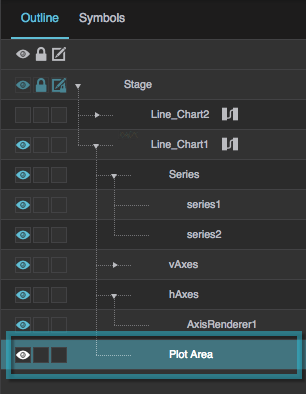
- Use the Outline to select a chart, series, axis renderer, or plot area.
- Use the Property Inspector to edit properties for the selected element.
For detailed information about each chart property, see the Chart Properties reference.
How do I change the data hover text?
How do I change the data hover text?
How do I change the data hover text?
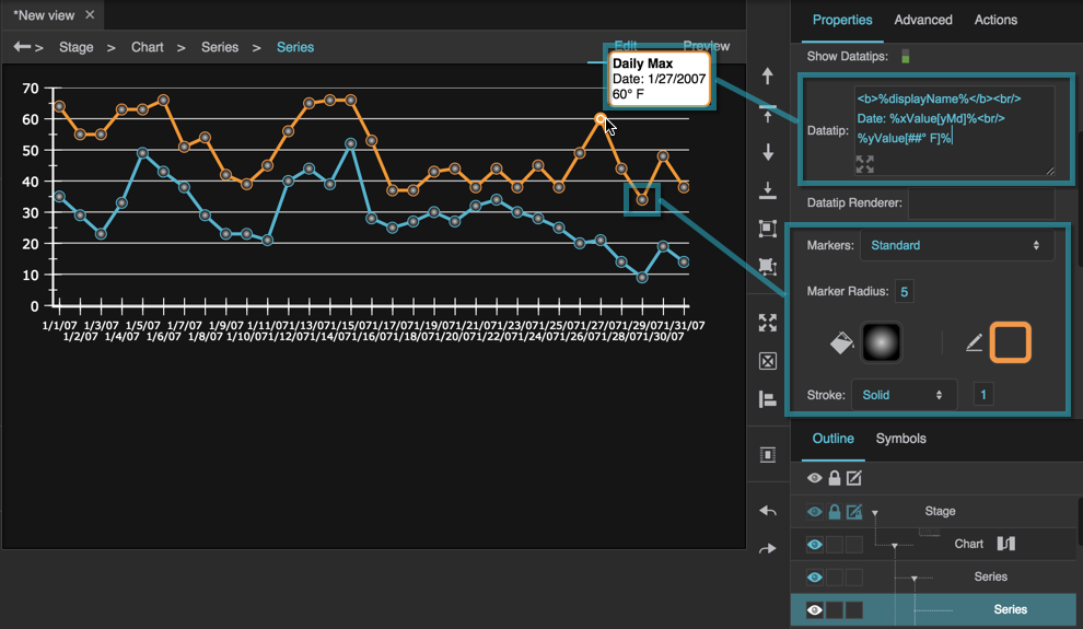
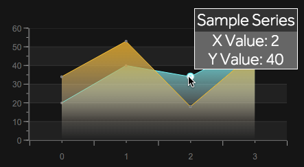
The hover text for a data point is called a datatip.
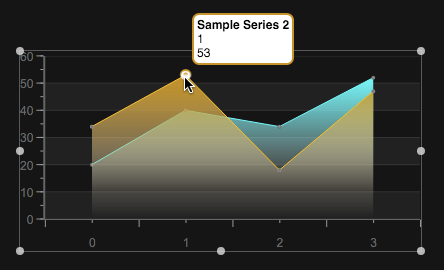
A datatip in DGLux5
To define whether datatips are shown for multiple series simultaneously, select the chart in the Outline, and use the Datatip Mode property.
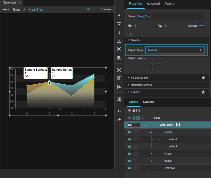
Multiple datatip mode
To define other aspects of datatips, first select the series in the Outline, and then:
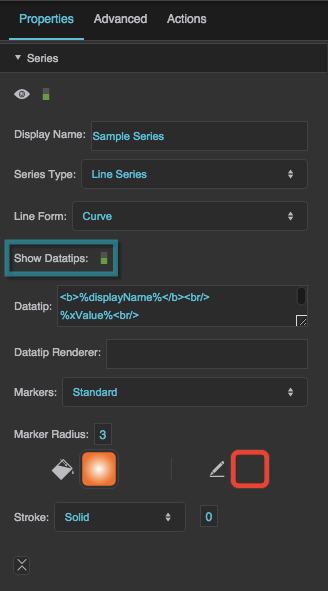
- Enable or disable datatips using the Show Datatips property.
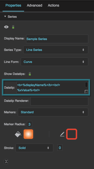
Change datatip text using the Datatip property.
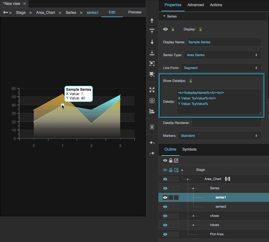
Use the text formatting tags that are listed in the Series Properties reference.
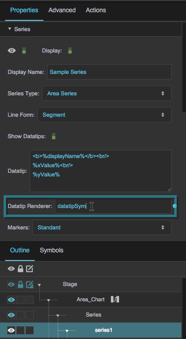
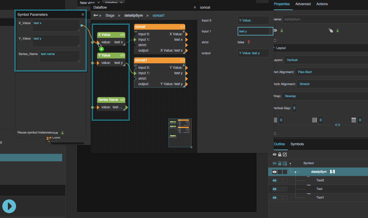
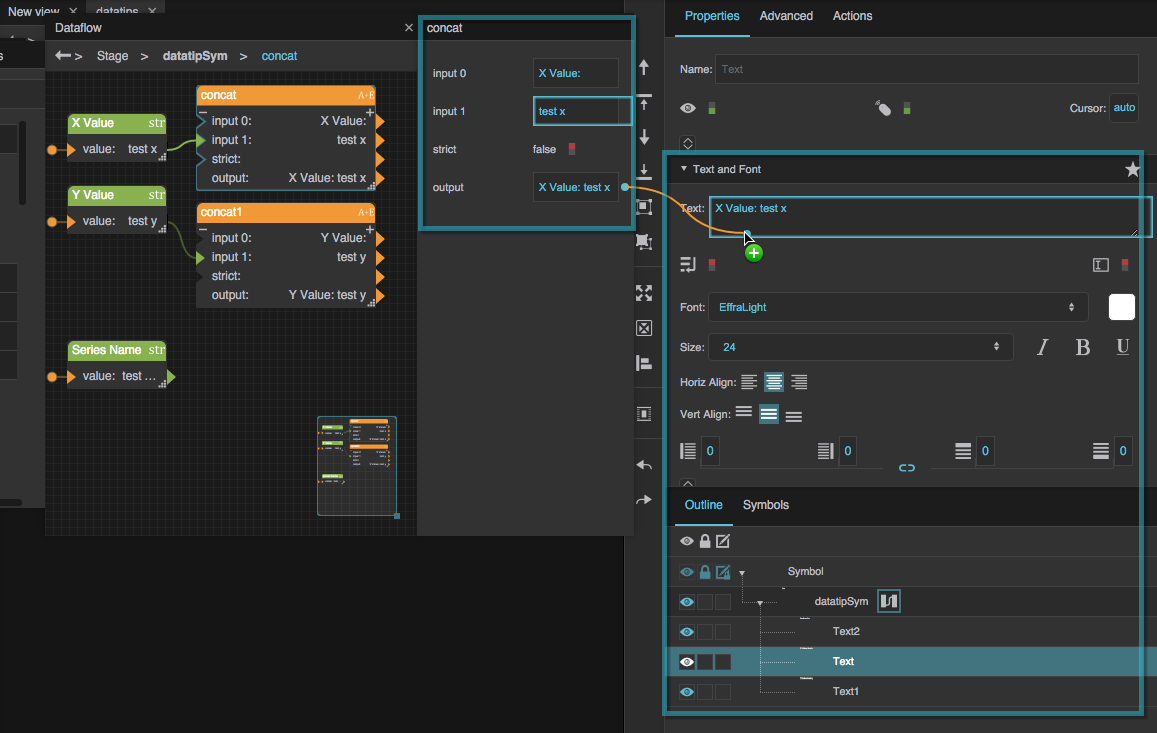
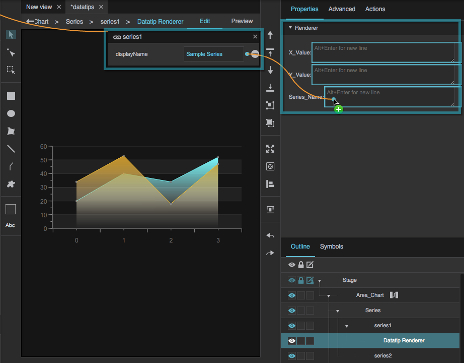
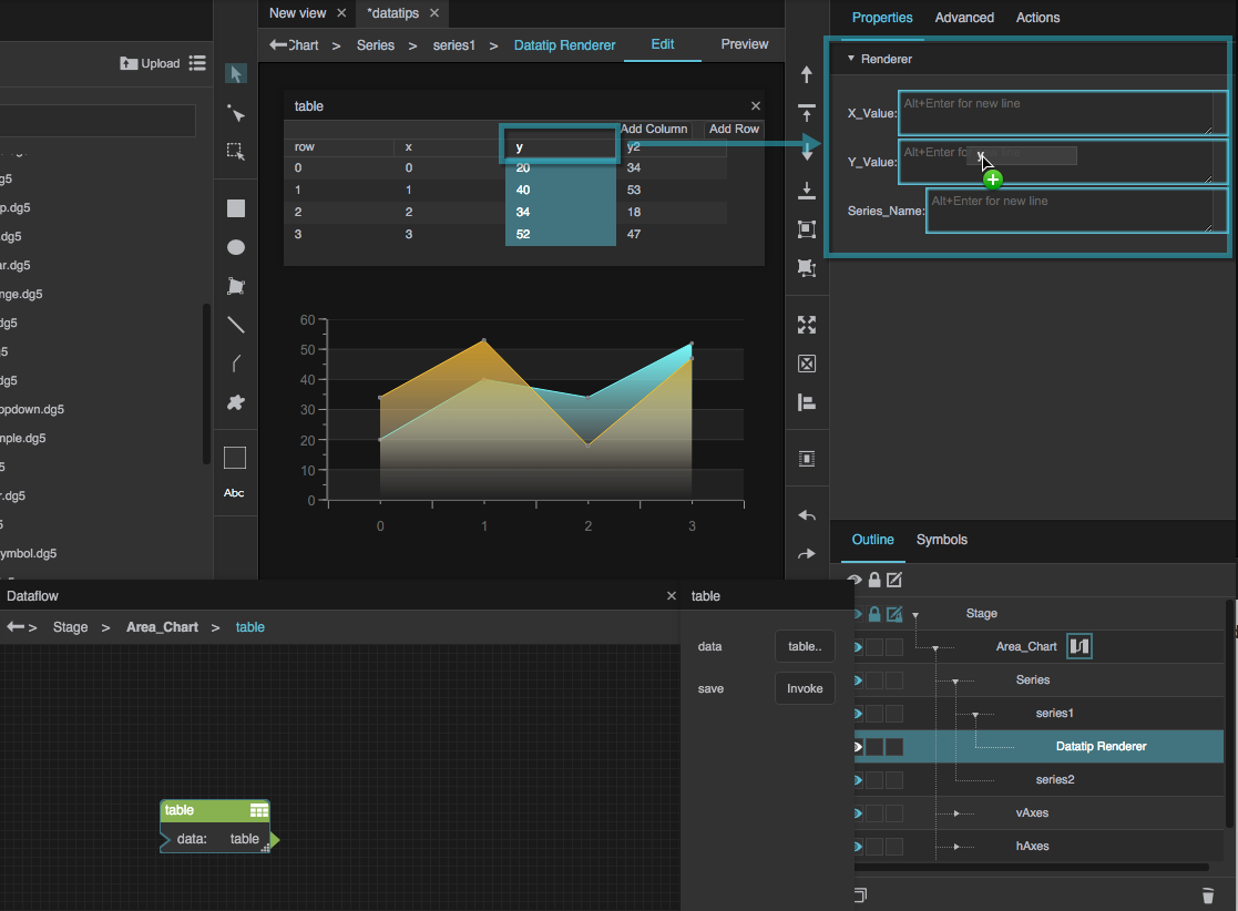
You can also specify a symbol to use for datatips. This symbol is rendered similarly to a repeater. This example shows you how to create this effect.
- Create a symbol.
Create symbol parameters, and bind the symbol parameters to String blocks inside dataflow for the symbol. Use Concatenate blocks to create the strings that you want to appear in the final datatip.
How do I style a line or area series?
How do I style a line or area series?
How do I style a line or area series?
First, in the Outline, select the series.
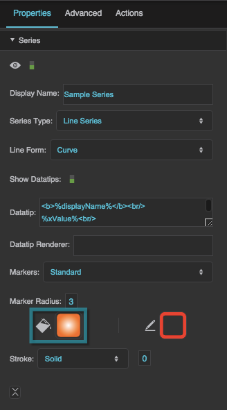
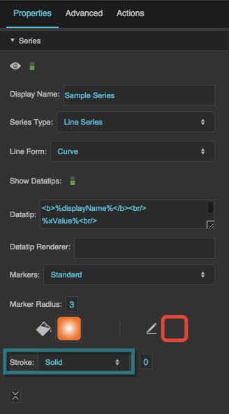
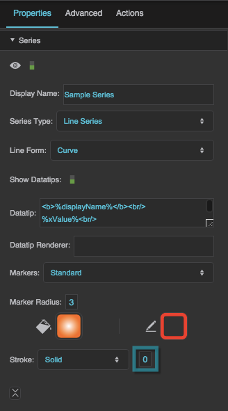
- Style the line and fill using the Fill and Stroke properties.
- Style the markers by selecting a value for Markers and then editing the properties that appear.
For more information, see Series Properties.
How do I style a column or bar series?
How do I style a column or bar series?
How do I style a column or bar series?
This video shows you how to customize a column series.
Video Tutorial: Customize Column Chart Series
More video tutorials are here.
First, in the Outline, select the series.
- Style the columns or bars using the Fill and Stroke properties.
Additionally, for column series:
- In the Advanced properties, use the columnWidthRatio property to change column width.
- Use the Column Series Offset property to move columns to the left and right by a portion of the maximum column width.
For more information, see Series Properties.
How do I animate a chart?
How do I animate a chart?
How do I animate a chart?
To make a series animate whenever its source table's data loads or its date range changes:
- In the Outline, select the series.
- Set the Series Animation property to your preferred animation type.
- For greater customization, edit the other series animation properties.
For more information, see Series Properties.
How do I change the range or type of an axis?
How do I change the range or type of an axis?
How do I change the range or type of an axis?
To change the range of an axis:
- In the Outline, select the axis renderer.
- In the Property Inspector, set the Auto Adjust property to FALSE.
Either set Base At Zero to FALSE, or set a specific range in the units of the axis using the Min and Max properties.
These are different from the read-only Axis Minimum and Axis Maximum properties.
To change the type of an axis, select the axis renderer in the Outline, and then use the Axis Type property.
You can also switch the minimum and maximum of the axis using the Inverted property.
For more information, see Axis Properties.
How do I change where labels or ticks appear on an axis?
How do I change where labels or ticks appear on an axis?
How do I change where labels or ticks appear on an axis?
To change the intervals between labels or ticks:
- In the Outline, select the axis renderer.
- In the Property Inspector, set the Auto Adjust property to FALSE.
- Use the Major Interval property for placement of labels and major ticks.
- Use the Minor Interval property for placement of minor ticks.
How do I edit and format the text in the axis title and labels?
How do I edit and format the text in the axis title and labels?
How do I edit and format the text in the axis title and labels?
First, in the Outline, select the axis renderer.
To edit and style the axis title:
- Use the Title property to enter a title for the entire axis.
- Use the top group of font styling properties to style the axis title.
- For a vertical axis, use the Vertical Axis Title Alignment property to determine which way the text faces.
To format and style the axis labels:
- Use the Format String property to specify a label format. For example, the string "0.00 meters" ensures that labels have two digits after the decimal and include the units "meters." See Scripting and Syntax for more information.
- If a title is defined, there are two groups of font styling properties in the Property Inspector. Use the lower of the two groups to style the axis labels.
- Use the Label Gap property to control the space between labels and the axis.
- Use the Label to Edge Gap property to control the space between labels and the edge of the component.
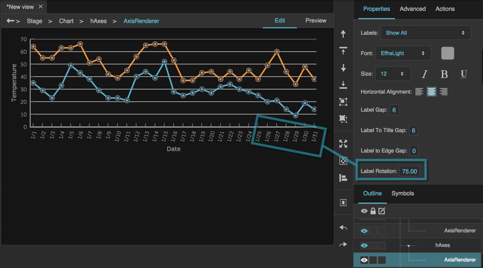
- Use the Label Rotation property to rotate labels.
How do I style axis lines?
How do I style axis lines?
How do I style axis lines?
To style the axis lines for a chart, select the axis renderer and use the Axis Stroke Color, Axis Stroke Style, and Axis Stroke Weight properties.
How do I zoom a chart?
How do I zoom a chart?
How do I zoom a chart?
You can zoom your chart, or you can enable the user to zoom in by dragging a marquee and zoom out by clicking. This does not work if your chart has a category axis.
In the Outline, select the plot area.
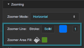
To enable the user to zoom, select a Zoomer Mode. See Plot Area Properties for more details.
How do I synchronize the zoom areas of two charts?
How do I synchronize the zoom areas of two charts?
How do I synchronize the zoom areas of two charts?
You can synchronize the zoom areas of two charts, so that zooming one causes the other to zoom to the same axis ranges. As with all chart zoom effects, this does not work with category axes.
To synchronize two charts' zoom areas:
- Follow the steps in How do I zoom a chart? to enable zooming for the charts.
- In the Outline, select the plot area for one of the charts.
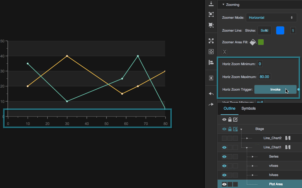
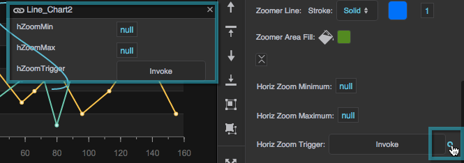
To synchronize horizontal zooming, hover over each of the following three properties until a blue dot appears, and then double-click each of the blue dots:
- Horiz Zoom Minimum
- Horiz Zoom Maximum
- Horiz Zoom Trigger
The properties are added to a small binding dialog.
- In the Outline, select the plot area for the other chart.
- To synchronize vertical zooming, repeat steps 3–6 for the vertical zoom properties.
The charts are now synchronized. Zooming one of the charts causes the other to zoom to the same axis ranges.
How do I create a custom item renderer?
How do I create a custom item renderer?
How do I create a custom item renderer?
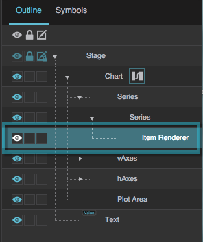
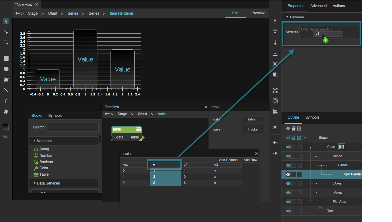
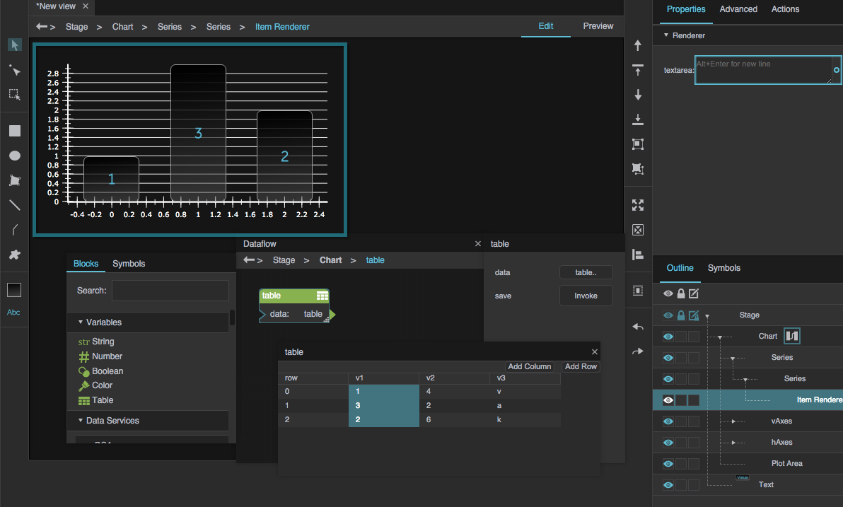
Similar to a repeater, a custom item renderer takes a symbol and uses it to represent each bar, column, or marker in a chart.
To create a simple custom item renderer:
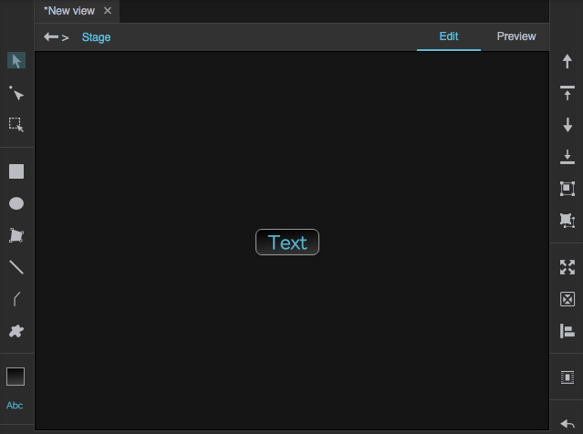
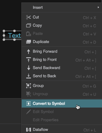
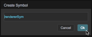
- Create the symbol:
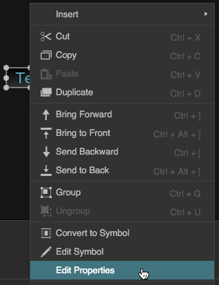
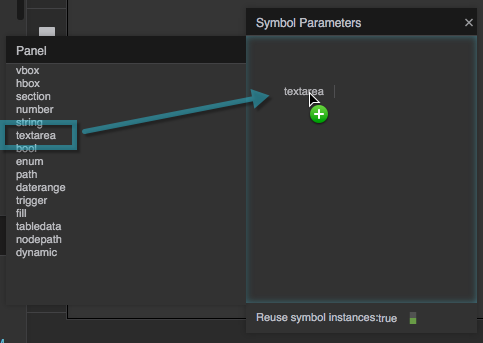
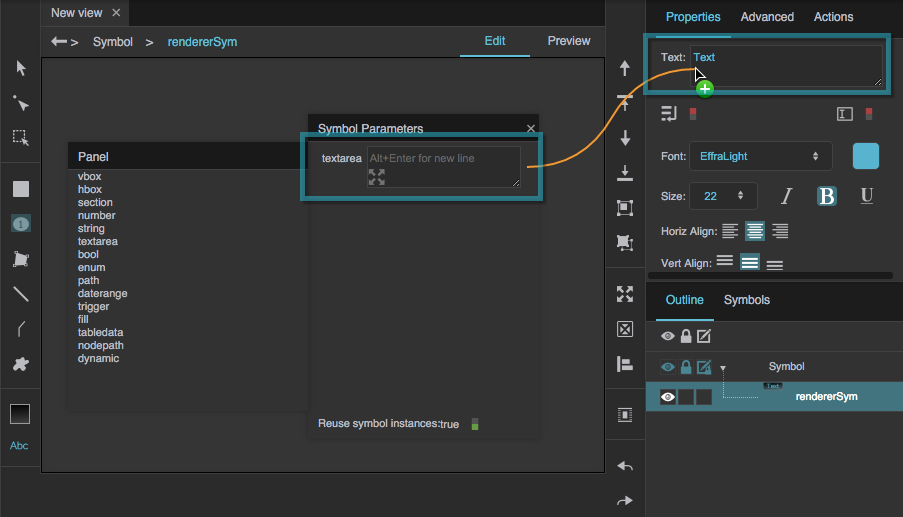
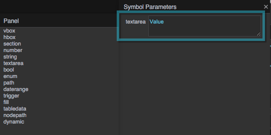
Insert a text component on the Stage.
- Create the chart:
In the Outline, select the series, and for the Renderer property, enter
rendererSym.Instances of the symbol replace the chart's columns.
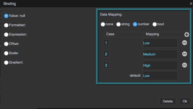
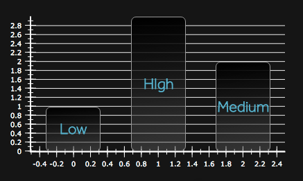
Alternatively, you can create a data mapping that assigns strings to a property depending on number ranges. For example, in the images below, the string "Low" is assigned when the value is 1 or lower, the string "Medium" when the value is above 1 and less than or equal to 2, and so on. For more information, see Bindings.
How do I save a chart for re-use?
How do I save a chart for re-use?
How do I save a chart for re-use?
To make a chart available for use in other projects, save it as a widget. See Widget Palette for more information.
How do I make a chart that compares different date ranges? (Multiple methods)
How do I make a chart that compares different date ranges? (Multiple methods)
How do I make a chart that compares different date ranges?
To overlay series for different data and time ranges, such as last year's data and this year's data, use Compare Mode. Alternatively, to compare ranges that are not supported in Compare Mode, you can use a category axis and column mapping.
Method 1: Compare Mode
These steps show one way to configure a chart to use Compare Mode:
- Insert a blank chart.
- Drag the data metric from the Metrics panel onto the chart. Configure the axes as appropriate, selecting datetime for one of them. Click OK.
- Drag the same data metric onto the chart a second time. Check Use existing axis for both axes, and click OK.
Open dataflow for the chart.
The dataflow includes two Load History blocks. One of them may be covering the other.
Select a timeRange for each of the two Load History blocks.
These time ranges are the ranges to be compared. Ensure that the ranges are the same range type. For example, each range could be a day, or each range could be a month.
- In the Outline, select the datetime axis.
In the Property Inspector, for the Compare Mode property, specify the appropriate Compare Mode type:
- None: Series with different dates and times are not aligned.
- Hour: For hour ranges, times within the hour are aligned. For longer ranges, times of day are aligned, so you can compare midnight with midnight.
- Day: Date ranges are aligned, so you can compare "day one" from different ranges.
- Week: Days of the week are aligned, so you can compare Mondays with Mondays.
- Month: Days of the month are aligned, so you can compare firsts of the month.
- Year: Days of the year are aligned, so you can compare January first with January first.
Method 2: category axis and column mapping
To use a range that is not supported by Compare Mode, create a custom comparison chart using a category axis and column mapping.
See this thread in the DGLogik user forum for an example. To create a custom range:
- Load a table that includes data for all of the dates.
- Using a Column Mapping block, create a column representing the category. For example, if you wanted to compare days in groups of 10, this column would hold the numbers 1 through 10.
- Create Filter or Select Rows blocks for each series, and filter the output of the Column Mapping block into separate tables for each series.
Create one chart series from each Filter output table.
Use a category axis instead of a datetime axis. For the category axis, use the column you created.
How do I change the data that a chart series is using? (Series property bindings)
How do I change the data that a chart series is using? (Series property bindings)
How do I change the data that a chart series is using?
If the data uses existing axes:
- Open dataflow for the chart.
- In the Outline, select the series.
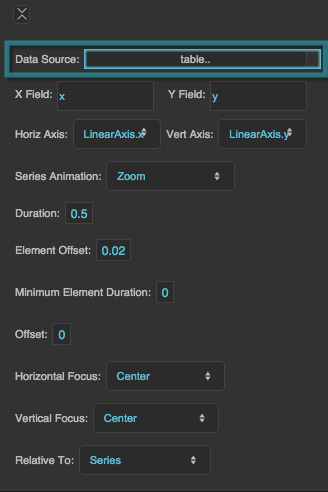
- Bind the appropriate table from dataflow to the Data Source property for the series.
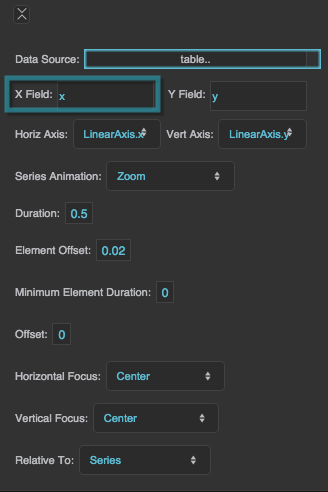
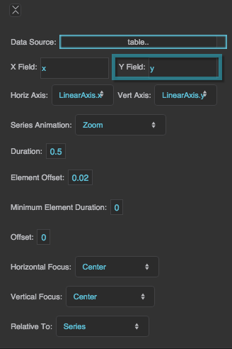
- If the column names are different, type the correct column names for the X Field and Y Field properties.
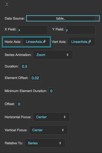
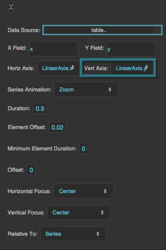
- Ensure the correct axes are selected for the Horiz Axis and Vert Axis properties.
In most cases, for example if you have just manipulated a table in dataflow, the data uses existing axes. However, if the data does not use existing axes, delete the old series and create a new one as described in Chart.
How do I use a master series to make the number of series dynamic?
How do I use a master series to make the number of series dynamic?
How do I use a master series to make the number of series dynamic?
A series repeater lets you work with a variable number of series. It also lets you create series formatting based on series index.
Video Tutorial: Series Repeater
Another series repeater tutorial is here. More video tutorials are here.
To create and style a chart whose number of series changes based on the source table:
- When you create a series, check Dynamic.
- In the Outline, click the "Series" node that is the parent of the "Master_Series" node.
- In the Property Inspector, for Type, select Overlaid.
- In the Outline, open the dataflow for the "Master_Series" node.
- Configure a Case block:
- Add a Case block to the dataflow.
- Add one case n value for each series index number expected.
- Set the case n values to the series indexes: 0, 1, 2….
- Bind the Case block's output property to the relevant property of the master series, such as Stroke Color.
- If you want, repeat step 5 with additional properties.
In the Master Series properties, click the Invoke trigger for the Update Repeater property.
Now, each series in the chart has its own color.
See this video and this video for more information.
How do I create a bar min repeater?
How do I create a bar min repeater?
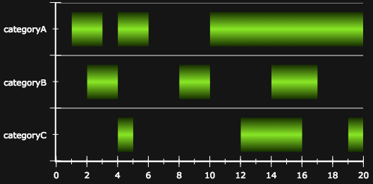
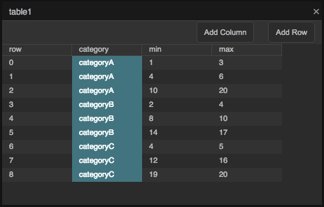
How do I create a bar min repeater? A bar min repeater allows a single bar to have multiple minimum and maximum values, giving the appearance of a stopping and starting bar. The following image shows an example of a bar min repeater.
To create a bar min repeater:
- Insert a chart component.
- As shown in the images below, create a table that has the following columns with sample data:
- category
- minimum
- maximum
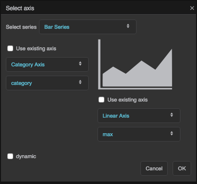
- Add the series:
- Drag a table column to the chart.
- For Select series, choose Bar Series.
- For the Y-axis, specify a Category Axis and the category table column name.
- For the X-axis, specify a Linear Axis and the maximum table column name.
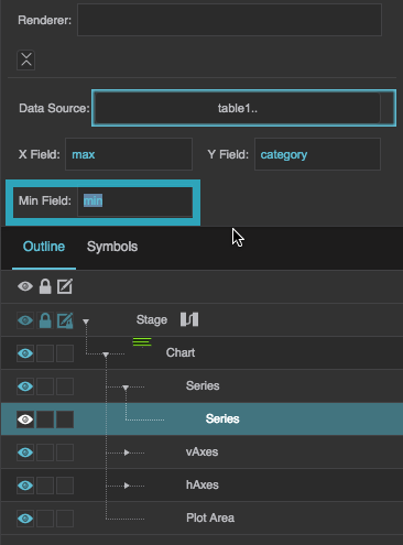
- With the series selected in the Outline, set the Min Field property to the minimum table column name.
The following images demonstrate how to create a bar min repeater:
How do I enable the user to select which series to display?
How do I enable the user to select which series to display?
How do I enable the user to select which series to display?
There are several ways to enable the user to select which series to display. This is one example:
- Create a chart with a dynamic number of series.
- Create a component for the user to interact with, such as a List component.
- For the List component’s Options property, list the descriptors for each series, in the same order as the series indexes.
- Open dataflow for the Master Series, and create an If block:
- Add the If block.
- Bind the Series Index property of the master series to the block's input 1 property.
- Bind the Selected Index property of the list element to the block’s input 2 property.
- Set op to “equals”.
- For then, type the string "TRUE".
- For else, type the string "FALSE".
- Bind the block’s output property to the
 Visible property of the master series.
 In the master series properties, click Invoke to update the series repeater.
Now, selecting an item in the list component displays that item's series in the chart.
How do I enable the user to select a range for a datetime axis?
How do I enable the user to select a range for a datetime axis?
How do I enable the user to select a range for a datetime axis?
There are several ways to enable the user to select a range for the datetime axis. For example, if your table comes from a block with a timeRange property, such as the Load History or Multi-Histories block:
- Create a date range picker component for the user to interact with.
- Bind the Value property of the date range picker to the timeRange property of the block.
Video Tutorial: Bind Date Range to Chart This video shows how to create a binding between a date range picker and a chart.
You must also make sure the table gets loaded. You can do this by setting an interval value for the block that loads your table, or by doing the following:
- Create a Hub block with one input property.
- Bind the timeRange property of the block that loads your table to the input 0 property of the Hub block.
- Bind the onChange property of the Hub block to the invoke property of the block that loads your table.
Chart Properties
These property groups apply to charts.
For a guide to using chart widgets, see Designing Charts.
These property groups apply to line, area, bar, and column charts:
- Datatips properties affect the hover text for data points.
- Series properties affect the styling of line, area, bar, column, or bubble series, including animation.
- Axis properties affect the styling of chart axes.
- Plot Area properties affect the styling of the chart plot area, including zooming.
These property groups apply to pie charts:
- Pie Chart properties affect the entire pie chart.
- Datatips properties affect the hover text for wedges.
- Pie Series properties affect the styling of chart series, including animation.
- Wedge Fills properties affect the colors of the pie chart.
- Labels properties affect the labels of the pie wedges.
Charts are also affected by Common Properties.
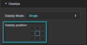
Datatips Properties
These properties affect the chart datatips. Datatips appear when the user mouses over data points.
For a guide to using charts, see Designing Charts.
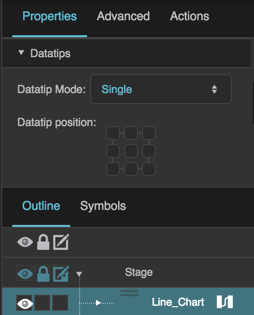
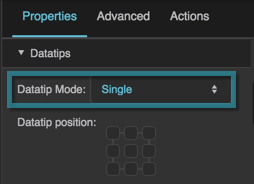
The Datatips properties in the Property Inspector
Datatip Mode
Datatip Mode
Datatip Mode
Defines datatip behavior.
None
No datatips are displayed.
Single
When the user mouses over a data point, a datatip is displayed. Only one datatip is displayed at a time.
Multiple
When the user mouses over a data point, a datatip is displayed. If points from multiple series exist at the moused-over position, multiple datatips are displayed. Only one datatip is displayed per series.
Series Properties
These properties affect a line, area, bar, column, or bubble series. Which properties are available depends on whether you have selected a line, area, bar, or column series, or whether you inserted a pre-made bubble chart widget. For pie chart properties, see Pie Chart Properties.
For a guide to using charts, see Designing Charts.
Series can also be affected by Fill and Stroke properties and Selection properties.

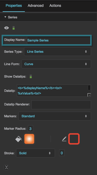
Series properties in the Property Inspector
Display Name
Display Name
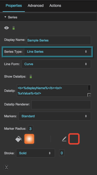
Series Type
Series Type
Series Type
Defines how the series data is visually represented.
Line series
Markers represent the data points. Lines connect the markers.
Area series
Markers represent the data points. Lines connect the markers, and the area delimited by the lines is filled in.
Bar series
Horizontal bars represent the data points.
Column series
Vertical columns represent the data points.
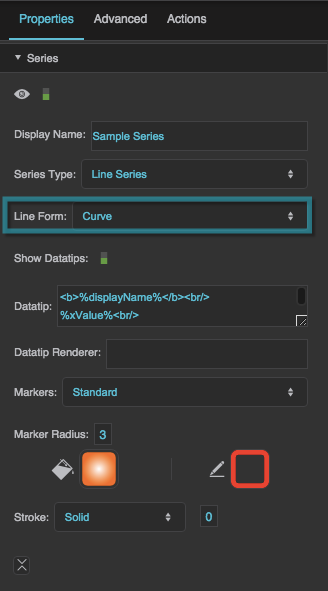
Line Form
Line Form
Line Form
Defines the shape of the lines in a line or area series.
Segment
Markers are connected using line segments.
Step
Markers are connected using orthogonal line segments. Horizontal and vertical segments alternate, beginning with a horizontal segment.
ReverseStep
Data points are connected using orthogonal line segments. Vertical and horizontal segments alternate, beginning with a vertical segment.
Vertical
Only the vertical segments from a Step line form are displayed.
Horizontal
Only the horizontal segments from a Step line form are displayed.
Curve
Markers are connected using a curve.
Show Datatips
Show Datatips
Datatip
Datatip
Datatip
Configures the text displayed in a datatip for a series. Use the tags listed below to format the datatip and include data.
HTML tags
Include these tags to format the datatip:
<br/>— line break<b>insert text here</b>— bold<i>insert text here</i>— italic
Including data
Include these tags to show values from the data:
%displayName%— the Display Name property for this series%xValue%— the X value of the point%yValue%— the Y value of the point%value%— the value of the pie wedge%yValueTotal%— The sum of the Y values for this point and other points in this table row. Only includes points from this series and others that appear above it inside this series stacker.%A%— Replace A with the name of a column to show the value of that column.
Formatting numbers
To control how a number is formatted, include a format string inside brackets, before the final percent sign. For example:
%yValue[,##0.00]%— the Y value with a thousands separator and two decimal digits%value[000.00]%— the pie wedge value with three mandatory digits before the decimal, and two mandatory digits after the decimal.
For number formatting help, see Scripting and Syntax.
Formatting dates
To control how a date is formatted, include a format string inside brackets, before the final percent sign. For example:
%xValue[yy/MM/dd]%— the X value as a date with a two-digit year, two-digit month, and two-digit day%xValue[y MMMM dd]%— the X value as a date with the full year, the name of the month, and a two-digit day%xValue[yy/MM/dd HH:mm:ss]%— the X value as a date and time%xValue[yMd]%— the X value as a localized short date pattern. The pattern will be different based on the locale.%xValue[yMMMd| |Hms]%— the X value as a localized date and time. The pattern will be different based on the locale. In this example, vertical bar symbols (|) are used to join three patterns: one for the localized date, one that contains a space, and one for the localized time.
For date formatting help, see Scripting and Syntax.
Datatip Renderer
Datatip Renderer
Datatip Renderer
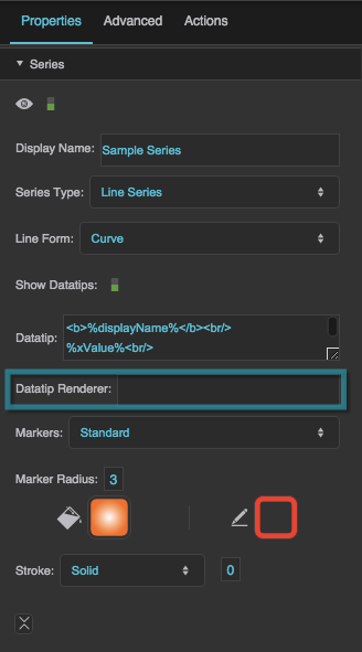
Specifies the symbol to use as the datatip for the series. This property overrides any text entered in the Datatip property. To use a symbol from this project, enter the name of the symbol. To use a symbol from another project in your library, enter the path to that symbol.
When you populate this field with a symbol, the datatip renderer appears in the Outline as a child of this series, and you can bind table columns to symbol properties in the Property Inspector.
Markers
Markers
Markers
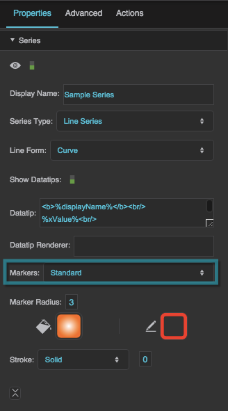
Defines the type of markers used by this series. Markers are used to visually represent each data point in the series, in addition to the line or shape that represents the entire series.
None
No markers are used by this series.
Standard
This series uses DGLux5’s standard marker design, a circle with a customizable fill, stroke, and size.
Custom
This series uses the specified symbol as a marker.
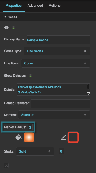
Marker Radius
Marker Radius
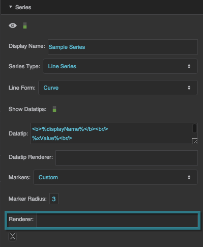
Marker Renderer
Marker Renderer
Marker Renderer
Specifies the symbol to use for custom markers. To use a symbol from this project, enter the name of the symbol. To use a symbol from another project in your library, enter the path to that symbol.
When you populate this field with a symbol, the marker's item renderer appears in the Outline as a child of this series, and you can bind table columns to symbol properties in the Property Inspector.
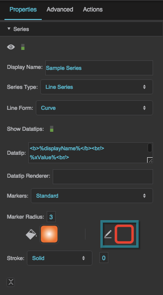
Marker Stroke Color
Marker Stroke Color
Marker Stroke Style
Marker Stroke Style
Marker Stroke Weight
Marker Stroke Weight
Data Source
Data Source
X Field
X Field
Y Field
Y Field
Column Series Offset
Column Series Offset
Column Series Offset
Moves columns to the left or right by a portion of the maximum column width. The maximum column width is equal to 1/n of the plot area width, with n being the total number of columns for the chart.
A Column Series Offset of −0.1 moves the columns to the left by 10% of this maximum width. A Column Series Offset of 0.1 moves the columns to the right by 10% of this maximum width.
This property is related to the Column Width Ratio property for the chart. The Column Width Ratio determines the width of each column in the chart as a percentage of the maximum column width.
Example
The Column Width Ratio is 60%, and there are two series. To offset the columns in series 1 by 10% of their width, use the value (0.6 / 2) * 0.1 = 0.03 for Column Series Offset.
Horizontal Axis
Horizontal Axis
Vertical Axis
Vertical Axis
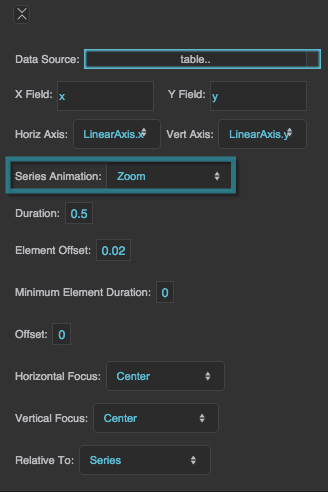
Series Animation
Series Animation
Series Animation
Defines animation behavior for this series.
None
An updated chart replaces the old chart without any animation.
Interpolate
The series goes through a smooth transition, with the old chart as the first frame and the new chart as the final frame.
Slide
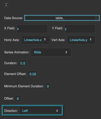
The series "slides" in and out of the chart boundaries from a direction that you specify.
Zoom
The series "implodes" and "explodes" from a focal point that you specify.
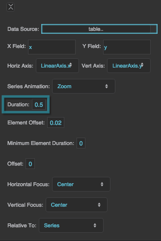
Duration
Duration
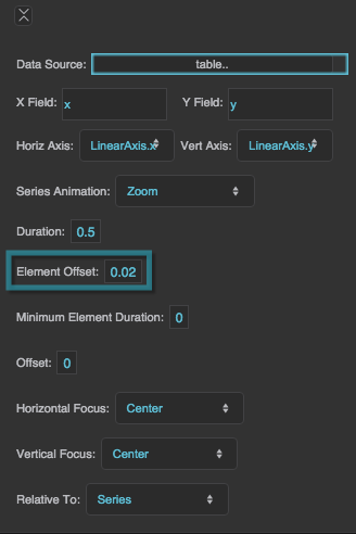
Element Offset
Element Offset
Element Offset
Specifies the amount of time, in seconds, that the animation of each element in the series is delayed. A value of zero means that all elements in the series begin animating at the same time and finish at the same time. A value of 1 means that the second element starts and finishes animating one second after the first element, and so on.
The Element Offset and Minimum Element Duration properties can cause the animation duration to be longer than that specified by the Duration property.
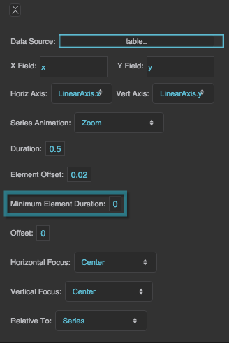
Minimum Element Duration
Minimum Element Duration
Minimum Element Duration
Specifies the minimum amount of time, in seconds, that an individual element takes to complete the animation.
The Element Offset and Minimum Element Duration properties can cause the animation duration to be longer than that specified by the Duration property.
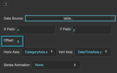
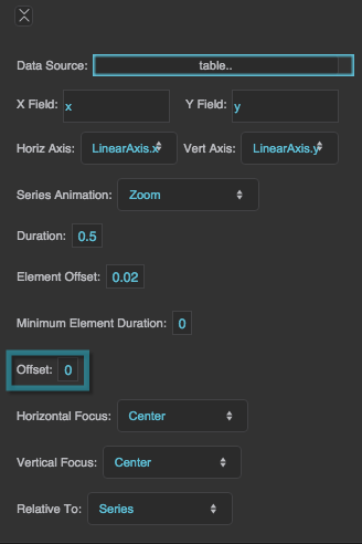
Offset
Offset
Easing
Easing
Easing
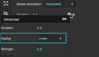
Specifies the rate of change over time for this animation.
Linear
The animation's rate of change is constant.
Ease In
The animation starts slowly and accelerates linearly as it executes.
Ease Out
The animation starts with a fast change rate and decelerates linearly as it executes.
Ease In Out
The animation starts slowly, accelerates linearly, and then decelerates linearly as it executes.
Cubic In
The animation starts slowly and accelerates cubically as it executes.
Cubic Out
The animation starts with a fast change rate and decelerates cubically as it executes.
Cubic In Out
The animation starts slowly, accelerates cubically, and then decelerates cubically as it executes.
Elastic In
The animation's rate of change starts on a small-amplitude sine wave. The sine wave grows as the animation executes.
Elastic Out
The animation's rate of change starts on a large-amplitude sine wave. The sine wave decays as the animation executes.
Elastic In Out
The animation's rate of change starts on a small-amplitude sine wave. The sine wave grows and then decays as the animation executes.
Bounce
The animation starts with a fast change rate, and decelerates to zero with an effect similar to a ball falling and bouncing on a floor.
Strength
Strength
Strength
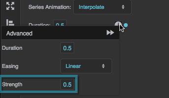
Affects the differential or the change rate of the easing function. A value of 0.5 is the default. Values below 0.5 decrease the differential or the change rate, making the easing appear less pronounced. Values above 0.5 increase the differential or the change rate, making the easing appear more pronounced.
Direction
Direction
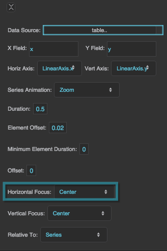
Horizontal Focus
Horizontal Focus
Horizontal Focus
Together with Vertical Focus and Relative To, determines the focal point of the zoom animation.
Left
The zoom animation begins at the left of the bounding box defined in Relative To.
Right
The zoom animation begins at the right of the bounding box defined in Relative To.
Center
The zoom animation begins at the horizontal center of the bounding box defined in Relative To.
Null
If Horizontal Focus is null, and Vertical Focus is not null, then the focus is a horizontal line rather than a point. If both values are null, then the focal point is the center of the bounding box.
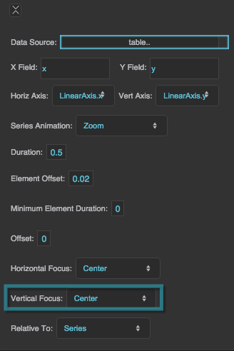
Vertical Focus
Vertical Focus
Vertical Focus
Together with Horizontal Focus and Relative To, determines the focal point of the zoom animation.
Top
The zoom animation begins at the top of the bounding box defined in Relative To.
Bottom
The zoom animation begins at the bottom of the bounding box defined in Relative To.
Center
The zoom animation begins at the vertical center of the bounding box defined in Relative To.
Null
If Vertical Focus is null, and Horizontal Focus is not null, then the focus is a vertical line rather than a point. If both values are null, then the focal point is the center of the bounding box.
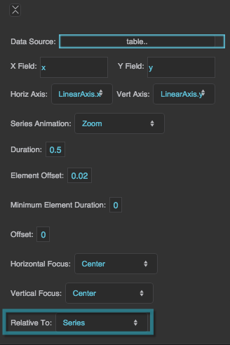
Relative To
Relative To
Relative To
Controls the bounding box used to determine the focal point of the zoom animation. Used together with Horizontal Focus and Vertical Focus.
Series
The bounding box tightly surrounds the horizontal and vertical minimums and maximums of the series data.
Chart
The bounding box tightly surrounds the plot area of the chart.
Axis Properties
These properties affect horizontal and vertical axes for charts.
For a guide to using charts, see Designing Charts.
Axes can also be affected using Effects properties.

Axis properties in the Property Inspector
Plot Area Properties
These properties affect the plot area and zooming for a chart.
For a guide to using charts, see Designing Charts.

General Plot Area properties and Zooming properties in the Property Inspector
Pie Chart Properties
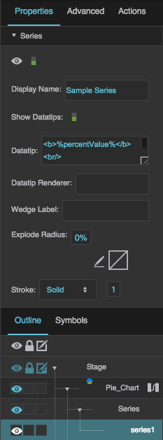
These properties affect pie charts. For pie charts, you can customize properties for the chart, series, wedge fills, and labels.
For a guide to using pie charts, see Pie Chart.
Pie charts are also affected by Common Properties and Datatips Properties.
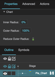
General Pie Chart Properties
These properties affect the entire pie chart.
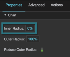
Inner Radius
Inner Radius
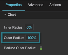
Outer Radius
Outer Radius
Outer Radius
Defines the radius of this pie chart, as a percentage of the radius of the largest pie chart that would fit. This depends on container size.
If the Reduce Outer Radius property is TRUE, then the radius size might be automatically reduced in order to fit labels or other elements.
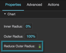
Reduce Outer Radius
Reduce Outer Radius
Reduce Outer Radius
Defines whether the pie chart radius shrinks automatically in order to fit labels or other elements.
TRUE
The pie chart radius might be smaller than that determined by the Outer Radius property, in order to fit labels or other elements.
FALSE
The pie chart size is determined by the Outer Radius property only.
Pie Chart Series Properties
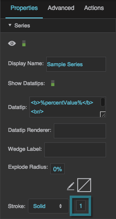
These properties affect a pie chart series.
Visible
Visible
Visible
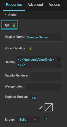
Defines whether this series is visible. Regardless of value, the series affects layout and is stored in the user's browser memory. Because the series is stored in memory, performance might be affected.
TRUE
The series is visible.
FALSE
The series is not visible, but still affects layout and is stored in browser memory.
Display Name
Display Name
Show Datatips
Show Datatips
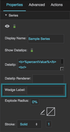
Wedge Label
Wedge Label
Wedge Label
Configures the text displayed in wedge labels for this series. Use the same tags you would use for a datatip.
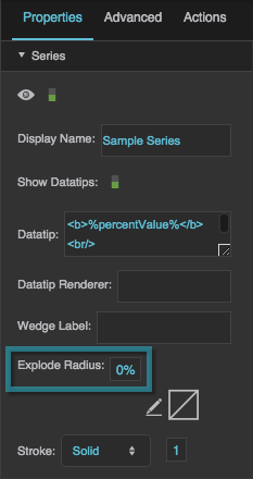
Explode Radius
Explode Radius
Radial Stroke Color
Radial Stroke Color
Radial Stroke Style
Radial Stroke Style
Radial Stroke Weight
Radial Stroke Weight
Pie Chart Wedge Fill Properties
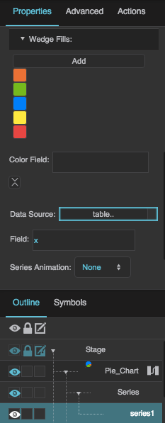
These properties affect the pie chart colors.
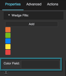
Color Field
Color Field
Color Field
Specifies the table column that contains data from which to determine wedge colors. The following formats are supported:
- #EEE: Any shortened, three-digit hexadecimal color string, including the # symbol.
- #FF00FF: Any hexadecimal color string, including the # symbol.
- rgba(255, 0, 0, 0.5): Any RGBA color string, including "rgba" and the parentheses.
You can also specify colors in the Property Inspector by expanding Wedge Fills.
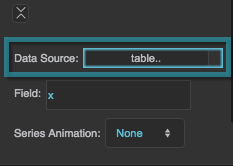
Data Source
Data Source
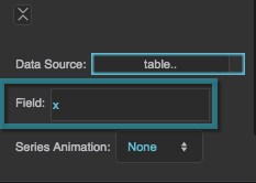
Field
Field
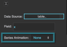
Series Animation
Series Animation
Series Animation
See General Series Properties.
Pie Chart Labels Properties
These properties affect the placement and appearance of pie chart labels.
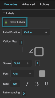
Show Labels
Show Labels
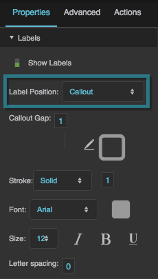
Label Position
Label Position
Label Position
Defines the position of the labels.
None
There are no labels.
Outside
Labels are positioned for each pie wedge, near the outer edge of the pie series. Labels might be inside or outside the wedges, depending on the outer radius of the series.
Callout
Labels are positioned outside of the chart, with callout lines.
Inside
Labels are positioned inside each pie wedge.
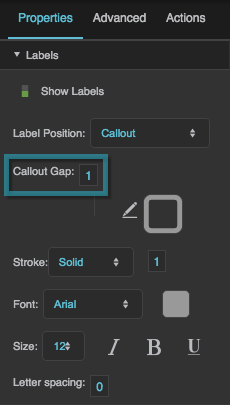
Callout Gap
Callout Gap
Callout Gap
Defines the amount of empty space, in pixels, that is added to the gap between the edge of the pie and the edge of the labels. Does not define the entire gap, but rather the amount that is added to the default gap. A negative value makes the gap smaller than the default.
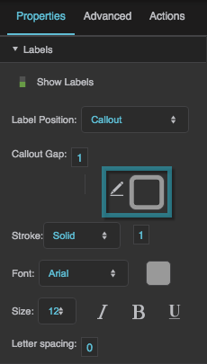
Callout Stroke Color
Callout Stroke Color
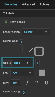
Callout Stroke Style
Callout Stroke Style
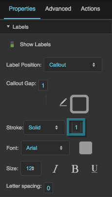
Callout Stroke Weight
Callout Stroke Weight
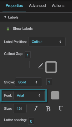
Font
Font
Font
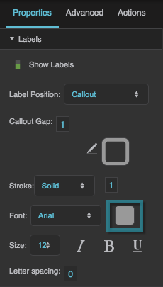
Defines the font for the wedge callout labels. To add a font to this project and use it for this property, see Text Component Properties.
Font Color
Font Color
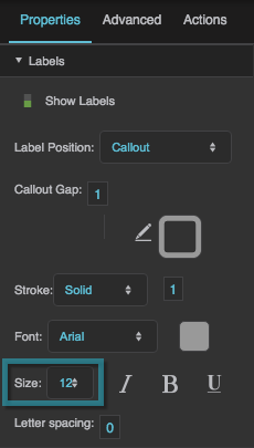
Font Size
Font Size
Video Tutorial: Customize Column Chart Series
More Resources
These threads in the DGLogik Community Forum show some use cases for charts:

