Table of Contents
Fill and Stroke Properties
These properties affect the background and border of the element.
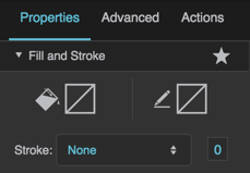
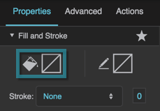
Fill and Stroke properties in the Property Inspector
Fill Properties
These properties affect the element background.
Gradient Editing
Any time you customize a gradient in DGLux5:
- To change a color value, click the small square below the track in the dialog, and then use the color picker.
- To add a color to the gradient, click below the track in the dialog.
- To delete a color from the gradient, right-click the small square.
- Drag colors to move them.
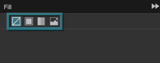
Fill Type
Fill Type
Fill Type
Defines the type of fill for this element.
 No fill
The element has no fill.
 Solid color
The element is filled with a single color that you specify.
 Gradient
The element is filled with a gradient that you specify.
 Image
Image
The element is filled using an image that you specify.
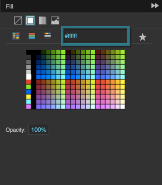
Fill Color
Fill Color
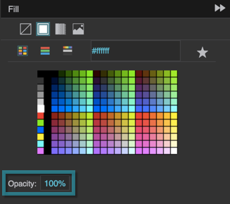
Fill Opacity
Fill Opacity
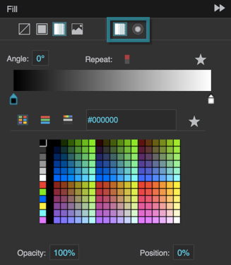
Gradient Type
Gradient Type
Gradient Type
Specifies whether a radial or linear gradient fills this element. To add colors to the gradient, click below the track in the dialog. To delete colors, right-click on them. To move colors, left-click them and drag.
 Linear
The gradient is defined by a linear axis.
 Radial
The gradient is defined by a circle or an ellipse.
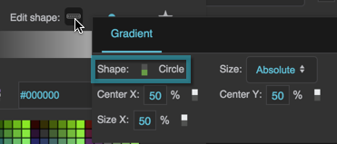
Radial Gradient Shape
Radial Gradient Shape
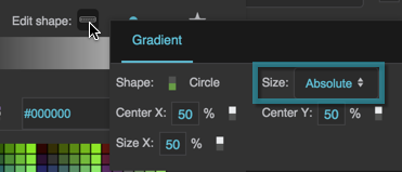
Radial Gradient Size
Radial Gradient Size
Radial Gradient Size
Specifies the size of the circle or ellipse that defines this radial gradient.
Absolute
You specify a value for the horizontal radius. If the shape is an ellipse, you also specify a value for the vertical radius.
Farthest Corner
The edge of the circle or ellipse meets the corner of the container that is farthest from the circle or ellipse's center.
Closest Side
If the shape is a circle, its edge meets the container edge closest to its center. If the shape is an ellipse, its edge meets the two container edges closest to its center.
Farthest Side
If the shape is a circle, its edge meets the container edge farthest from its center. If the shape is an ellipse, its edge meets the two container edges farthest from its center.
Closest Corner
The edge of the circle or ellipse meets the corner of the container that is closest to the circle or ellipse's center.
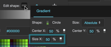
Radial Gradient Size X
Radial Gradient Size X
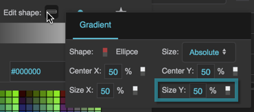
Radial Gradient Size Y
Radial Gradient Size Y
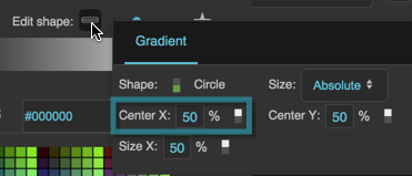
Radial Gradient Center X
Radial Gradient Center X
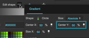
Radial Gradient Center Y
Radial Gradient Center Y
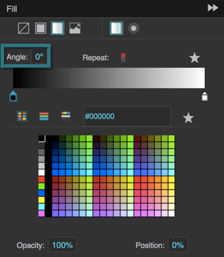
Gradient Angle
Gradient Angle
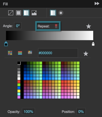
Gradient Repeat
Gradient Repeat
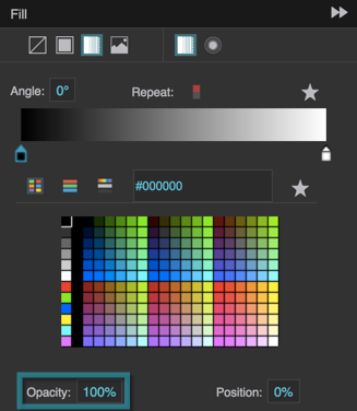
Gradient Color Opacity
Gradient Color Opacity
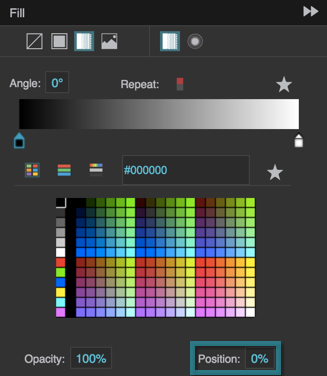
Gradient Color Position
Gradient Color Position
Fill URL
Fill URL
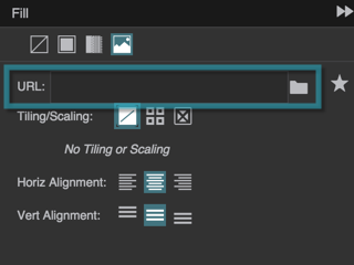
Fill URL
Specifies the location of the image that fills this element. Click the folder icon to select or upload an image, or enter a relative URL within the project, such as assets/image.png. You can also enter any absolute URL, even if it is outside of your project or DGLux.
You can use any image format that is supported by the user's browser.
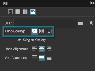
Fill Tiling and Scaling
Fill Tiling and Scaling
Fill Tiling and Scaling
The Fill Tiling and Scaling properties are similar to the tiling and scaling properties for images.
Stroke Properties
These properties affect the element border.
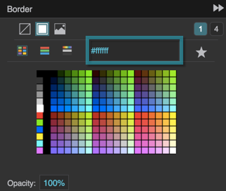
Border
Border
Border
Opens the Border dialog for defining the border for this element.
Borders are part of an object's width and height. See Borders, Padding, and Content Size.
Border Type
Border Type
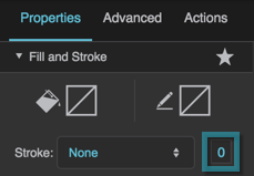
Border Width
Border Width
Border Width
Defines the stroke weight or border width for outlining this element.
Borders are part of an object's width and height. See Borders, Padding, and Content Size.
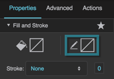
Stroke Color
Stroke Color
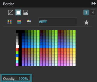
Stroke Opacity
Stroke Opacity
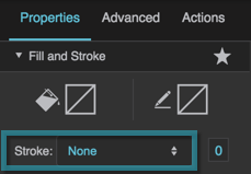
Stroke Style
Stroke Style
Border URL
Border URL
Border URL
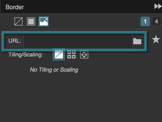
Defines the location of the image that is used for this element's border. Click the folder icon to select or upload an image, or enter a relative URL within the project, such as assets/image.png. You can also enter any absolute URL, even if it is outside of your project or DGLux.
Only works if the Border Width property is more than zero.
You can use any image format that is supported by the user's browser.
Border Tiling/Scaling
Border Tiling/Scaling
Border Tiling/Scaling
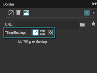
Determines whether the image tiles or scales around the border.
 No Tiling
The image does not tile. An image larger than the allotted space is clipped.
 Tiling
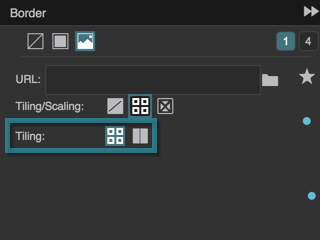
The image tiles to fill the border either horizontally, vertically, or both horizontally and vertically. Image corners are placed in the corresponding corners of the container.
 Scaling
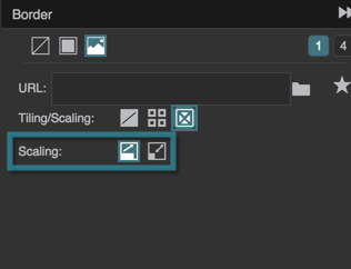
The image scales to the size of the container.
Border Tiling Options
Border Tiling Options
Border Tiling Options
Determines how the image tiles. Image corners are placed in the corresponding corners of the container.
 Repeat
The image tiles to fill the border. Some tiles might be clipped. Only works properly if the Border Width property is less than the image width and height.
 Round
Round
The image tiles, and scales to fit the nearest whole number of tiles. Only works properly if the Border Width property is less than the image width and height. In Chrome and Safari, Round might be interpreted as Repeat.
Border Scaling Options
Border Scaling Options
Border Scaling Options
Determines how the image scales:
 Cover
Cover
The image scales to fill each space between two borders.
 Scale-9
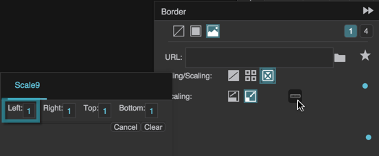
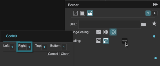
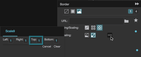
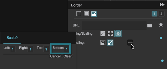
This is useful if your stroke image is intended to create a border using scale-9 stretching. The image scales to cover a 9-section grid that you specify. The four corner sections do not scale. The top-center and bottom-center sections scale horizontally only. The left-center and right-center sections scale vertically only. The center section scales horizontally and vertically.
Scale-9 Grid Left
Scale-9 Grid Left
Scale-9 Grid Right
Scale-9 Grid Right
Scale-9 Grid Top
Scale-9 Grid Top
Scale-9 Grid Bottom
Scale-9 Grid Bottom
