Scrolling Properties

These properties affect the scrolling behavior of the element.

Scrolling properties
The Scrolling properties in the Property Inspector

Scrolling properties affect the appearance of the scrollbar's thumb and track. The thumb is the part of the scrollbar that the user can move, and the track is the area in which the thumb moves.
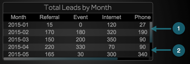

1. Thumb
2. Track

Important

Thumb and track properties are supported only in Chrome. In other browsers, the appearance of the thumb and track are specified by the browser. This is true of both Edit mode and the Viewer.

Horizontal Scrolling

Horizontal Scrolling

Horizontal Scrolling
Defines horizontal scrolling behavior on this element

Off
Horizontal scrolling is always disabled.

On
Horizontal scrolling is always enabled. The track appears even if the content does not overflow.

Auto
Horizontal scrolling is automatically enabled when content overflows.

The Horizontal Scrolling property

Vertical Scrolling

Vertical Scrolling

Vertical Scrolling
Defines vertical scrolling behavior on this element

Off
Vertical scrolling is always disabled.

On
Vertical scrolling is always enabled. The track appears even if the content does not overflow.

Auto
Vertical scrolling is automatically enabled when content overflows.

The Vertical Scrolling property

Vertical Scrollbar Width

Vertical Scrollbar Width

Vertical Scrollbar Width
Defines the width of the vertical scrollbar on this container, as a pixel value or a percentage of the container width.

The Vertical Scrollbar Width property

Horizontal Scrollbar Height

Horizontal Scrollbar Height

Horizontal Scrollbar Height
Defines the height of the horizontal scrollbar on this container, as a pixel value or a percentage of the container height.

The Horizontal Scrollbar Height property

Thumb Fill

Thumb Fill

Thumb Fill
Defines the fill of the thumbs in this container's scrollbars.

The Thumb Fill property

Thumb Stroke Color

Thumb Stroke Color

Thumb Stroke Color
Defines the stroke color for outlining the thumbs in this container's scrollbars.

The Thumb Stroke Color property

Thumb Stroke Style

Thumb Stroke Style

Thumb Stroke Style
Defines the stroke style for outlining the thumbs in this container's scrollbars.

The Thumb Stroke Style property

Thumb Stroke Weight

Thumb Stroke Weight

Thumb Stroke Weight
Defines the stroke weight for outlining the thumbs in this container's scrollbars.

The Thumb Stroke Weight property

Thumb Corner Radius

Thumb Corner Radius

Thumb Corner Radius
Defines rounded corners for the thumbs in this container's scrollbars, as arcs of circles or ellipses. The circles or ellipses are defined using a pixel value or percentage. A pixel value define the radius of a circle. A percentage value defines an ellipse with horizontal and vertical radii that are that percentage of the component's width and height, respectively.

The Thumb Corner Radius property

Track Fill

Track Fill

Track Fill
Defines the fill of the track in this container's scrollbars.

The Track Fill property

Track Stroke Color

Track Stroke Color

Track Stroke Color
Defines the stroke color for outlining the track in this container's scrollbars.

The Track Stroke Color property

Track Stroke Style

Track Stroke Style

Track Stroke Style
Defines the stroke style for outlining the track in this container's scrollbars.

The Track Stroke Style property

Track Stroke Weight

Track Stroke Weight

Track Stroke Weight
Defines the stroke weight for outlining the track in this container's scrollbars.

The Track Stroke Weight property

Track Corner Radius

Track Corner Radius

Track Corner Radius
Defines rounded corners for the tracks in this container's scrollbars, as arcs of circles or ellipses. The circles or ellipses are defined using a pixel value or percentage. A pixel value defines the radius of a circle. A percentage value defines an ellipse with horizontal and vertical radii that are that percentage of the component's width and height, respectively.

The Track Corner Radius property