Data Grid Properties

The following properties affect the data grid component. For data grids, you can customize properties for the header, rows, and columns.

For a guide to using the data grid component, see Data Grid.

Data grid components are also affected by Common Properties.


General Data Grid properties

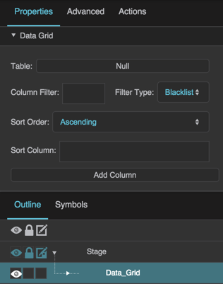
These properties affect the entire data grid. To see these properties in the Property Inspector, click on your data grid on the Stage or in the Outline.

Table

Table

Table
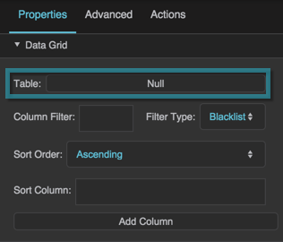
Defines the table that the data grid uses as a data source.

The Table property
The Table property

Column Filter

Column Filter

Column Filter
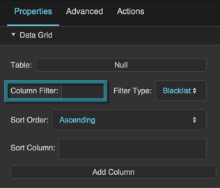
Specifies the columns for a filter, as a comma-separated list of table column names. Use the Filter Type property to specify whether these columns are shown in this data grid or hidden from it. The order of columns in a whitelist filter overrides the column order in the Outline and the source table.

The Column Filter property

Filter Type

Filter Type

Filter Type
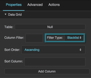
Specifies how this filter handles the listed columns.

Whitelist
Only the listed columns are shown in this data grid. Columns appear in the order specified in the filter.

Blacklist
The listed columns are hidden from this data grid.

The Filter Type property

Sort Order

Sort Order

Sort Order
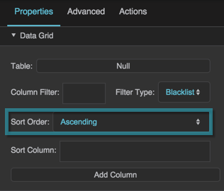
Specifies whether the data is sorted in ascending or descending order.

To change whether the data is treated as strings or numbers when sorted, open the dataflow for this data grid and edit the Sort block.

The Sort Order property

Sort Column

Sort Column

Sort Column
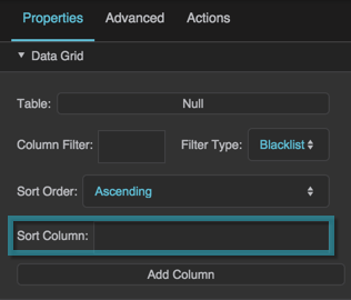
Specifies the name of the column by which to sort the data. Only works if the column has the Sortable property enabled.

The Sort Column property

Add Column

Add Column

Add Column
Click this button to add a column editor to the Outline. Each column editor lets you edit the properties of a group of one or more data grid columns.

The Add Column property


Data Grid Header Properties

These properties affect the data grid header. There are four groups of Data Grid Header properties. To see these properties in the Property Inspector, click on Header in the Outline.

Header Text and Font

The Text and Font properties for headers are similar to those for text components.

Header Gridlines

These properties control the style of the vertical lines between column headings and the horizontal lines between column headings and category headings.

Header Horizontal Stroke Color

Header Horizontal Stroke Color

Header Horizontal Stroke Color
Defines the stroke color for the horizontal lines that divide the column headings and category headings.

The Header Horizontal Stroke Color property

Header Horizontal Stroke Style

Header Horizontal Stroke Style

Header Horizontal Stroke Style
Defines the stroke style for the horizontal lines that divide the column headings and category headings.

The Header Horizontal Stroke Style property

Header Horizontal Stroke Weight

Header Horizontal Stroke Weight

Header Horizontal Stroke Weight
Defines the stroke weight for the horizontal lines that divide the column headings and category headings.

The Header Horizontal Stroke Weight property

Header Vertical Stroke Color

Header Vertical Stroke Color

Header Vertical Stroke Color
Defines the stroke color for the vertical lines that divide the column headings.

The Header Vertical Stroke Color property

Header Vertical Stroke Style

Header Vertical Stroke Style

Header Vertical Stroke Style
Defines the stroke style for the vertical lines that divide the column headings.

The Header Vertical Stroke Style property

Header Vertical Stroke Weight

Header Vertical Stroke Weight

Header Vertical Stroke Weight
Defines the stroke weight for the vertical lines that divide the column headings.

The Header Vertical Stroke Weight property

Header Fill and Stroke

The Fill and Stroke properties for headers are similar to those for most components.

Header Position and Size

This property controls the height of the header.

Header Height

Header Height

Header Height
Defines the height of the header in pixels. A value of Auto makes the header height follow the size of its content.

The Header Height property


Data Grid Row Properties

These properties affect data grid rows. There are four groups of Data Grid Rows properties. To open these properties in the Property Inspector, click on Rows in the Outline.

Row Text and Font

The Text and Font properties for data grid rows rows are similar to those for text components.

Row Gridlines

These properties control the lines that divide the columns and rows.

Gridlines

Gridlines

Gridlines
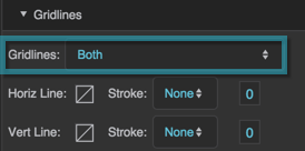
Specifies whether the Property Inspector displays property editing options for horizontal gridlines, vertical gridlines, or both. Changing which gridline properties are displayed does not reset any properties.

The Gridlines property

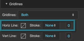
Horizontal Line

Horizontal Line

Horizontal Line
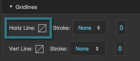
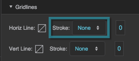
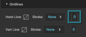
These properties define the horizontal lines between rows. They are similar to the Stroke properties for most components

The Horizontal Line properties

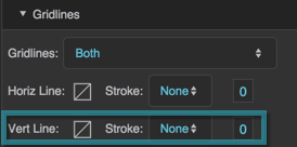
Vertical Line

Vertical Line

Vertical Line
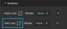
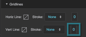
These properties define the vertical lines between columns.They are similar to the Stroke properties for most components.

The Vertical Line properties

Row Fill and Stroke

The Fill and Stroke properties for rows are similar to those for most components. You can define fill and stroke for the types of rows listed in the table. In each case, the properties define the fill for the row, and the stroke that outlines the row.

Property Description
Main RowsThe first group of alternating rows.
Alternate RowsThe second group of alternating rows.
Hovered RowThe row that the user mouses over.
Focused RowThe row that is in focus.
Selected RowsThe selected rows. Only works if selection is enabled for this data grid.

Row Position and Size

This property controls the row height:

Row Height

Row Height

Row Height
Defines the height in pixels of each data grid row.

The Row Height property


Column Properties

These properties affect data grid columns. There are three groups of column properties. To open these properties in the Property Inspector, expand Column in the Outline, and select a column editor.

A column editor lets you edit the properties of a group of one or more data grid columns. To add a column editor, go to the General Data Grid Properties and click Add Column.

Column Editor Properties

These properties specify which columns this editor controls, as well as sorting and visibility for those columns.

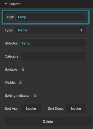
Column Label

Column Label

Column Label
Defines the label to be used as heading text for columns controlled by this column editor.

The Column Label properties
The Column Label property

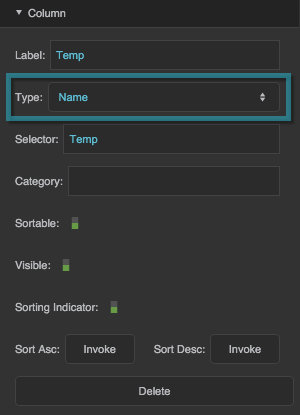
Column Editor Type

Column Editor Type

Column Editor Type
Defines the kind of column group this column editor controls. See About Column Editors and Column Order

all

An All column editor dictates that all of the columns from the source table are included in the grid, except for those that you filter out of the entire grid. Grid columns appear in source table order, unless you specify another order using a whitelist filter. Properties edited for this column editor apply to all columns.

name

Each Name column editor dictates that one column from the source table is included in the grid. Grid columns appear in the order in which they appear in the Outline, unless you specify another order using a whitelist filter. Properties edited for this column editor apply to this column.

repeater
A Repeater column editor lets you use a configuration table to determine which source table columns appear in the grid, which symbols represent those columns (if any), and properties of the symbols.

The Column Editor Type properties
The Column Editor Type property

Selector

Selector

Column Editor Selector
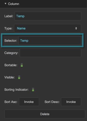
Specifies which column or columns this column editor controls. If the column editor type is All, this property does nothing. If the column editor type is Name, this property specifies the name of one column in the source table. If the column editor type is Repeater, this property specifies which column of the configuration table contains the data table column names.

The Selector property

Category

Category

Category
Specifies the category to which this column belongs. Must match the Selector property of some other column editor in this grid. For more information, see Using the Category Feature.

Sortable

Sortable

Sortable
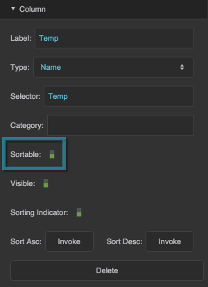
Specifies whether the columns affected by this column editor are sortable.

The Sortable property

Visible

Visible

Visible
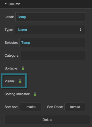
Defines whether this element is visible. Regardless of value, the element affects layout and is stored in the user's browser memory. Because the element is stored in memory, performance might be affected.

TRUE
This element is visible.

FALSE
This element is not visible, but it still affects layout and is stored in browser memory.

The Visible property

Sorting Indicator

Sorting Indicator

Sorting Indicator
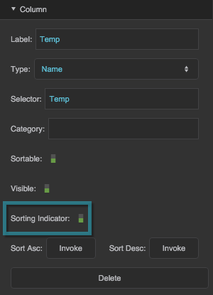
Specifies whether a graphic appears in the column that currently sorts the data. The Sorting Indicator property for a Name column editor overrides the Sorting Indicator property for an All column editor.

The Sorting Indicator property

Sort Ascending

Sort Ascending

Sort Ascending
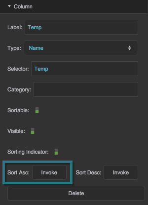
Sorts the data using this column, in ascending order. Using this trigger changes the Sort Order to Ascending, under Data Grid properties.

The Sort Ascending property

Sort Descending

Sort Descending

Sort Descending
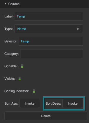
Sorts the data using this column, in descending order. Using this trigger changes the Sort Order to Descending, under Data Grid properties.

The Sort Descending property

Delete

Delete

Delete
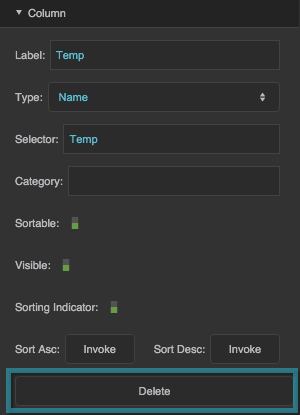
Deletes this column editor.

The Delete property
The Delete property

Column Symbol Properties

These properties control symbols that appear in this data grid.

Symbol

Symbol

Symbol
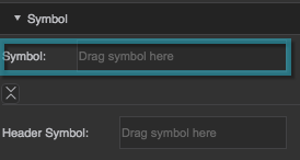
Specifies the name of the symbol that appears in each cell of the columns affected by this column editor.

The Symbol property
The Symbol property

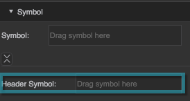
Header Symbol

Header Symbol

Header Symbol
Specifies the name of the symbol that appears in the header of the columns affected by this column editor.

The Header Symbol property

Column Position and Size Properties

These properties control column width.
Column Width

Column Width

Column Width
See Common Properties.

The Column Width property

Column Flex-Grow

Column Flex-Grow

Column Flex-Grow
See Position and Size Properties.

The Column Flex-Grow property

Column Flex-Shrink

Column Flex-Shrink

Column Flex-Shrink
See Position and Size Properties.

The Column Flex-Shrink property