Image

The image component displays an image from some file path. It can also create animations from a set of frame images. This component also allows you to edit SVG images within DGLux5.

This component supports all image formats supported by the browser.

For a detailed reference of properties that affect image components, see Common Properties and Image Properties.


An image component in DGLux5


Create an Image Component

Before you create an image component, you might want to load your image into the project. You can also use images stored at external URLs.

To load an image:

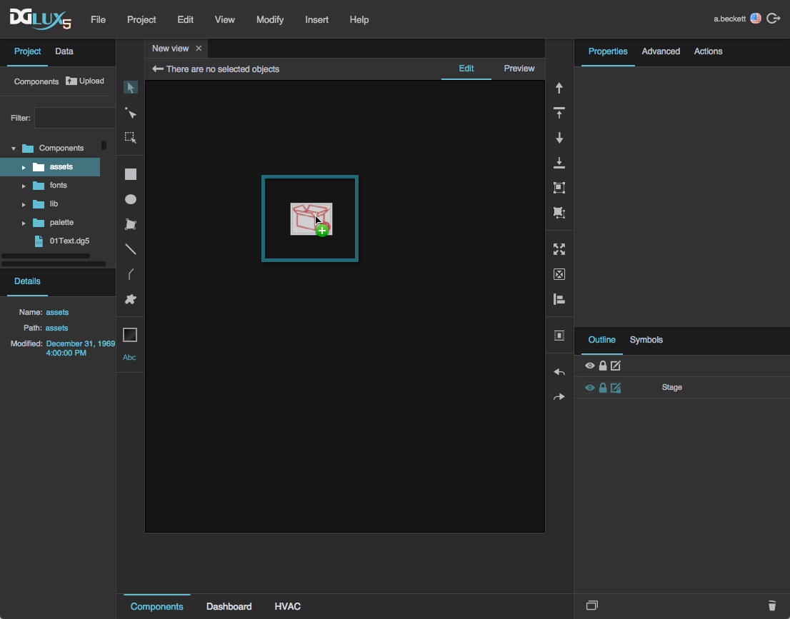
  1. Drag the image file from your file system onto the DGLux5 environment.

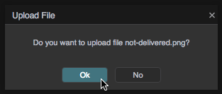
  2. When prompted to upload the image, click OK.

    Your image is uploaded to the assets folder in the Project panel, and an image component using this image is automatically added to the page.

Alternatively, you can select the assets folder and then click Upload, and specify the file on your computer.

This adds the image file to assets without adding a component to the page.

To create an image component:

  1. Right-click in the Outline or Document window, and select Insert > Components > Image.

  2. In the Outline or Document window, select the image component.
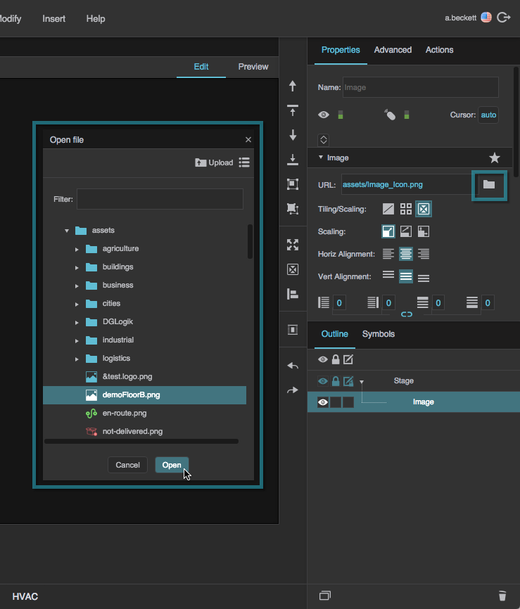
  3. In the Property Inspector, under URL, click the folder icon, and select the image.

    If the image is stored outside this project, enter the full URL of the image instead.

You can also create an image component automatically when uploading an image via drag and drop. See Add Other Files.


Create an Animation

To create an animation:

  1. In the Outline or Document window, select the image.
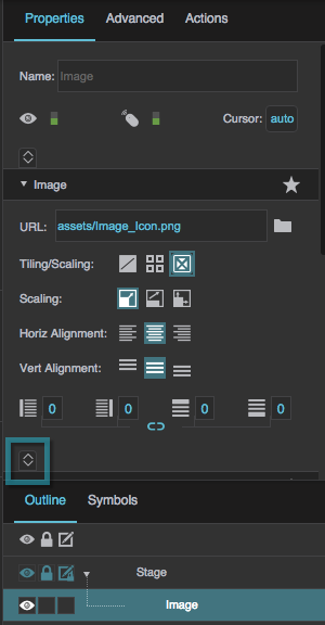
  2. In the Property Inspector, under Image Properties, click Expand.

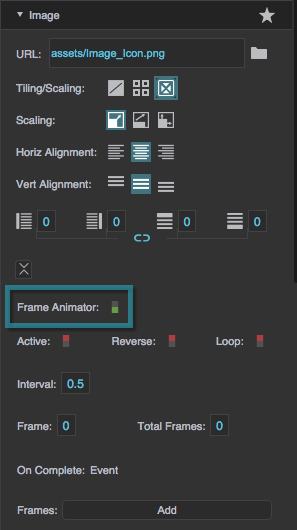
  3. Set the Frame Animator property to TRUE.

    More properties appear in the Property Inspector.

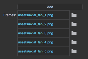
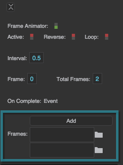
  4. For the Frames property, click Add until the number of frame fields is the same as the number of frames in your animation.

    Tips

    • To delete a frame field, hover over the field until a minus sign appears, and then click the minus sign.
    • If you want the first frame in the animation to display when the image is not animating, use the same path for URL and the first frame.
  5. Beginning at the topmost Frames field, add paths to your frame images in order.

    If the image is loaded in this project, click the folder icon, and select the image. Otherwise, enter the full URL of the image. You can also drag the file from the Project panel to the frame field.

  6. Adjust the other animation properties as needed:
    • To run the image automatically when the page loads, set Active to TRUE.
    • To cause the animation to automatically repeat, set Loop to TRUE.
    • Set Interval to the duration in seconds to display each frame.
    • To cause the animation to be dependent on data or a property, bind a Boolean property or data metric to Active.
    • To trigger some event when the animation finishes, bind On Complete to the trigger.

Edit SVG within DGLux5

If you load an SVG image into the project and add it as an image component, you can break apart the SVG image into its component vectors and edit them.

To edit an SVG image:

  1. In the Outline or Document window, select the image component.
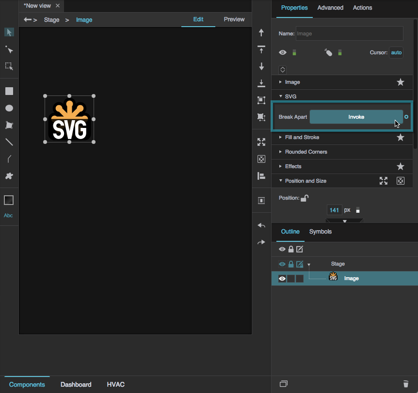
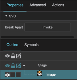
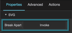
  2. In the Property Inspector, under SVG, for Break Apart, click Invoke.

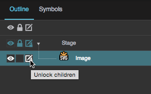
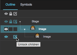
  3. In the Outline, next to the image component, click Unlock Children to show the children of that node so that they can be edited.

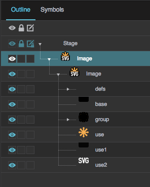
    You might need to click Unlock Children several times for different nodes, in order to expose all of the component vectors for editing.

    The individual vectors of the SVG appear in the Outline in one or more groupings.

  4. Select the individual vectors to edit color, position, and size.

Image FAQ

Can the image component's size follow the source image's size?

Can the image component's size follow the source image's size?

Can the image component's size follow the source image's size?
Yes. To create this effect:

  1. In the Outline or Document window, select the image component.
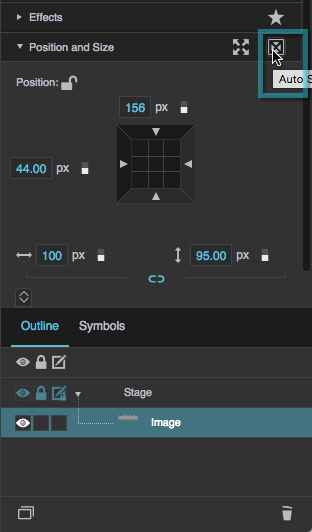
  2. In the Property Inspector, inside the Position and Size category header, click Auto Size.

    This sets the size of the component to the measurements of the source image.

Alternatively, if you add the image to your project by dragging a file from the Project panel to the Outline or Document window, it is automatically added at the source image's pixel size.

How do I make the image grow and shrink to follow the component size?

How do I make the image grow and shrink to follow the component size?

How do I make the image grow and shrink to follow the component size?
Use the Scaling properties. To read more about scaling, see the Image Properties reference.

How do I make the image repeat within the component?

How do I make the image repeat within the component?

How do I make the image repeat within the component?
Use the Tiling properties. To read more about tiling, see the Image Properties reference.

How do I include live CCTV images?

How do I include live CCTV images?

How do I include live CCTV images?
To display a CCTV feed, insert an image component and set the URL to the mjpeg URL for your camera. To find the mjpeg URL for your camera, use a resource like this one.


Image Properties

These properties affect the contents of the image component.

For a guide to using the image component, see Image.

Image components are also affected by Common Properties.

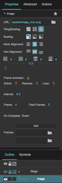
Image properties
The Image properties in the Property Inspector

SVG properties
The SVG properties in the Property Inspector


Image Properties

URL

URL

URL
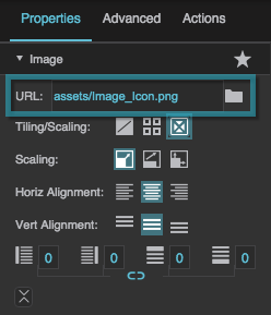
Defines the path where the image is located. Click the folder icon to select or upload an image, or enter a relative URL within the project, such as assets/image.png. You can also enter any absolute URL, even if it is outside of your project or DGLux.

You can also drag the file from your computer:

  1. Drag the image onto DGLux5.
  2. When prompted to upload the image, click Yes. Your image is uploaded. It can be found under the assets folder in the Project Tree.

You can use any image format that is supported by the user's browser.

The URL property
The URL property

Tiling/Scaling

Tiling/Scaling

Tiling/Scaling
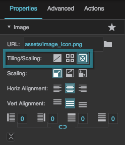
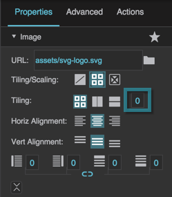
Determines whether the image tiles (repeats to fill the container) or scales (changes size to match the container).

No Tiling
The image does not tile or scale. An image larger than its container is clipped.

Tiling
The image tiles to fill the container either horizontally, vertically, or both horizontally and vertically.

Scaling
The image scales to the size of the container.

The Tiling/Scaling property

Tiling Options

Tiling Options

Tiling Options
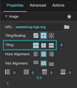
Determines whether the image tiles (repeats to fill the container) horizontally, vertically, or both horizontally and vertically.

Repeat
The image tiles horizontally and vertically.

Repeat Horizontally
The image tiles horizontally only. One row of tiles appears.

Repeat Vertically
The image tiles vertically only. One column of tiles appears.

The Tiling Options
The Tiling Options

Tiling Angle

Tiling Angle

Tiling Angle
If Repeat Horizontally or Repeat Vertically is selected, changing this value causes tiles to repeat along an angle. Valid values are between −45 and 45.

The Tiling Angle property

Scaling Options

Scaling Options

Scaling Options
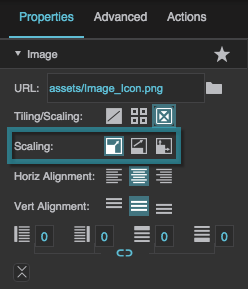
Determines how the image scales (changes size to match the container).

Contain
The image scales while maintaining its aspect ratio. Part of the container might be empty.

Cover
The image scales to fill the container while maintaining its aspect ratio. Any part of the image that overflows the container is clipped.

Stretch
The image stretches to cover the container. The image’s aspect ratio is not maintained.

The Scaling Options
The Scaling Options

Horizontal Alignment

Horizontal Alignment

Horizontal Alignment
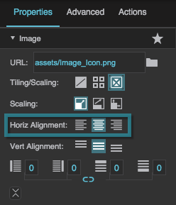
Determines how images or tiles are horizontally aligned.

Left
The leftmost edge of the image or tiles is justified to the left container boundary.

Center
The image or tiles are horizontally centered.

Right
The rightmost edge of the image or tiles is justified to the right container boundary.

The Horizontal Alignment property

Vertical Alignment

Vertical Alignment

Vertical Alignment
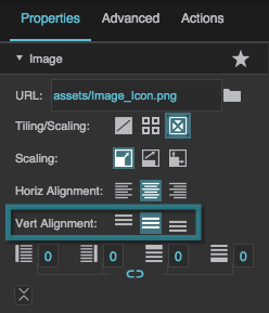
Determines how images or tiles are vertically aligned.

Top
The topmost edge of the image or tiles is justified to the top container boundary.

Middle
The image or tiles are vertically centered.

Bottom
The bottommost edge of the image or tiles is justified to the bottom container boundary.

The Horizontal Vertical property
The Vertical Alignment property

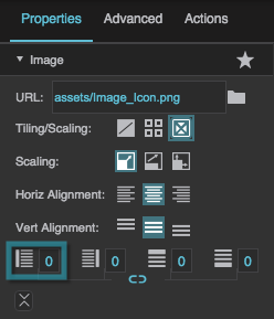
Left Padding

Left Padding

Left Padding
Defines a number of pixels of space between the left container boundary and the leftmost edge of the content. Negative numbers are not allowed.

Paddings are part of an object's width and height. See Borders, Padding, and Content Size.

The Left Padding property

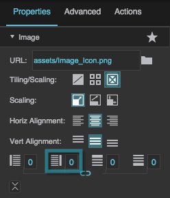
Right Padding

Right Padding

Right Padding
Defines a number of pixels of space between the right container boundary and the rightmost edge of the content. Negative numbers are not allowed.

Paddings are part of an object's width and height. See Borders, Padding, and Content Size.

The Right Padding property

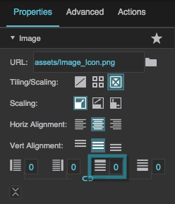
Top Padding

Top Padding

Top Padding
Defines a number of pixels of space between the top container boundary and the topmost edge of the content. Negative numbers are not allowed.

Paddings are part of an object's width and height. See Borders, Padding, and Content Size.

The Top Padding property

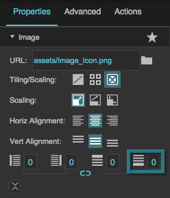
Bottom Padding

Bottom Padding

Bottom Padding
Defines a number of pixels of space between the bottom container boundary and the bottommost edge of the content. Negative numbers are not allowed.

Paddings are part of an object's width and height. See Borders, Padding, and Content Size.

The Bottom Padding property

Link Paddings

Link Paddings

Link Paddings
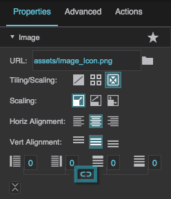
Links all four padding editors so that their values are equal.

The Link Paddings property

Frame Animator

Frame Animator

Frame Animator
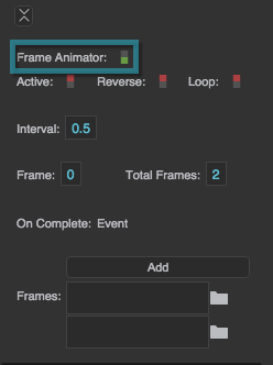
Specifies whether the image component animates a specified list of frames.

The image defined by the URL property is displayed only when the animation is not active.

Frame animators can be used to create moving images, such as a running fan or moving dampers.

The Frame Animator property

Active

Active

Active
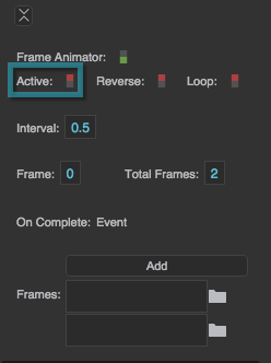
Sets or returns whether the animation is currently running.

The Active property
The Active property

Reverse

Reverse

Reverse
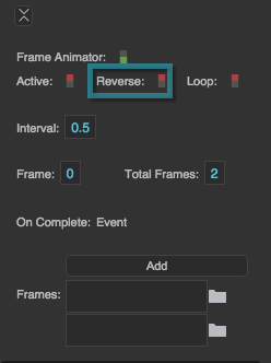
Determines whether the animation frames are displayed in reverse.

TRUE
The topmost frame in the Property Inspector appears first in the animation sequence.

FALSE
The bottommost frame in the Property Inspector appears first in the animation sequence.

The Reverse property

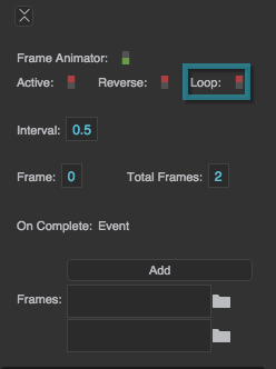
Loop

Loop

Loop
Determines whether the animation sequence is repeated.

TRUE
As soon as it is complete, the animation starts again.

FALSE
The animation happens once, and then the image defined for the image component is displayed.

The Loop property
The Loop property

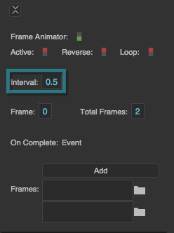
Interval

Interval

Interval
Defines how long each frame is displayed, in seconds.

The Interval property

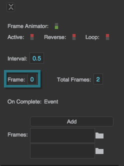
Frame Index

Frame Index

Frame Index
Returns the index of the frame currently displayed in the animation. The image defined by the URL property is 0, the topmost frame in the animation sequence is 1, and so on. This is a read-only property, so changing it manually does nothing.

The Frame Index property

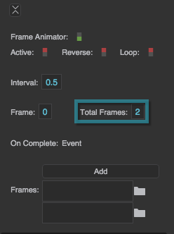
Total Frames

Total Frames

Total Frames
Returns the number of frames in the animation, not including the image. This is a read-only property, so changing it manually does nothing. Add frames by clicking the Add button.

The Total Frames property

On Complete

On Complete

On Complete
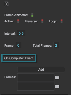
Triggers an event on completion of this animation. Can be used to invoke actions or trigger other events.

The On Complete property

Frames

Frames

Frames
Specifies the paths to each of the frames in the animation sequence. Click Add to add frames, and then specify an image path for each frame.

The Frames property
The Frames property


SVG Properties

Break Apart

Break Apart

Break Apart
Separates an SVG into its component vectors to allow you to edit it within DGLux5. This property is available only for image components that contain an SVG image.

The Break Apart property

2019/07/17 19:17