Image
The image component displays an image from some file path. It can also create animations from a set of frame images. This component also allows you to edit SVG images within DGLux5.
This component supports all image formats supported by the browser.
For a detailed reference of properties that affect image components, see Common Properties and Image Properties.

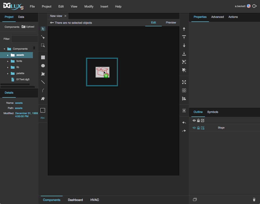
An image component in DGLux5
Create an Image Component
Before you create an image component, you might want to load your image into the project. You can also use images stored at external URLs.
To load an image:
Drag the image file from your file system onto the DGLux5 environment.
When prompted to upload the image, click OK.
Your image is uploaded to the
assetsfolder in the Project panel, and an image component using this image is automatically added to the page.
Alternatively, you can select the assets folder and then click Upload, and specify the file on your computer.

This adds the image file to assets without adding a component to the page.
To create an image component:
Right-click in the Outline or Document window, and select Insert > Components > Image.

- In the Outline or Document window, select the image component.
In the Property Inspector, under URL, click the folder icon, and select the image.
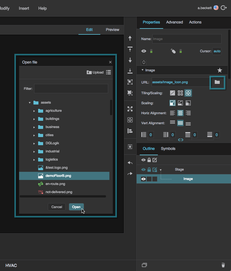
If the image is stored outside this project, enter the full URL of the image instead.
You can also create an image component automatically when uploading an image via drag and drop. See Add Other Files.
Create an Animation
To create an animation:
- In the Outline or Document window, select the image.
In the Property Inspector, under Image Properties, click
 Expand.
Set the Frame Animator property to TRUE.
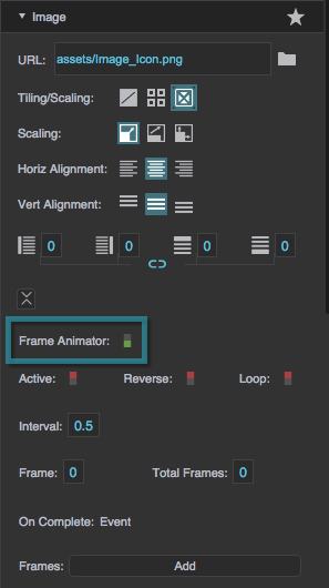
More properties appear in the Property Inspector.
For the Frames property, click Add until the number of frame fields is the same as the number of frames in your animation.
Tips
- To delete a frame field, hover over the field until a
 minus sign appears, and then click the minus sign.
 - If you want the first frame in the animation to display when the image is not animating, use the same path for URL and the first frame.
Beginning at the topmost Frames field, add paths to your frame images in order.
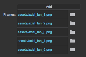
If the image is loaded in this project, click the folder icon, and select the image. Otherwise, enter the full URL of the image. You can also drag the file from the Project panel to the frame field.
- Adjust the other animation properties as needed:
- To run the image automatically when the page loads, set Active to TRUE.
- To cause the animation to automatically repeat, set Loop to TRUE.
- Set Interval to the duration in seconds to display each frame.
- To trigger some event when the animation finishes, bind On Complete to the trigger.
Edit SVG within DGLux5
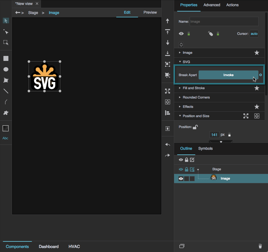
If you load an SVG image into the project and add it as an image component, you can break apart the SVG image into its component vectors and edit them.
To edit an SVG image:
- In the Outline or Document window, select the image component.
In the Property Inspector, under SVG, for Break Apart, click Invoke.
In the Outline, next to the image component, click
 Unlock Children to show the children of that node so that they can be edited.
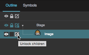
You might need to click
Unlock Children several times for different nodes, in order to expose all of the component vectors for editing.
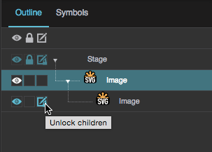
The individual vectors of the SVG appear in the Outline in one or more groupings.
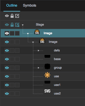
- Select the individual vectors to edit color, position, and size.
Image FAQ
 Auto Size.
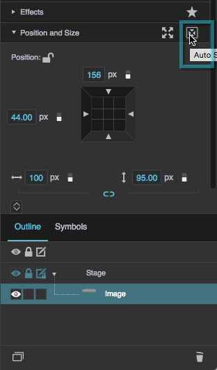
Image Properties
These properties affect the contents of the image component.
For a guide to using the image component, see Image.
Image components are also affected by Common Properties.

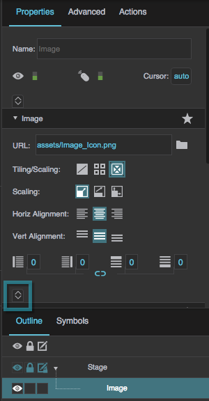
The Image properties in the Property Inspector

The SVG properties in the Property Inspector

 No Tiling
 Tiling
 Repeat Horizontally
 Repeat Vertically

 Contain
 Stretch
 Left
Left Center
 Right
Right
 Top
Top Middle
 Bottom


