Table of Contents
Component and Widget Essentials
DGLux5 components are customizable, graphical building blocks for web applications. A widget is a custom graphical element that comprises one or more DGLux5 widgets, components, shapes, or paths. When you create a project in DGLux5, you add components and widgets to a page or set of pages. Then, you customize the behavior and appearance of each object using properties, dataflow, and actions. DGLux5 has four kinds of components: Components, Charts, Gauges, and Form Input.
When you add a widget to the widget palette, you can re-use it in different pages and projects. You can load widgets from other projects using your lib directory.
Insert Components
You insert components, and some default widgets such as charts, using the Insert menu.
To insert a core component or default DGLux5 chart widget into your Document window:
- In the Outline or the Document window, select the Stage or a group.
In the Main Menu, select Insert, and choose the component to add.
The component is inserted as a child of the selected Stage or group.
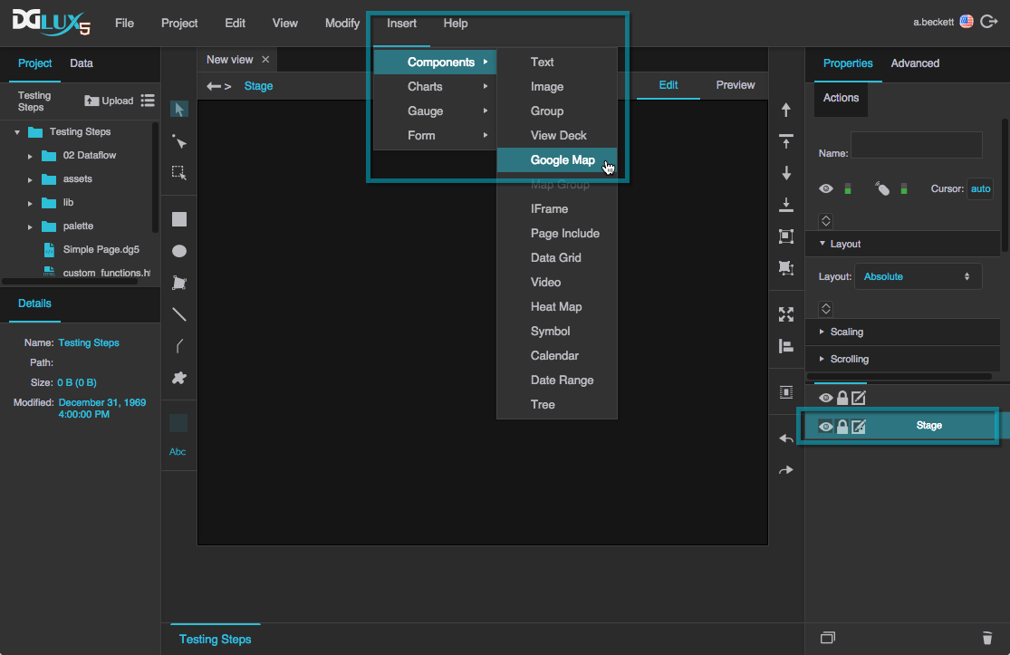
Inserting a Google Map component onto the Stage

Inserting a text component into a group
You can also insert components by right-clicking the Stage or group.
Insert Widgets
You insert widgets using the widget palette.
These steps only work in Edit mode.
To insert a widget from the widget palette:
- Expand the relevant category in the widget palette.
Drag the widget to the Document window.
When you drop the widget, it is inserted as a child of the Stage or the first available unlocked group at your mouse location.
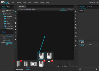
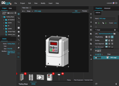
Inserting a widget onto the Stage by dropping it over an empty area in the Document window
Edit Components and Widgets
Edit a component or widget by selecting it and then using the Properties panel.
In general, changes that you make in the palette and lib directories affect widget palettes but do not "trickle down" to instances of the widget. See Edit Widgets for more information.
Select Objects
You can select one or more children of the same group simultaneously. You cannot select children from different groups simultaneously.
To select an object, you use one of the following:
- The Outline lets you select objects from a list.
- The
 Select tool lets you select objects visually in the WYSIWYG Document window.
 - The
 Path Selection tool lets you select paths within an object in the WYSIWYG Document window. For example, this lets you select a single axis or series of a chart widget.
Use the Outline
To select objects using the Outline:
In the Outline, click the object.
You may have to click a toggle arrow to expand a group, or scroll up or down in the panel to locate the object.
Shift + click to add another object, and all of the objects in between, to the selection.
You can also Ctrl + click or Command + click to change whether an item is part of the selection.
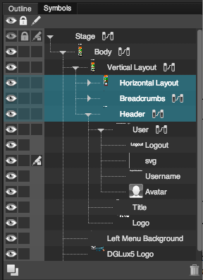
Horizontal Layout, Breadcrumbs and Header groups have been selected
Use the Select Tool
These steps work only in Edit mode.
To select items using the Select tool:
- In the Tools panel, click the
 Select tool.
 - Either click an object, or drag to select multiple objects.
- Shift + click to change whether an item is part of the selection.
Use the Path Selection Tool
These steps only work in Edit mode.
To use the Path Selection tool:
- In the Tools panel, click the
 Path Selection tool.
 - In the Document window, do one of the following:
- Click individual anchor points or path segments to select them.
- Click a portion of a path that is not an anchor point to select the entire path.
Tip
To select an object that lies behind another object, click multiple times without moving the mouse. Selection iterates through the objects at the cursor position, beginning with the topmost object.
Group and Ungroup Objects
You can group widgets and components. Groups are useful for responsive layouts, symbols, repeaters, and widgets that comprise multiple components.
When you group objects, the stacking order of your page might change. A group is arranged immediately behind the frontmost object in the group.
A group can be a child of another group.
Group Objects
- Select the widgets and components to be grouped.
- Do one of the following:
- In the Quick Access panel, click
 Group.
 - In the Main Menu, choose Modify > Group.
- Right-click on one of the selected objects, and select Group.
- In the Outline, insert a Group component, and then drag objects into the group.
Ungroup Objects
- Select the group.
- Do one of the following:
- In the Quick Access panel, click
 Ungroup
 - In the Main Menu, choose Modify > Ungroup
- In the Document window or Outline, right-click on one of the selected objects, and select Ungroup.
Remove a Child from a Group
- In the Outline, select the child, and drag it out of the group.
Move Objects
You can move objects by dragging them, by using arrow keys on the keyboard, or by entering precise values in the Property Inspector.
Move Objects by Dragging
These steps only work in Edit mode. Snapping can help you position objects.
To drag objects:
- Select one or more objects.
- In the Document window, drag the object to a new location.
Move Objects Using the Arrow Keys
These steps only work in Edit mode. Snapping can help you position objects.
To move objects using the arrow keys:
- Select one or more widgets or objects.
Press the arrow keys to move the objects.
The object moves one pixel for each keystroke. Hold Shift to move the object five pixels per keystroke.
Specify Position Properties in the Property Inspector
See also: Position and Size Properties
To specify position properties:
- Select one or more widgets or objects.
In the Property Inspector, under Position and Size, specify the appropriate position properties. For example, you could set the Top and Left properties to pixel values, or you could set the Horizontal Center and Vertical Center properties to pixel values.
