View Deck
The view deck component holds multiple objects and displays only the object whose index is currently selected. One simple way to use the view deck is to cycle through a series of images using a stopwatch. Another, more typical use case is to create a navigation control for the user and then bind user input to the selection index.
The view deck’s contents can be determined by a repeater. A repeater iterates a given symbol once for each row in a table. Each instance of the symbol can have dynamic properties.
For a detailed reference of properties that affect view decks, see Common Properties and View Deck Properties.

A view deck component in DGLux5
Tip
To quickly switch between selecting the view deck and its displayed object, use the  Select tool to click the view deck, and then click again without moving the mouse.
Video Tutorial: Kiosk Mode for Data Visualization: DGLux5 Viewdeck Feature
Create a View Deck That Cycles Through Images
To create a view deck that cycles through a list of images:
- Right-click the Stage in the Outline or Document window, and select Insert > Components > View Deck.
Add some images to the view deck.
To add objects, either right-click the view deck and use the Insert menu, or drag objects into the view deck.
- Right-click the view deck and select
 Dataflow.
 - In the dataflow window, expand Logic, and add a Stopwatch block with the following properties:
- Set interval to 1, to specify that each frame displays for a duration of 1 second.
- Make sure loop is set to TRUE.
- For modulo, enter the number of images in the view deck.
- Bind output to the view deck's Selected Index property.
- Set enabled to true, to begin the image cycling and to specify that the cycling begins when the page loads.
Create a View Deck with Button Control
To create a view deck that the user can control using buttons:
- Create the view deck:
- Right-click the Stage in the Outline or Document window, and select Insert > Components > View Deck.
- Create the button panel:
- Right-click the Stage and select Insert > Components > Group.
- In the Property Inspector, set the Layout property of the group to Horizontal or Vertical.
Insert a text component within the group.
This is your first button. Optionally, style your button using properties and actions.
- When your button is styled, select it in the Outline and click
 Duplicate until you have the correct number of buttons.
 - Change the text that appears on each button. Each button should refer to the view deck element with the same index. Indexes match positions in the order in the Outline.
- In the Outline, select the group.
- In the Property Inspector, set Selection to
 Single Select.
 - Bind the Selected Index property of the buttons group to the Selected Index property of the view deck:
- In the Outline, select the group.
In the Property Inspector, under Selection, hover over Selected Index until a blue dot appears, and double-click the blue dot.
A pop-up opens that represents the group's Selected Index property.
- In the Outline, select the view deck.
- Drag the blue dot in the pop-up to the Selected Index property of the view deck.
Create a View Deck Based on a Repeater
To create a view deck whose contents are determined by a repeater:
- Create a symbol.
- Create symbol parameters for any properties that you want to be dynamic, and make sure to bind the parameters to the relevant properties. See Symbol.
- Insert a view deck.
- Load your table in the view deck's dataflow. See Working with Tables.
- Select the view deck, and in the Property Inspector, under Repeater:
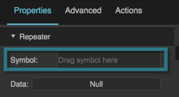
- Type the name of the symbol in the Symbol field.
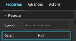
- Bind the dataflow table to the Data property.
- In the Outline, expand the view deck node and select the "renderer" node.
In the Property Inspector, for each symbol parameter, either enter a value or bind a table column.
To bind a table column, open the table in dataflow and drag the column header to the field.
In this view deck, the row number of the table corresponds to the selection index.
You could use a group to create another repeater for this view deck's navigation buttons.


