Create a Simple Page
A project like the one you just created contains pages. These steps show you how to design a simple page with a responsive header and body.
When you design a page, you customize your page's root component, called the Stage. Then, you add components to the Stage. Finally, you customize each component’s behavior, layout, and appearance using the Property Inspector.
Create Vertical Layout for the Stage
Vertical layout ensures that the children of the Stage are positioned vertically from top to bottom. In this example, the Stage's children will be a header group and a body group.
- In the Outline, click the Stage.
In the Property Inspector, for the Layout property group, use the drop-down menu to change the Layout property from Absolute to Vertical.

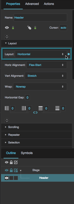
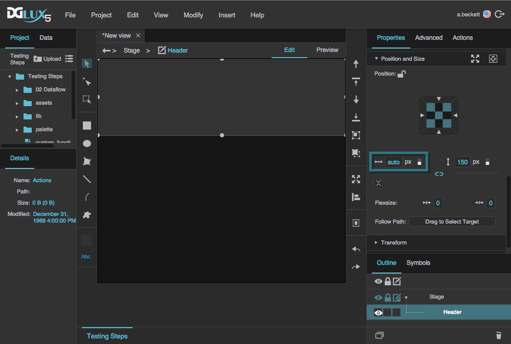
Create a Header Group
Horizontal Layout ensures that children of the header group are positioned horizontally from left to right. In this example, the header's children will be a logo and a text box.
- In the Outline, right-click the Stage. Choose Insert > Components > Group.
In the Outline, double-click the group component and rename it
Header.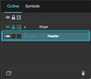
- With the header group selected, customize its properties in the Property Inspector:
For Layout, select Horizontal.
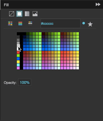
Under Fill and Stroke, click
 Fill, then choose
  Solid Color, and then select a color.
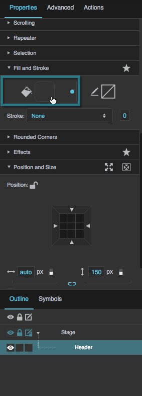

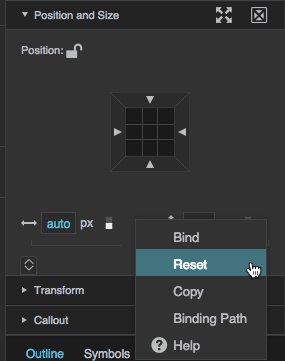
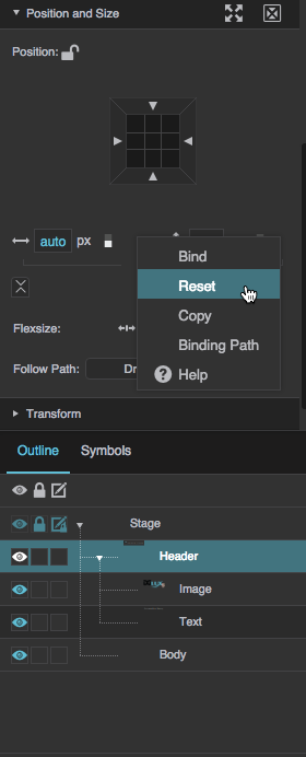
Under Position and Size, hover over
 Width until a blue dot appears.

Click the blue dot, and select Reset.

This sets the header's width to Auto.
Because the Stage's Horizontal Alignment is set to Stretch, the header's width of Auto makes the header expand to follow the size of the Stage.
Create a Body Group
- In the Outline, right-click the Header group and select
 Duplicate.
 In the Outline, double-click the new group and rename it
Body.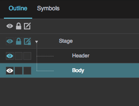
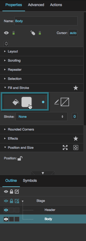
- With
Bodyselected, customize its properties in the Property Inspector:Under Fill and Stroke, click
Fill and select a color.
Under Position and size, hover over
 Height until a blue dot appears.
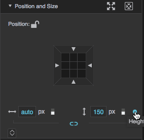
Click the blue dot and select Reset.
This sets the body's height to Auto. When you set Flex-Grow in the next step, the body's height will grow to fill available space.
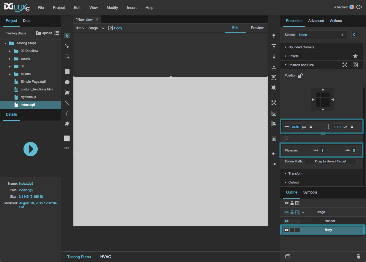
Under Position and size, click
 Expand and then enter a value of 1 for
  Flex-Grow.
Because the body's height is Auto and its Flex-Grow is 1, its height grows so that the entire height of the Stage is used.
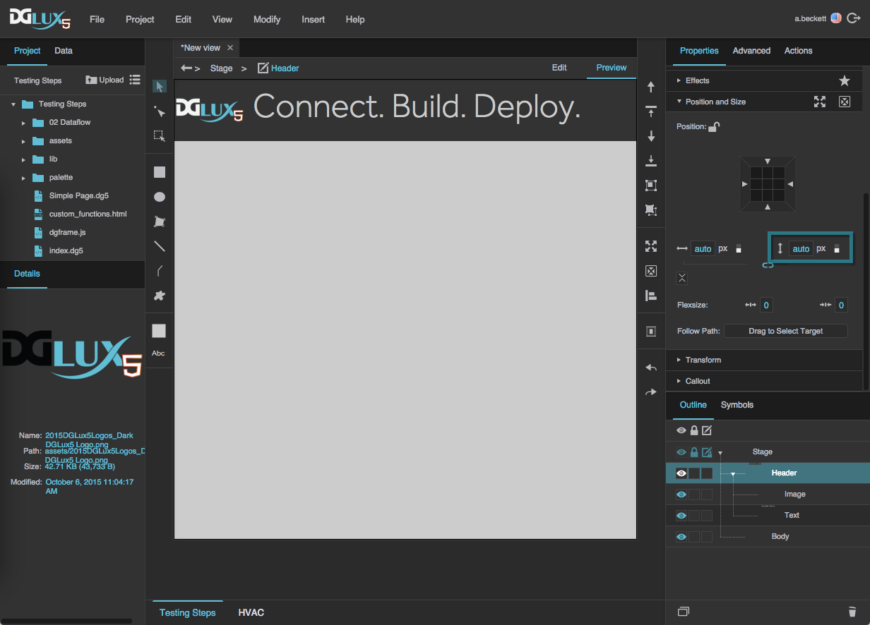
Add Content to the Header
- Add an image component to the Header group:
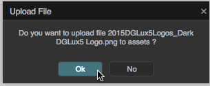
Drag the image of your choice from your OS’s file browser to the assets folder in the Project panel.
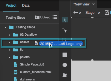
When prompted, click OK to upload the image asset.
- In the Outline, right-click the Header group. Choose Insert > Components > Image.
- In the Outline, select the image.
In the Property Inspector, under Image, next to URL, click
 Browse.
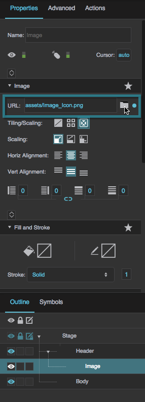
In the pop-up, expand the
assetsdirectory, and double-click the image asset.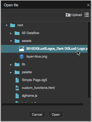
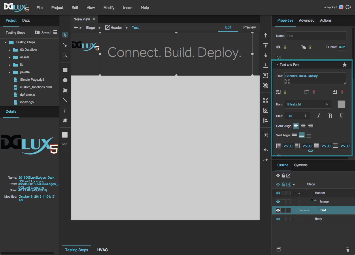
- Add a text component to the Header group:
- In the Outline, right-click the Header group. Choose Insert > Components > Text.
In the Property Inspector, under Text and Font, enter some text in the Text property, and customize the Text and Font properties.
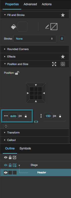
Set Header Height to Auto
You can set the header group's height to Auto to make the header group height follow the size of the group's content.
- In the Outline, select the Header group.
In the Property Inspector, under Position and Size, hover over the
Height property until a blue dot appears.

Click the blue dot, and select Reset.
This sets the height to Auto, which causes the header height to follow the size of its content.
Learn More
- To read about any property, hover over the property until a blue dot appears. Then, click the blue dot, and select Help. Or, look at the Properties Reference.
- To learn more about Layout, see online references about
flexbox, like this one - To learn more about Flex-Grow, see this video.