Selection Properties

These properties control selection behavior. They are available for the Stage, and for groups, view decks, maps, data grids, trees, and chart series. View decks have a Selected Index property but no Selection Behavior property.
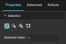
Selection properties
The Selection properties in the Property Inspector

Selection properties are useful when you want to let the user select items within a component. For example, you could create a button panel by adding a group groucomponent that contains several text components. Then, you could use the Selection properties of the group to control whether the user can select more than one text component, and whether clicking a selected text component deselects it. Because the group's Selected Index property reflects which button or buttons are selected, you could use the Selected Index property to control whatever properties you want the button panel to affect.

To test Selection properties, you must use Preview mode. In Preview mode, clicking children changes the Selected Index property of the group; this does not happen in Edit mode.

Selection Behavior

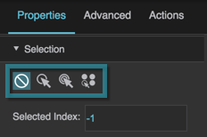
Selection Behavior

Selection Behavior
Specifies a behavior for selection of this element's children. If the value is anything other than None, the user can select children by clicking them. Even if the value is None, you can change this element's Selected property in the Property Inspector, or by using a Set State action.

None
Clicking on items in this container does not select them. Children of this parent can be selected using other methods. One child of this parent can be selected at a time.

Single Select
Clicking on an item selects it and deselects all other items in this container.

Toggle Select
Clicking on an item selects it and deselects all other items in this container. Clicking a selected item deselects it.

Multi-Select
Clicking on an item selects it. More than one item can be selected at a time. Clicking a selected item deselects it.

The Selection Behavior property

Selected Index

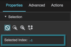
Selected Index

Selected Index
Sets or returns the index of the selected item in this container.

An index of 0 indicates the first item.

An index of −1 deselects all items.

If Multi-Select is enabled and multiple items are selected, comma-separated values are used.

The Selected Index property

Selected Items (Tree and Tree Grid Only)

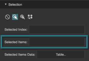
Selected Items (Tree and Tree Grid Only)

Selected Items (Tree and Tree Grid Only)
Sets or returns a comma-separated list of IDs of selected items in the tree. Only works if the tree's Selection Behavior is set to a value other than None. This property is not serializable, meaning that changes to this property are in effect only for the current session.

A value listed in this property is considered selected regardless of whether the specified node is loaded. However, a node that is selected in the tree will be automatically added to this property only when it is visible.

If a node with the specified ID exists in more than one table, the first node with this ID that is encountered is recognized.

To select and expand a node, and make it visible, use the Select Node property. However, Select Node works only with a single node.

The Selected Items property

Selected Items Data (Tree and Tree Grid Only)

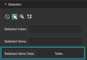
Selected Items Data (Tree and Tree Grid Only)

Selected Items Data (Tree and Tree Grid Only)
Returns a read-only table describing items that are both selected and also displayed in the tree. If a node is selected but one of its ancestors is collapsed, that node is not displayed and is not included in the Selected Items Data table.

The Selected Items Data property


More Resources