Designing Gauges

A gauge is a widget that displays the current value of a data metric. Gauges can include a scale on which the current value is marked. They also can include a text readout of the current value. As with all objects in DGLux5, you can use bindings to ensure that the properties of a gauge will change depending on the current data. DGLux5 includes pre-made gauges, and you can also design your own.

For a detailed reference of properties that affect gauges, see Common Properties and Gauge Scale Properties.


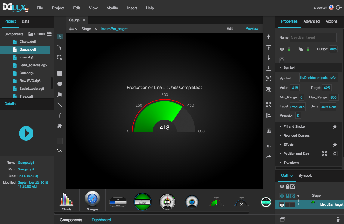
A pre-made gauge component in DGLux5


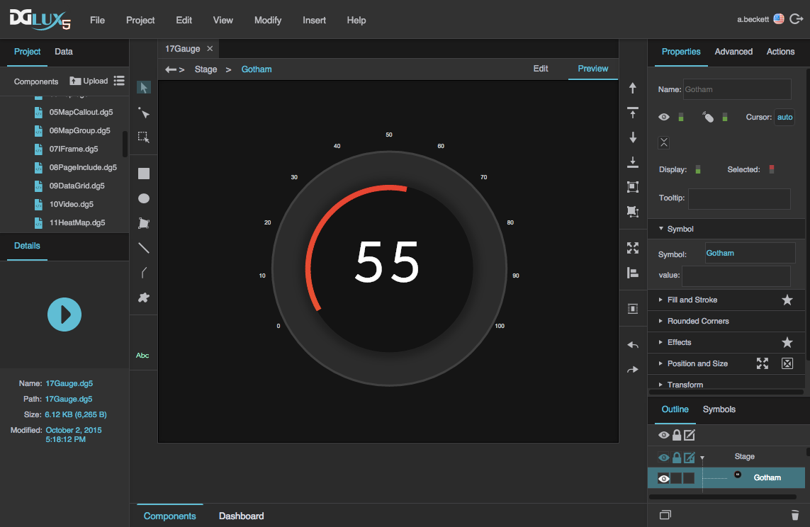
Another gauge created in DGLux5


Video Tutorial: Creating Custom Gauges in DGLux5

More video tutorials are here.


Use a Pre-Made DGLux5 Gauge

To use a pre-made DGLux5 gauge widget, you must have the Dashboard widget library installed. A normal DGLux5 installation includes this library.

To use a pre-made gauge:

  1. Import the Dashboard widget library into your project, by following the steps in Import a Widget Library.
  2. In the widget palette at the bottom of the screen, expand Dashboard and then Gauges to display the pre-made DGLux5 gauges.
  3. Find the gauge you want, and drag it to the Document window.

    This inserts the gauge widget in your file.

  4. Make sure the gauge that you inserted is selected, and then in the Property Inspector, under Symbol, edit the properties of the gauge according to the following table. Which properties are available depends on which widget you choose.
Property Name Importance, When Available Steps
Value or Status Crucial

Bind a data metric to this property using the steps in Bind from a Data Metric.

Alternatively, you can bind a data value that has been loaded by a Data Services block in the dataflow.

On Crucial Bind the same data metric to On that you bound to Value or Status. Value holds the string value for text readouts, and On holds the boolean value for determining other properties, such as color.
Units Important Enter the units, such as "kW," "cfm," or "acres."
Min and Max, or Min_Range and Max_Range Important Edit the lowest and highest values for the gauge scale.
Title Important Enter a title for the gauge, such as "Airflow."
Target Optional Enter the target value for this metric. If the target value changes based on other factors, you can use the dataflow to define a dynamic target value, and bind the result to Target.
Various color properties Optional Choose the colors for the appropriate gauge pieces and conditions.
Start Angle, End Angle Optional Edit the positions on the circle where you want the gauge scales to start and end.

Create an Example Gauge

These steps create a basic, data-driven gauge widget with a track scale, label scale, and text readout. First, you style the appearance of the gauge. Next, you configure the gauge's behavior in reaction to data. Finally, you tie live data to the gauge.

Work from a Mockup

If you want to create a gauge based on a mockup:

  1. Insert the mockup image on the stage.
  2. In the Outline, next to the image, click the empty square in the lock column so that a lock icon appears. This prevents you from editing the image.
  3. Refer to the image as you work, and then delete it when you are done.

If your mockup does not include color codes, use a color picker browser plugin to match colors. You can paste the hex values into the DGLux5 fill and stroke pop-ups.

Style the Gauge Appearance

To style the gauge appearance:

  1. Create a group:
    1. Right-click in the Outline or Document window and select Insert > Components > Group.
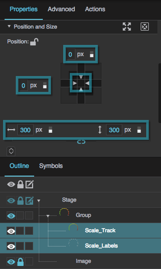
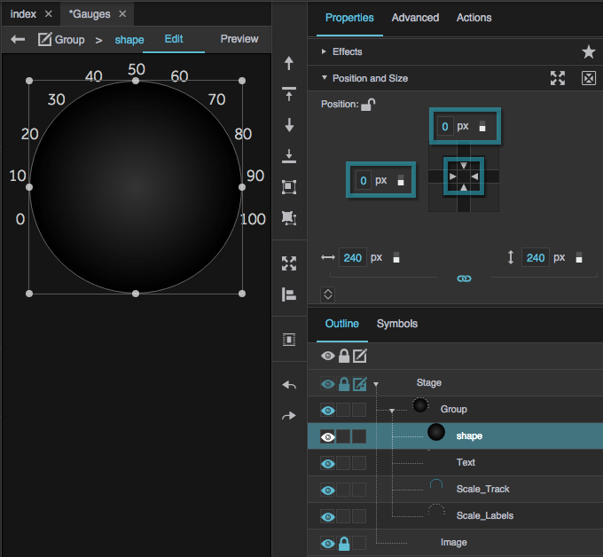
    2. In the Property Inspector, under Position and Size, set the width and height of the group to 300px and 300px. You can make the size dynamic when the gauge is finished.
    3. Make sure the group's layout is Absolute.

  2. Create scales inside the group:
    1. Right-click the group and select Insert > Gauge > Scale Labels.
    2. Right-click the group again, and select Insert > Gauge > Scale Track.
    3. Select both scale components by Shift+clicking them in the Outline, and then set the width and height to 300px and 300px.
    4. With the scale components selected, under Position and Size, click the middle square in the grid, and enter 0 in both fields that appear.

      This centers the scales in the group.

  3. In the Outline, select the scale track, and then set its properties:
    1. Set Radius to 70%.
    2. Set Track Fill to the fill that you want.

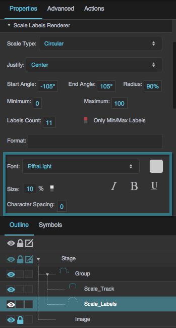
  4. In the Outline, select the scale labels, and then set the properties:
    1. Set Radius to 90%.
    2. Set Start Angle and End Angle to −105 and 105.

    3. Set the font styling of the scale labels to your preferred styling.

  5. Create a text readout:
    1. In the Outline, right-click the group, and select Insert > Components > Text.
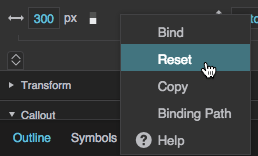
    2. With the text component selected, under Position and Size, ensure Width and Height are set to Auto. If Width or Height is not Auto, hover over the property until a blue dot appears. Then, click the blue dot and select Reset.

    3. With the text component selected, under Position and Size, click the middle square in the grid, and enter 0 in both fields that appear.

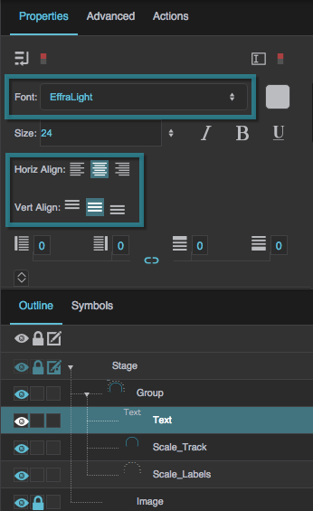
    4. Set the text component's font styling to your preferred styling.
    5. Set the Horizontal Alignment and Vertical Alignment properties to centered.

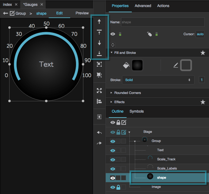
  6. Create one or more circles to go behind the gauge information.
    1. Use the Ellipse tool. Hold Shift while dragging the tool to create a circle.
    2. Style the circles' fill and stroke to your preference

    3. Drag the circles into the group to add them.
    4. With the circles selected, under Position and Size, click the middle square in the grid, and enter 0 in both fields that appear.

    5. Use the Outline to stack the group's items in the order you want them by selecting them and clicking Send Backward and Bring Forward.

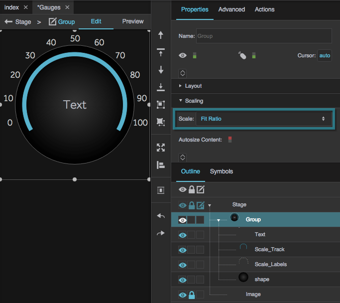
  7. Select the group, and in the Property Inspector, under Scaling, select Fit Ratio.

  8. Right-click the group, and select Convert to Symbol.

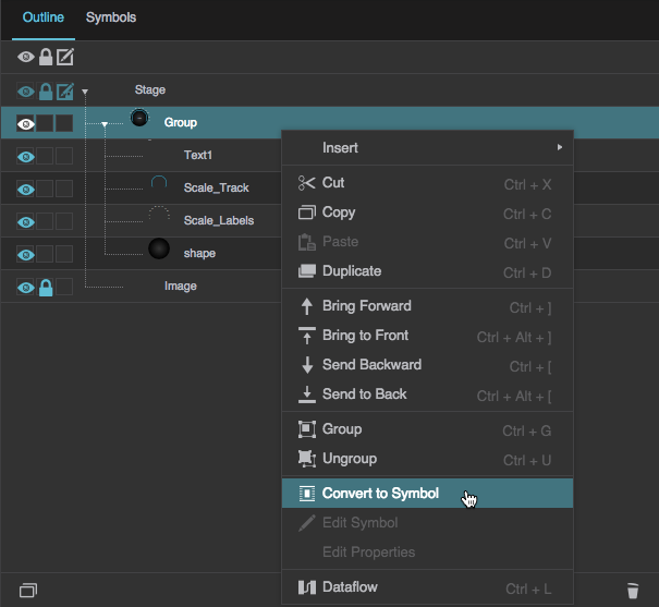
  9. When prompted, create a name for your symbol.

Create the Gauge Behavior

To create some behavior for this gauge:

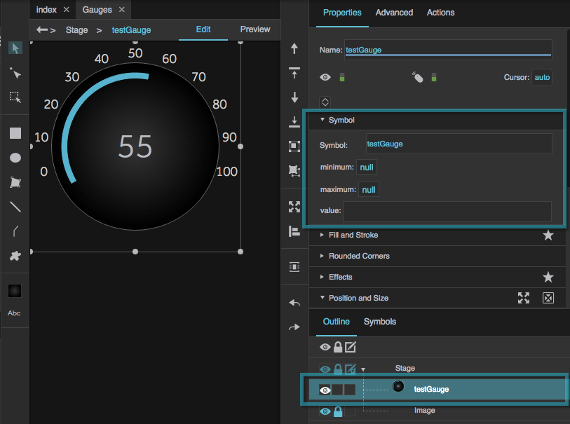
  1. Add symbol parameters:
    1. Right-click the symbol, and select Edit Properties.

    2. Drag two instances of number and one instance of string from the left panel to the right panel.

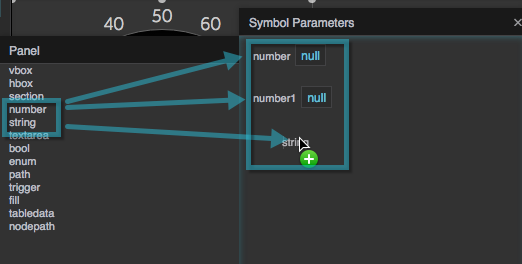
    3. Name the two number parameters minimum and maximum, by double-clicking the labels and editing them.
    4. Name the string parameter value.

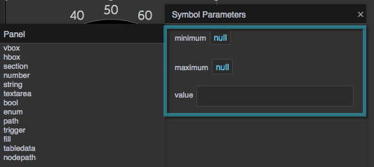
    5. Enter the default values 0 and 100 for minimum and maximum, and 55 for value.

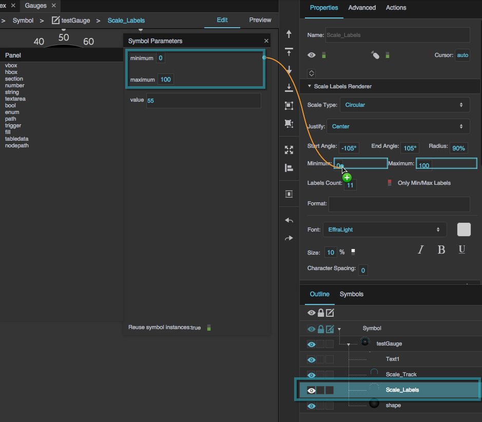
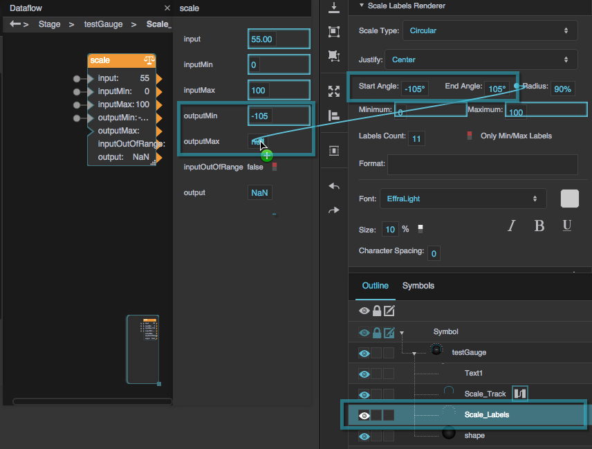
    6. In the Outline, select the Scale Labels component.
    7. Bind the minimum and maximum symbol parameters to the Minimum and Maximum Scale Labels properties.

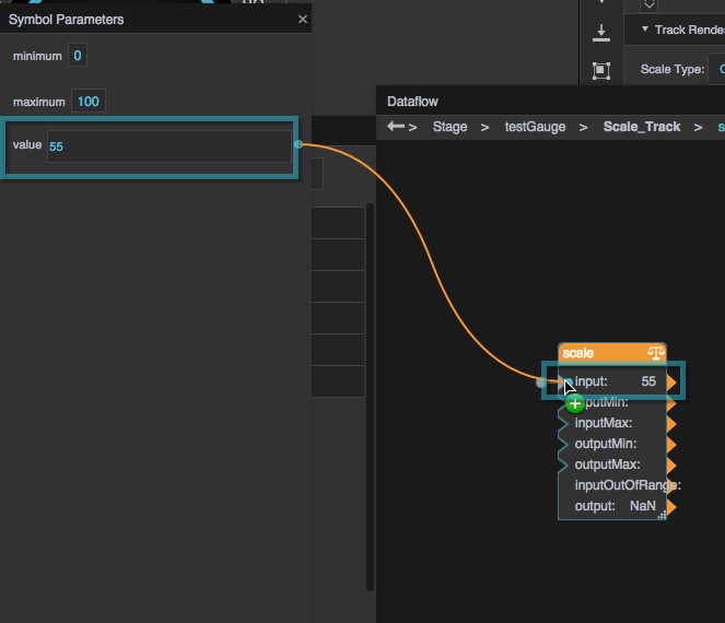
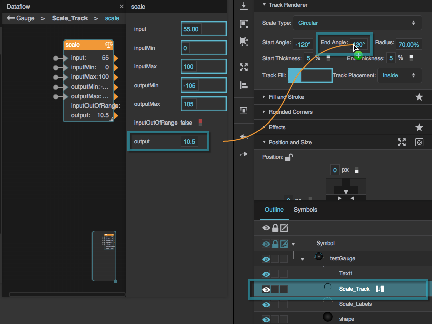
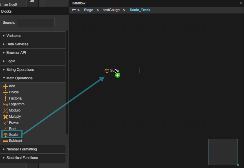
  2. Make the track's end angle dynamic:
    1. Right-click the scale track, and select Dataflow.

    2. In the dataflow blocks palette, under Math Operations, find the Scale block, and drag the Scale block to the dataflow view.

    3. Bind the value symbol parameter to the Scale block's input property.

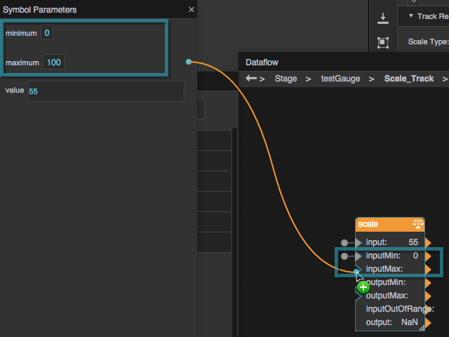
    4. Bind the minimum and maximum symbol parameters to the Scale block's inputMin and inputMax properties.

    5. Bind the scale label component's Start Angle and End Angle properties to the Scale block's outputMin and outputMax properties.

    6. Bind the block's output property to the scale track's End Angle property.

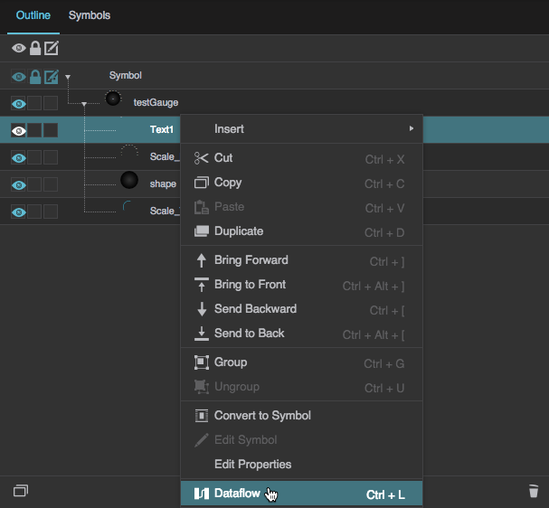
  3. Map the data value to the text component:
    1. Right-click the text box, and select Dataflow.

    2. In the Dataflow blocks palette, under Number Formatting, find a Round block, and drag the Round block to the dataflow view.

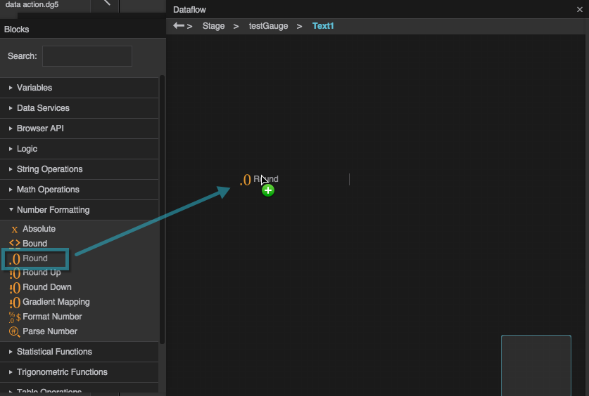
    3. Bind the symbol's value parameter to the Round block's input property.

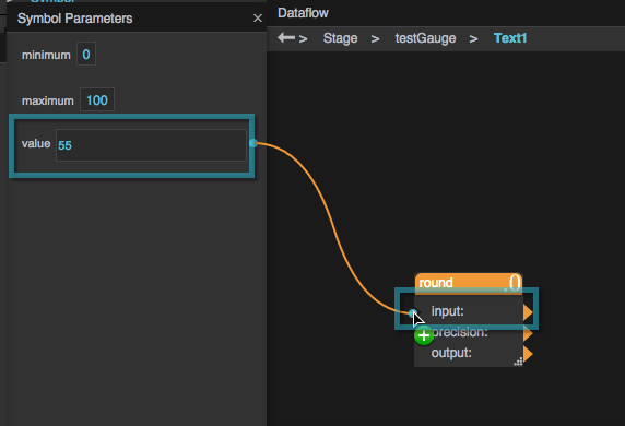
    4. For the Round block's precision property, enter 0 to ensure a round number in the text readout.
    5. Bind the Round block's output property to the text component's Text property.

  4. Double-click the Document window to exit symbol editing mode.

Tie Data to the Gauge

To tie data to this gauge:

  1. Select the symbol instance in the Outline.
  2. In the Property Inspector, open the Symbol properties.

  3. In the Data Panel, navigate to the data source.

  4. In the Metrics panel, find the data metric.

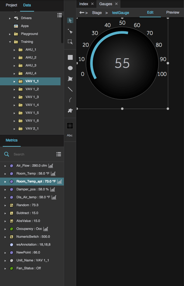
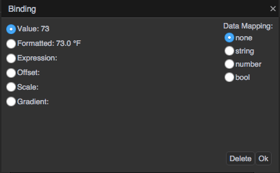
  5. Drag the data metric from the metrics panel to the value property.

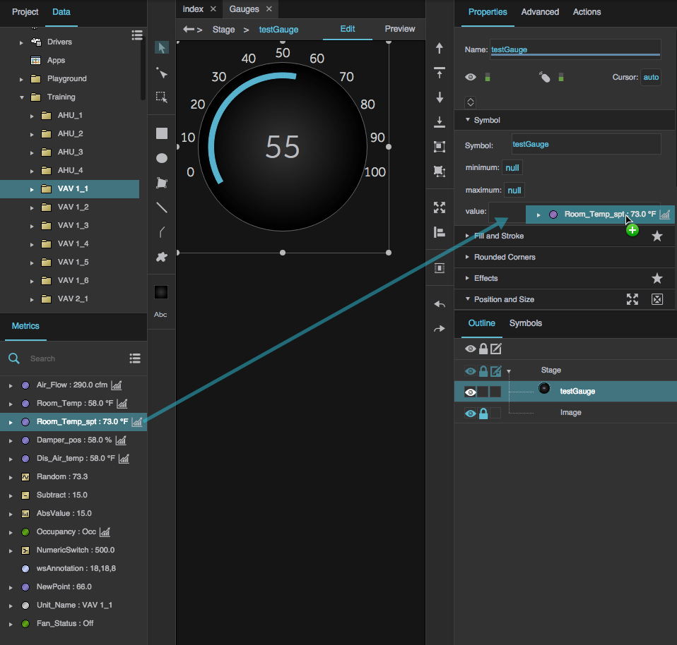
  6. In the Binding dialog, specify Value, and click OK.

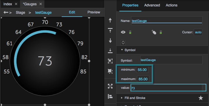
  7. If you want, in the Property Inspector, change the minimum and maximum property values to your preferred range.


Save a Gauge as a Widget

If you want to save a gauge as a widget so that you can use it in other projects, follow the steps in Create Your Own Widget Library.


Gauge Scale Properties

These properties affect gauge scales. A gauge scale fits into one of three categories, based on whether it has ticks, labels, or a track. Each category has its own properties.

For a guide to using gauges, see Designing Gauges.

Gauges and gauge scales can also be affected using Common Properties.

2019/07/17 19:17

Shared Gauge Scale Properties

These properties affect the shape of any type of gauge scale.

Scale Type

Scale Type

Scale Type
Specifies whether the shape of the scale is defined by a circle or a straight line.

The Scale Type property

Start Angle

Start Angle

Start Angle
Defines the start angle of the circular scale. A value of zero indicates the top of the circle. Valid values are between −180 and 180.

The Start Angle property

End Angle

End Angle

End Angle
Defines the end angle of the circular scale. A value of zero indicates the top of the circle. Valid values are between −180 and 180.

The End Angle property

Radius

Radius

Radius
Defines the radius of the circle that defines the scale, as a percentage of either half the width or half the height of the container, whichever is larger.

The Radius property
The Radius property

Left Padding

Left Padding

Left Padding
Defines the distance between the left side of a linear scale and the container boundary, in pixels. If a border stroke is defined, defines the distance between the scale and the border stroke. See Borders, Padding, and Content Size.

The Left Padding property

Right Padding

Right Padding

Right Padding
Defines the distance between the right side of a linear scale and the container boundary, in pixels. If a border stroke is defined, defines the distance between the scale and the border stroke. See Borders, Padding, and Content Size.

The Right Padding property


2019/07/17 19:17

Gauge Scale Properties

These properties affect gauge scales. A gauge scale fits into one of three categories, based on whether it has ticks, labels, or a track. Each category has its own properties.

For a guide to using gauges, see Designing Gauges.

Gauges and gauge scales can also be affected using Common Properties.


Shared Gauge Scale Properties

These properties affect the shape of any type of gauge scale.

Scale Type

Scale Type

Scale Type
Specifies whether the shape of the scale is defined by a circle or a straight line.

The Scale Type property

Start Angle

Start Angle

Start Angle
Defines the start angle of the circular scale. A value of zero indicates the top of the circle. Valid values are between −180 and 180.

The Start Angle property

End Angle

End Angle

End Angle
Defines the end angle of the circular scale. A value of zero indicates the top of the circle. Valid values are between −180 and 180.

The End Angle property

Radius

Radius

Radius
Defines the radius of the circle that defines the scale, as a percentage of either half the width or half the height of the container, whichever is larger.

The Radius property
The Radius property

Left Padding

Left Padding

Left Padding
Defines the distance between the left side of a linear scale and the container boundary, in pixels. If a border stroke is defined, defines the distance between the scale and the border stroke. See Borders, Padding, and Content Size.

The Left Padding property

Right Padding

Right Padding

Right Padding
Defines the distance between the right side of a linear scale and the container boundary, in pixels. If a border stroke is defined, defines the distance between the scale and the border stroke. See Borders, Padding, and Content Size.

The Right Padding property


Scale Ticks Renderer Properties

These properties affect a scale with ticks.

Ticks Placement

Ticks Placement

Ticks Placement
Specifies whether the ticks are positioned on the inside, outside, or center of the circle or line that defines the scale.

The Ticks Placement property

Major Tick Count

Major Tick Count

Major Tick Count
Defines the total number of major ticks along this scale.

The Major Tick Count property

Major Tick Length

Major Tick Length

Major Ticks Length
Defines the length of each major tick, as a pixel value or a percentage. For circular scales, a percentage is a portion of the circle’s radius. For linear scales, a percentage is a portion of half the container width.

The Major Tick Length property

Major Tick Stroke Color

Major Tick Stroke Color

Defines the stroke color of the major ticks.

The Major Tick Color property

Major Tick Stroke Weight

Major Tick Stroke Weight

Major Tick Stroke Weight
Defines the stroke weight of each major tick.

The Major Tick Weight property

Minor Tick Count

Minor Tick Count

Minor Tick Count
Defines the number of minor ticks between each consecutive pair of major ticks.

The Minor Tick Count property

Minor Tick Length

Minor Tick Length

Minor Tick Length
Defines the length of each minor tick, as a pixel value or a percentage. For circular scales, a percentage is a portion of the circle’s radius. For linear scales, a percentage is a portion of half the container width.

The Minor Tick Length property

Minor Tick Stroke Color

Minor Tick Stroke Color

Minor Tick Stroke Color
Defines the stroke color of the minor ticks.

The Minor Tick Color property

Minor Tick Stroke Weight

Minor Tick Stroke Weight

Minor Tick Stroke Weight
Defines the stroke weight of each minor tick.

The Minor Tick Weight property


Scale Labels Renderer Properties

These properties affect a scale with number labels.

Justify

Justify

Justify
Specifies whether the labels appear on the inside, outside, or center of the circle or line that defines the scale.

The Justify property

Minimum

Minimum

Minimum
Defines the lowest number on the scale.

The Minimum property

Maximum

Maximum

Maximum
Defines the highest number on the scale.

The Maximum property

Labels Count

Labels Count

Labels Count
Defines the total number of labels along this scale. Must be an integer greater than or equal to 2. The Only Min/Max Labels property overrides this property.

The Labels Count property

Only Min/Max Labels

Only Min/Max Labels

Only Min/Max Labels
Specifies whether the labels for the minimum and maximum of the scale are the only two labels that appear. This property overrides the Labels Count property.

The Only Min/Max Labels property

Format

Format

Format
Defines the number format for scale labels, as a format string.

For example:


  • ,##0.00: Labels have a thousands separator and two decimal digits.

  • 000.00: Labels have three mandatory digits before the decimal, and two mandatory digits after the decimal.


For more information about supported formatting options, see Scripting and Syntax.

The Format property
The Format property

Labels Font

Labels Font

Labels Font
Defines the font used for the labels along this scale. To add a font to this project and use it for this property, see Text Component Properties.

The Font property
The Font property

Labels Size

Labels Size

Labels Size
Defines the height of the scale numbers, as a pixel value or percentage. For circular scales, a percentage is a portion of the circle's radius. For linear scales, a percentage is a portion of half the container width.

The Labels Size property

Italic

Italic

Italic
Defines whether the labels along this scale are italic.

The Italic property
The Italic property

Bold

Bold

Bold
Defines whether the labels along this scale are bold.

The Bold property
The Bold property

Underline

Underline

Underline
Defines whether the labels along this scale are underlined.

The Underline property

Character Spacing

Character Spacing

Character Spacing
Specifies the horizontal spacing between characters in the scale labels, as a pixel value. A null value means the font's default spacing is used.

The Character Spacing property


Scale Track Renderer Properties

These properties affect a scale with a track.

Start Thickness

Start Thickness

Start Thickness
Defines the thickness of the scale track at its start, as a pixel or percentage value. For circular scales, a percentage is a portion of the circle’s radius. For linear scales, a percentage is a portion of the entire container width.

The Start Thickness property

End Thickness

End Thickness

End Thickness
Defines the thickness of the scale track at its end, as a pixel or percentage value. For circular scales, a percentage is a portion of the circle’s radius. For linear scales, a percentage is a portion of the entire container width.

The End Thickness property

Track Fill

Track Fill

Track Fill
Defines the colors for the gradient fill for the scale track. To add colors, click below the track in the dialog. To delete colors, right-click on them in the dialog.

The Track Fill property

Track Placement

Track Placement

Track Placement
Specifies whether the track is positioned on the inside, outside, or center of the circle or line that defines the scale.

The Track Placement property

2019/07/17 19:17

Scale Labels Renderer Properties

These properties affect a scale with number labels.

Justify

Justify

Justify
Specifies whether the labels appear on the inside, outside, or center of the circle or line that defines the scale.

The Justify property

Minimum

Minimum

Minimum
Defines the lowest number on the scale.

The Minimum property

Maximum

Maximum

Maximum
Defines the highest number on the scale.

The Maximum property

Labels Count

Labels Count

Labels Count
Defines the total number of labels along this scale. Must be an integer greater than or equal to 2. The Only Min/Max Labels property overrides this property.

The Labels Count property

Only Min/Max Labels

Only Min/Max Labels

Only Min/Max Labels
Specifies whether the labels for the minimum and maximum of the scale are the only two labels that appear. This property overrides the Labels Count property.

The Only Min/Max Labels property

Format

Format

Format
Defines the number format for scale labels, as a format string.

For example:


  • ,##0.00: Labels have a thousands separator and two decimal digits.

  • 000.00: Labels have three mandatory digits before the decimal, and two mandatory digits after the decimal.


For more information about supported formatting options, see Scripting and Syntax.

The Format property
The Format property

Labels Font

Labels Font

Labels Font
Defines the font used for the labels along this scale. To add a font to this project and use it for this property, see Text Component Properties.

The Font property
The Font property

Labels Size

Labels Size

Labels Size
Defines the height of the scale numbers, as a pixel value or percentage. For circular scales, a percentage is a portion of the circle's radius. For linear scales, a percentage is a portion of half the container width.

The Labels Size property

Italic

Italic

Italic
Defines whether the labels along this scale are italic.

The Italic property
The Italic property

Bold

Bold

Bold
Defines whether the labels along this scale are bold.

The Bold property
The Bold property

Underline

Underline

Underline
Defines whether the labels along this scale are underlined.

The Underline property

Character Spacing

Character Spacing

Character Spacing
Specifies the horizontal spacing between characters in the scale labels, as a pixel value. A null value means the font's default spacing is used.

The Character Spacing property


2019/07/17 19:17

Gauge Scale Properties

These properties affect gauge scales. A gauge scale fits into one of three categories, based on whether it has ticks, labels, or a track. Each category has its own properties.

For a guide to using gauges, see Designing Gauges.

Gauges and gauge scales can also be affected using Common Properties.


Shared Gauge Scale Properties

These properties affect the shape of any type of gauge scale.

Scale Type

Scale Type

Scale Type
Specifies whether the shape of the scale is defined by a circle or a straight line.

The Scale Type property

Start Angle

Start Angle

Start Angle
Defines the start angle of the circular scale. A value of zero indicates the top of the circle. Valid values are between −180 and 180.

The Start Angle property

End Angle

End Angle

End Angle
Defines the end angle of the circular scale. A value of zero indicates the top of the circle. Valid values are between −180 and 180.

The End Angle property

Radius

Radius

Radius
Defines the radius of the circle that defines the scale, as a percentage of either half the width or half the height of the container, whichever is larger.

The Radius property
The Radius property

Left Padding

Left Padding

Left Padding
Defines the distance between the left side of a linear scale and the container boundary, in pixels. If a border stroke is defined, defines the distance between the scale and the border stroke. See Borders, Padding, and Content Size.

The Left Padding property

Right Padding

Right Padding

Right Padding
Defines the distance between the right side of a linear scale and the container boundary, in pixels. If a border stroke is defined, defines the distance between the scale and the border stroke. See Borders, Padding, and Content Size.

The Right Padding property


Scale Ticks Renderer Properties

These properties affect a scale with ticks.

Ticks Placement

Ticks Placement

Ticks Placement
Specifies whether the ticks are positioned on the inside, outside, or center of the circle or line that defines the scale.

The Ticks Placement property

Major Tick Count

Major Tick Count

Major Tick Count
Defines the total number of major ticks along this scale.

The Major Tick Count property

Major Tick Length

Major Tick Length

Major Ticks Length
Defines the length of each major tick, as a pixel value or a percentage. For circular scales, a percentage is a portion of the circle’s radius. For linear scales, a percentage is a portion of half the container width.

The Major Tick Length property

Major Tick Stroke Color

Major Tick Stroke Color

Defines the stroke color of the major ticks.

The Major Tick Color property

Major Tick Stroke Weight

Major Tick Stroke Weight

Major Tick Stroke Weight
Defines the stroke weight of each major tick.

The Major Tick Weight property

Minor Tick Count

Minor Tick Count

Minor Tick Count
Defines the number of minor ticks between each consecutive pair of major ticks.

The Minor Tick Count property

Minor Tick Length

Minor Tick Length

Minor Tick Length
Defines the length of each minor tick, as a pixel value or a percentage. For circular scales, a percentage is a portion of the circle’s radius. For linear scales, a percentage is a portion of half the container width.

The Minor Tick Length property

Minor Tick Stroke Color

Minor Tick Stroke Color

Minor Tick Stroke Color
Defines the stroke color of the minor ticks.

The Minor Tick Color property

Minor Tick Stroke Weight

Minor Tick Stroke Weight

Minor Tick Stroke Weight
Defines the stroke weight of each minor tick.

The Minor Tick Weight property


Scale Labels Renderer Properties

These properties affect a scale with number labels.

Justify

Justify

Justify
Specifies whether the labels appear on the inside, outside, or center of the circle or line that defines the scale.

The Justify property

Minimum

Minimum

Minimum
Defines the lowest number on the scale.

The Minimum property

Maximum

Maximum

Maximum
Defines the highest number on the scale.

The Maximum property

Labels Count

Labels Count

Labels Count
Defines the total number of labels along this scale. Must be an integer greater than or equal to 2. The Only Min/Max Labels property overrides this property.

The Labels Count property

Only Min/Max Labels

Only Min/Max Labels

Only Min/Max Labels
Specifies whether the labels for the minimum and maximum of the scale are the only two labels that appear. This property overrides the Labels Count property.

The Only Min/Max Labels property

Format

Format

Format
Defines the number format for scale labels, as a format string.

For example:


  • ,##0.00: Labels have a thousands separator and two decimal digits.

  • 000.00: Labels have three mandatory digits before the decimal, and two mandatory digits after the decimal.


For more information about supported formatting options, see Scripting and Syntax.

The Format property
The Format property

Labels Font

Labels Font

Labels Font
Defines the font used for the labels along this scale. To add a font to this project and use it for this property, see Text Component Properties.

The Font property
The Font property

Labels Size

Labels Size

Labels Size
Defines the height of the scale numbers, as a pixel value or percentage. For circular scales, a percentage is a portion of the circle's radius. For linear scales, a percentage is a portion of half the container width.

The Labels Size property

Italic

Italic

Italic
Defines whether the labels along this scale are italic.

The Italic property
The Italic property

Bold

Bold

Bold
Defines whether the labels along this scale are bold.

The Bold property
The Bold property

Underline

Underline

Underline
Defines whether the labels along this scale are underlined.

The Underline property

Character Spacing

Character Spacing

Character Spacing
Specifies the horizontal spacing between characters in the scale labels, as a pixel value. A null value means the font's default spacing is used.

The Character Spacing property


Scale Track Renderer Properties

These properties affect a scale with a track.

Start Thickness

Start Thickness

Start Thickness
Defines the thickness of the scale track at its start, as a pixel or percentage value. For circular scales, a percentage is a portion of the circle’s radius. For linear scales, a percentage is a portion of the entire container width.

The Start Thickness property

End Thickness

End Thickness

End Thickness
Defines the thickness of the scale track at its end, as a pixel or percentage value. For circular scales, a percentage is a portion of the circle’s radius. For linear scales, a percentage is a portion of the entire container width.

The End Thickness property

Track Fill

Track Fill

Track Fill
Defines the colors for the gradient fill for the scale track. To add colors, click below the track in the dialog. To delete colors, right-click on them in the dialog.

The Track Fill property

Track Placement

Track Placement

Track Placement
Specifies whether the track is positioned on the inside, outside, or center of the circle or line that defines the scale.

The Track Placement property

2019/07/17 19:17

More Resources

This thread in the DGLogik Community Forum addresses gauges: