Tree
The tree component loads source tables and uses these tables to render a visual tree. Each source table describes the children of some tree node.
The tree uses "lazy loading," which means that a child table is loaded only when the relevant tree node is expanded. In order to enable this lazy loading, you must build a special dataflow symbol. See About the Dataflow Symbol.
Note
The terms tree node and tree item are closely related. A node is a tree data unit. An item is the rendered visual entity for a node.
For a detailed reference of properties that affect trees, see Common Properties and Tree Properties.

The tree component in DGLux5
About the Source Tables
The top-level source table is loaded in dataflow and can describe the top-level tree nodes. For example, to create the tree in the image above, the top-level source table could contain one row each for floorplans, reports, and devices.
Note
Alternatively, the top-level source table can describe a root node that you do not want to appear in your tree. In such a case, set the Show Root property to FALSE.
You bind the top-level source table to the Table property of the tree. All other source tables are loaded lazily.
All source tables must use the same column names for columns that are used to load tables, to identify tree items for selection, or to render tree items. These columns can include:
- Name—By default, this name becomes the string displayed in the node. This behavior can be overridden by a visual symbol.
- ID—This value is required and must be unique within a table. If a tree uses a property that requires unique IDs across tables, such as the Select Node property, this value must be unique across all source tables.
- Whether the item has children—This boolean value is optional. If it is not defined, the user can attempt to expand any node, even if no children exist.
- Dataflow symbol properties—This can be any column that is used to define lazy loading behavior, such as a path. See About the Dataflow Symbol.
- Visual symbol properties—This can be any column that is passed to the items renderer for the visual symbol. See About the Visual Symbol.
About the Dataflow Symbol
The tree requires a special dataflow symbol for lazy loading. You must create this dataflow symbol and use the symbol name as the Data Symbol property of the tree.
The dataflow symbol must have two tabledata parameters. These parameters must be named input and output. If any other names are used, the tree might not work at all. These names are case sensitive. The input and output parameters represent any particular tree node and the children of that node, respectively. You must define the relationship between input and output within the symbol.
The following are some example methods for creating the dataflow symbol. For more examples, see the tree tutorials.
Example 1: Tables are parsed from CSV files on the server.
Any table that has children must include a column that contains the paths to the child CSV files.
- Inside the dataflow symbol, add a String Loader block.
- Hover over the String Loader's path property, click the blue dot, and choose Binding Path.
- Set the binding path as
@parent.@params.input.0_child, wherechildis the name of the table column that contains CSV file paths. - Join this String Loader block to a CSV Parser.
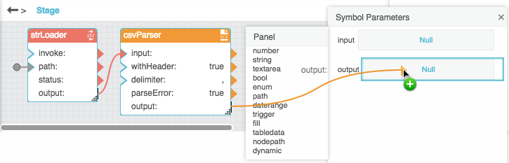
- Bind the CSV Parser's output table to the symbol's output parameter.
- Example 2: Tables reflect data structure or project directory structure.
- Use a List Node or Get Children block for data nodes and metrics, or use List Files for DGLux5 project files.
- Hover over the path property, click the blue dot, and select Binding Path.
- Set the binding path as
@parent.@params.input.0_<pathColumn>. - Bind the block output table to the symbol's output parameter.
- Example 3: Queries.
- Inside the dataflow symbol, add a Concatenate block that creates a query string.
- For the input n property that represents the path, set the binding path as
@parent.@params.input.0_<pathColumn>. - Join the Concatenate block to the block that runs the query. This query block might be Invoke Action or another block, depending on your data source.
- Bind the query block's output to the symbol's output parameter.
The following image demonstrates how to set the binding path in the dataflow symbol.
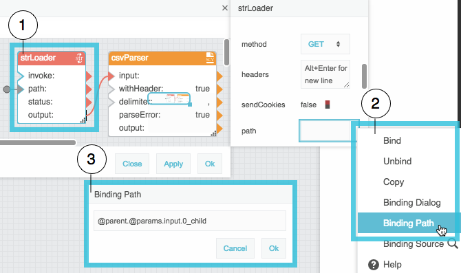
| 1 | Select block. | 2 | Click the blue dot and choose Binding Path. |
| 3 | Type binding path. |
The following image demonstrates how to bind the dataflow symbol output to the output parameter.
Important
Whenever the column names change, for example if your query changes, you must re-create the dataflow symbol.
Tip
To avoid typing a binding path manually, you can use the following shortcut:
- Temporarily bind a table with the same column names as the source tables to the
inputparameter. - Drag the table cell from row 0 and the relevant column.
Drop the cell on the relevant property.
This causes the table cell at this location to be set as the binding path.
- Delete the binding to the
inputparameter.
The following image demonstrates this shortcut.
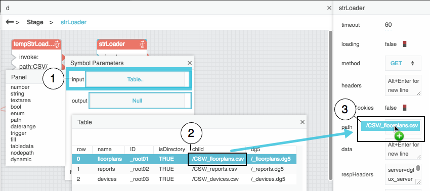
| 1 | Open input table. | 2 | Drag the cell from relevant column, top row. |
| 3 | Drop on relevant dataflow property. | 4 | (Not shown) Delete the binding to input. |
See also: Page Model.
About the Visual Symbol
Optionally, the tree component can render an instance of a visual symbol for each item in the tree.
Within the symbol, Horizontal layout is strongly recommended. Symbol contents might not be displayed at all in Vertical or Absolute layout.
If you use a visual symbol, you can bind source table columns to symbol parameters in the tree items renderer. To do so:
- In the Tree properties, invoke the value of the Table property to open the top-level source table.
- Expand Tree > Items > renderer in the Outline.
Drag column headers from the source table to properties in the Property Inspector, as shown in the following image.
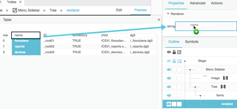
The symbol parameters also must be bound to properties inside the symbol.
For an example, see the tree tutorials.
Important
Whenever the column names change, for example if your query changes, you must re-bind the changed table columns to the renderer.
Tip
If the visual symbol has a default parameter, this parameter is automatically used as the name property of the tree. This shortcut works only if the dataflow symbol has been defined. To set a default symbol parameter, right-click the parameter in the parameters list in symbol editing mode and choose Make Default. See Symbol.
About Selection
This section configures how to configure tree selection, and it describes the Selected Items string and the Selected Items Data table.
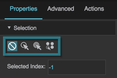
How to Configure Selection
You can configure the selection behavior allowed by the tree. For example, the tree can allow one item to be selected, or it can allow multiple items to be selected. Selection behaviors are described here.
To configure tree selection:
- In the Outline, select Tree.
- Expand the Selection properties.
Choose a selection behavior.
The following image shows the selection behaviors. See also: Selection Properties.
Selected Items and Selected Items Data
The Selected Items property is a comma-separated list of IDs of the selected items in the tree.
The Selected Items Data property is a table containing the source table rows for all currently selected tree items. This property allows you to pass data for selected items through the tree component to other parts of the project. For example, the tree tutorials include an example of using the selected items to drive a repeater. You can also perform operations on this table in the dataflow, using Table Operations dataflow blocks or the Script dataflow block. See also: Scripting and Syntax.
For more details about both of these properties, see Selection Properties.
Tutorial: Create a Simple Tree to List Files
These steps create a tree that displays the directory structure of this DGLux5 project.
-
- In the
assetsdirectory, addassets_1,assets_2,assets_3, andassets_4. In the
assets_1directory, addMP4sandPNGs.The following image demonstrates the finished directory structure.

- Right-click in the Outline or Document window, and select Insert > Components > Tree.
- Add the top-level source table:
In the dataflow model for the tree, add a List Files block, as shown in the following image.

Drag the
assetsfolder from the Project Panel, and drop it on the path property of the block, as shown in the following image.
- In the block properties, click Invoke.
Bind the List File block's output property to the tree's Table property, as shown in the following image.

- In the Property Inspector, type these column names:
- Type
pathfor Item ID Column (replaceID). - Type
namefor Item Name Column. Type
isDirectoryfor Has Children Column.The top-level folders now appear in the tree component, as shown in the following image.

- Create a dataflow symbol:
- In dataflow for the Stage, add two List Files blocks.
Name the List Files blocks
tempLFandoutputLF, as shown in the following image.
Select the two dataflow blocks, right-click, as shown in the following image, and select Convert to Symbol.

Name the symbol
dataSym, and click OK, as shown in the following image.
Right-click the new symbol block that appears, and select Edit Symbol, as shown in the following image.

Click in the path property field of
tempLF, and press Return, as shown in the following image.
Right-click the dataflow window, and choose Symbol Properties, as shown in the following image.

Add two tabledata parameters, as shown in the following image.

Name the new parameters
inputandoutput, as shown in the following image.
Important: If you do not use these exact names, the symbol might not collect data for the tree. Names are case sensitive.
Bind the output table of
tempLFto theinputparameter, as shown in the following image.
Open the
inputparameter table, and drag the cell from row 0, column path, to the path property ofoutputLF, as shown in the following image.
Bind the output property of
outputLFto theoutputparameter, as shown in the following image.
Unbind the
inputsymbol parameter, as shown in the following image.
The symbol parameter values will become null.
- Delete the
tempLFblock. - Click OK to save changes and exit dataflow symbol editing mode.
- Delete the instance of the dataflow symbol from the Stage dataflow.
Select the tree in the Outline, and in the Property Inspector, type
dataSymfor the Data Symbol property, as shown in the following image.
All descendants of the root now can appear in the tree component.
Tutorial: Render a Visual Symbol in the Tree
These steps create a visual symbol to use in the tree. See also: About the Visual Symbol.
- Create the tree described in Tutorial: Create a Simple Tree to List Files.
- In the
assetsdirectory, add some image files. For example, add images in the following locations:- In
assets/assets_1/PNGs, add imagespngA.pngandpngB.png - In
assets/assets_2, add imagepngC.png - In
assets/assets_3, add imagepngD.png In
assets/assets_4, add imagepngE.pngThe following image shows the completed file structure.

- Create the visual symbol:
In the Symbols panel, click New, as shown in the following image.

Name the new symbol
visSym, as shown in the following image.
In the Symbols panel, right-click visSym, and choose Edit, as shown in the following image.

Set the Layout property of visSym to Horizontal, as shown in the following image.

Important
Horizontal layout is strongly recommended for visual symbols used in trees. Symbol content might not be displayed in Vertical or Absolute layout.
- Add an image component and a text component to visSym.
Set the image height and width to 50 pixels, as shown in the following image.

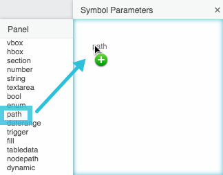
Add a path parameter and a string parameter to visSym, as shown in the following image.

Bind the path parameter to the image component's URL property, as shown in the following image.

Bind the string parameter to the text component's Text property, as shown in the following image.

Set the string parameter as default, as shown in the following image.

- Click OK to exit symbol editing mode.
In the Tree properties, type
visSymas the Symbol property, as shown in the following image.
Now a symbol instance is rendered for each tree item.
- Bind the table column to the renderer:
- Open the tree's top-level source table.
- In the Outline, expand Tree > Items > renderer.
Drag the header of the path column to the path property of the renderer, as shown in the following image.

- In the Outline, select Tree > Items.
Set the tree item height to 50 pixels, as shown in the following image.

Tutorial: Use Tree Selection
These steps cause the currently selected tree items to drive a repeater.
- Create the tree, as described in Tutorial: Create a Simple Tree to List Files.
- Render the visual symbol, as described in Tutorial: Render a Visual Symbol in the Tree.
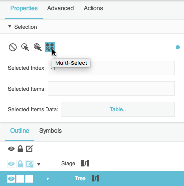
Set the tree's Selection Behavior property to Multi-Select, as shown in the following image.
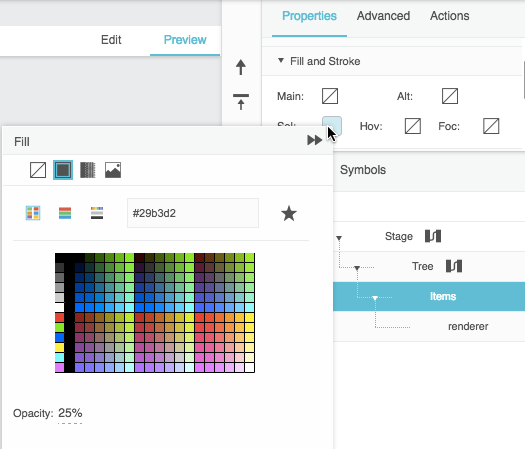
Set the tree items' Selected Items Fill property to a value, as shown in the following image.
- Create the symbol for the repeater:
In the Symbols panel, click New, as shown in the following image.
Name the new symbol
imageSym, as shown in the following image.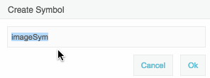
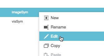
In the Symbols panel, right-click imageSym, and choose Edit, as shown in the following image.
- Add an image component to the imageSym symbol.
Set the width and height of the imageSym symbol to 100 pixels, as shown in the following image.

Add a path parameter to the imageSym symbol, as shown in the following image.
Bind the path symbol parameter to the image URL inside the symbol, as shown in the following image.
- Click OK to exit symbol editing mode.
- Add a group to the stage.
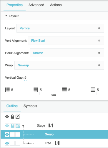
- Set the group's Layout properties as follows:
- Set Layout to Vertical.
- Set Horiz Alignment to Stretch.
(Optional) Add padding and a vertical gap.
The following image shows the configured layout properties.
- Inside the group, add a text component and a group.
- Set the text component and inner group properties as follows:
Enter
You have selected:as the value of the text component's Text property, as shown in the following image.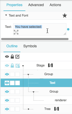
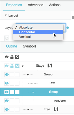
Set the layout of the inner group to Horizontal, as shown in the following image.
Set the width of the inner group to Auto, as shown in the following image.

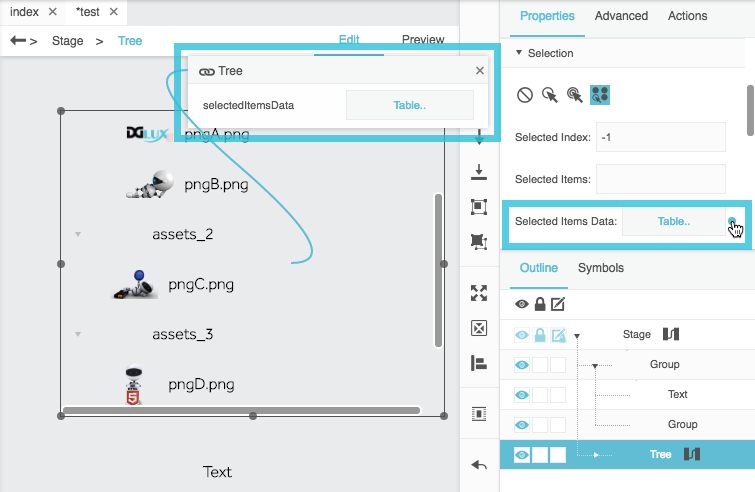
- Select the tree in the Outline, and expand the tree's Selection properties.
Hover over Selected Items Data until a blue dot appears, and then double-click the blue dot.
This opens a small binding pop-up, as shown in the following image.
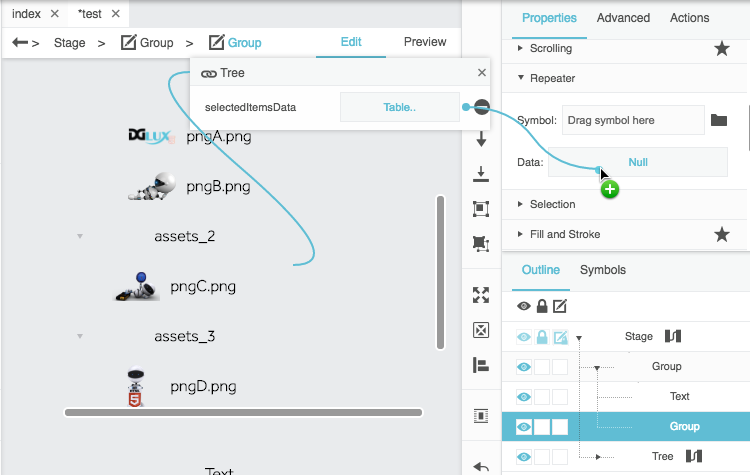
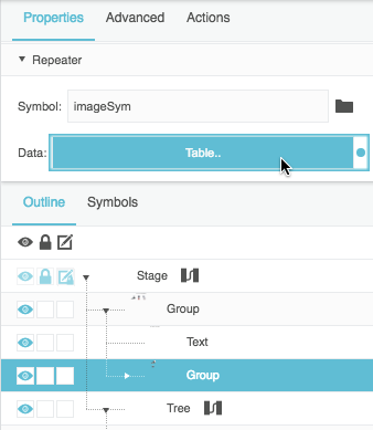
- Select the inner group in the Outline, and expand the Repeater properties.
Bind the Selected Items Data property in the small binding pop-up to the Data property, as shown in the following image.
In the inner group, type
imageSymas the Symbol property, as shown in the following image.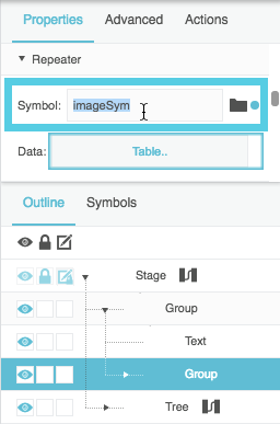
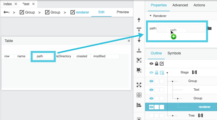
- Bind the table column to the renderer:
Open the table that drives the inner group repeater, as shown in the following image.
- In the Outline, select Group > Group > renderer.
Bind the path table column header to the path renderer property, as shown in the following image.
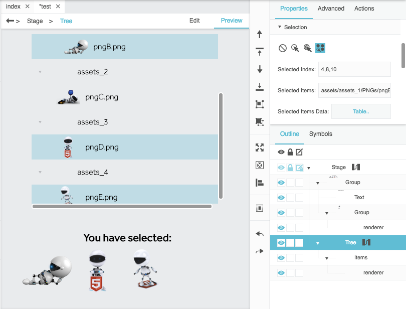
In Preview mode, click in the tree to select items. Selected items are displayed in the repeater, as shown in the following image.
Tree Properties
These properties affect the tree component. For a guide to using the tree component, see Tree.
Trees are also affected by Common Properties.


Tree Properties


Tree Items Properties
These properties affect the visual formatting of the tree.
Tree Items Text and Font Properties
The Text and Font properties for tree items are similar to those for Text components.
Tree Items Lines Properties
The Lines properties for tree items affect the lines that connect tree items.

A tree with the Lines properties set as a black dotted line.


Tree Items Fill Properties
Tree items fill properties affect the types of rows listed in this table.
| Property | Description |
|---|---|
| Main Rows | The first group of alternating rows. |
| Alternate Rows | The second group of alternating rows. |
| Hovered Row | The row that the user mouses over. |
| Focused Row | The row that is in focus. |
| Selected Rows | The selected rows. Only works if selection is enabled for this tree. |

The Tree Items Fill properties

